The Grand Narrative

New Bodypainting Nudes by Kim Joon (김준)

Posted in Korean Art by James Turnbull on November 30, 2008

kim-joon-body-painting-jeonju-hite-beer-factory-eab980eca480-eca084eca3bcec9790-ec9e88eb8a94-ed9598ec9db4ed8ab8-eba7a5eca3bc-eab3b5ec9ea5ec9d84-eab2ac
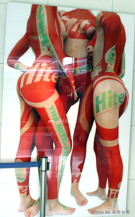
Having waxed lyrical about his work back in May, then it would probably be selfish of me not to share these new pictures of bodypainting artist Kim Joon’s (김준) that I happened to come across recently, but unfortunately upon closer inspection it turned out that they were not part of a new exhibition but were merely spotted in the lobby of the Jeonju Hite Beer factory instead (“전주에 있는 하이트 맥주 공장을 견학 하면서 바디 페인팅 광고가 눈에 들어와서”). Which was a little disappointing, although on the bright side it does perhaps open the possibility that managers of Korean Starbucks branches might get similarly moved by the Starbucks version of his “branded” works.

I am still very interested in seeing an exhibition of his for myself though, but given that even Kim Joon’s own website doesn’t mention upcoming ones then it can be very hard to find any information about them in advance. And so I apologize, for after a little digging I learned that by complete coincidence a few new pieces of his work were actually being displayed in Daegu at about the time this photo was taken, as part of a wider exhibition entitled “From the Roots to the Being Now” (근원으로부터 현제까지), but unfortunately that finished two weeks ago.

kim-joon-eab980eca480-bird-land-swarovski-2008By way of compensation then, let me direct you to the 2008 page of his website, where he does seem to have added several new images since I wrote that first post, and here on the right is one more new one (among many) from the website of the Boxart Gallery in Verona, Italy, where there was an exhibition of his work in June and July. On top of that, here’s a 52 page PDF catalogue of much of his work available as a zip file, here’s a description of the exhibition, below is yet one more recent work (source), and finally here’s a surreal 3D video of his from 2004 too, which I confess I don’t care for myself, but which will still probably be the strangest thing you and I will ever see while listening to what seems to be chanting from a Korean Buddhist temple.

kim-joon-eab980eca480-detail-from-bird-land-armani

Am I forgiven?^^ Seriously though, if any readers do ever hear about any upcoming exhibitions of his in Korea then please pass on the details, for considering how many there have been overseas just in the past year then his domestic appearances must be quite rare unfortunately.

Share

Korea’s “Lonely Geese” Families: More of them than you may think

korean-child-and-lonely-goose-fatherBack in July, I wrote a lengthy post on the reasons behind and implications for Korean society of the high numbers of “weekend couples” (주말부부) and “lonely geese fathers” (외기러기) here, the latter generally referring to fathers who remain in Korea to work while their families live overseas for the sake of the children’s eduction. Back then, no statistics on the numbers of either seemed to be available, so I speculated that the combination of both meant that a total of perhaps one in fifteen to one in ten Korean teenagers lived in a different city to their father most of the time.

But it turns out that perhaps I underestimated that number: according to this recent survey of single women, effectively teenagers in this particular sense, for Koreans tend to live at home until marriage (although this is more for economic rather than the cultural reasons usually cited: see here and here), as many as one in eight Korean families have “at least one immediate family member living apart from the rest”. True, on the one hand that figure will include also university students living away from home, but then they are not common as I explain in those two posts linked to above, and on the other it wouldn’t contain the “international” lonely goose fathers I mention above either, so ultimately I’d wager that 90% or more of those one in eight immediate family members referred to would indeed be fathers working in different cities during the week.

There are some other interesting points made in that survey, but as it doesn’t mention the numbers and methodology (par for the course for most Korean newspapers unfortunately), then I’d take them with a grain of salt. But I think that the figures for geese families would be pretty consistent whatever the sample size.

Photo Source: *lemonade*

Share

It’s not the size that matters, it’s what you do with it that counts…

Posted in Gender Roles, Gender Socialization, Korean Advertisements, Korean Feminism by James Turnbull on November 26, 2008
cass-beer-avertisement-passive-sexist-woman-relative-size-ritualization-of-subordination-licensed-withdrawal-erving-goffman-gender-advertisments-ecb9b4eba7a5eca3bc-eab491eab3a0( Source )

Back in this post, I discussed the role of sociologist Erving Goffman’s concept of “relative size” in advertising, or in other words the reasons for and implications of women almost invariably being shown as shorter or smaller than men in advertisements, despite the woman being taller of the two in roughly 1 out of 6 mixed pairs in real life. But while significant, that’s just one of several sexist tendencies of advertisements mentioned by Goffman and later commentators, and this Cass beer (카스) advertisement in particular shows how the relative size idea can be thrown on its head (no pun intended). For while the woman is actually the largest object in it, and most observers would probably think it too dogmatic of me to describe it as sexist, I still very much doubt that it would appeal to most women. But why not? Can’t women “live fizzily” (톡하게 산다) just as much as men?

To answer that, let’s begin with its most obvious features. Take the symbolism of the spurting, foaming beer coming out of a phallic beer bottle for instance: just in case already beer-addled brains in dark bars can’t make the connection, then the good people at Cass have helpfully rendered some of the beer suds suspiciously semen-like. Sorry if that’s a little crass, but no, I don’t think that it would just be me that would make the connection, although I will demur from providing close-ups to prove my point. But regardless, that symbolism is a very common theme in advertising, and, last time I checked, women liked having sex too, and of course there’s nothing at all wrong with visual triggers for convincing consumers to associate the product with sex per se. Having said that, the result is usually patronizing rather than sexual when it’s too blatantly applied, like in this recent commercial for Seoksu (석수) mineral water for instance (especially 0:21):

Personally, the forced smiles in it remind me of Soundgarden’s surreal 1994 Black Hole Sun music video more than anything else…

…and which never exactly made me want to drink beer, as I’d want to keep all my wits about me to escape from that particular nightmare. Not that many of today’s Korean 20 year-olds will have seen it though, and one is more than enough veiled references to my own decidedly unhip age of 32.

cass-beer-avertisement-passive-woman-breasts-relative-size-ritualization-of-subordination-licensed-withdrawal-erving-goffman-gender-advertisments-ecb9b4eba7a5eca3bc-eab491eab3a0Next are the stances of the two men as compared to the woman: ostensibly all have been just shot out of the beer bottle, but whereas they are definitely powerful and in control, she seems content to passively go to wherever her trajectory happens to take her, a contrast which parallels this Moschino advertisement that I discussed in that earlier post. Also, there is her pose, which again I don’t think I’d be the only one to whom the top half of her body at least conjures images of her lying in repose on a bed, awaiting the gracious presence of the male observer, although I accept that that might be more open to debate. But while that may be off-putting to a female observer (I don’t think it universally would be, by any means), even I would concede that again that’s still not really sexist in itself. But also recall the point I made in that earlier post that Goffman’s arguments being about primarily about the effects of persistent themes in advertisements rather than of specific features of individual ones, and one argument he made is that women are more frequently shown sitting or lying on a floor or bed whereas a man will more usually be depicted standing. Which not only has subtle sexual overtones (see above) but is also a visual clue about the (literally) higher authority in the relationship…a theme he called “Ritualization of Subordination”.

But instead of discussing that in this post, there’s another theme of his which I think this advertisement better exemplifies, namely “Licensed Withdrawal”, and which is why I chose it. For paradoxically, while the woman is the largest object in the advertisement, at the same time she’s not really in it, as she’s on the cusp of withdrawing psychologically from it by removing her gaze from the scene below her to wherever she is being taken, at which point she would be entirely superfluous to the true focus which is the men.

But why is this sexist? Again, Goffman himself is very long-winded and obtuse in his discussion of that, ironically the one he spends the most attention on, so let me turn you over to this excellent summary of it instead (which all the following quotes and pictures are from):

[One] way in which women are disempowered is by displaying them as withdrawn from active participation in the social scene and therefore dependent on others.  This involvement with some inner emotional processing, whether anxiety, ecstasy or introspection, can be symbolized by turning the face away, looking dreamy and introverted, or by covering the face, particularly the mouth, with the hands.

Next:

Rather than being portrayed as active, powerful and in charge, females are commonly shown in this licensed withdrawal mode, removed into internal involvements, overcome with emotions, or symbolically silenced with hand over the mouth.

Finally:

In another variation, females are frequently shown withdrawn inwards into some dreamy introverted state;  they pose, become things for others to gaze at and desire.  Males will stereotypically be shown active, engaged, and in charge of the situation.  They are not so much objects for others’ to gaze at, as actors with occupations and professions.

And, unusually for me, I’ll stop there: partially because it’s a big topic, and I’d like to keep things simple; partially because I see my role as a blogger as primarily introducing concepts like these to those unfamiliar with them and adding my own spin, not simply rehashing the original source’s contents (how am I doing?^^); but mostly because while I’ll keep an close eye out for them, the only comparatively recent study of sexism and related subjects in Korean academia means that the Korean internet (unlike the English-language one) isn’t exactly full of easy-to-find themed examples, making internet searches somewhat random, and I’d much rather use primarily Korean examples in any further discussion. But still, I’m always on the lookout these days, so I promise that if I do find enough, I’ll make sure to add them to this post and try to get to grips with all the subcategories and details for you.

Share

Why do Korean Cartoon Characters Look so Caucasian?

Posted in East Asia, Korean Media, Manhwa by James Turnbull on November 16, 2008
red-bikini-cartoon-woman-manga-manhwa-eba78ced9994-breasts-eab080ec8ab4-korean-cartoon-beach( Source: A Muchness of Me )

Introduction: On Assumptions about Korean Culture

my-wife-got-married-bed-scene-ec9584eb82b4eab080-eab2b0ed98bced9688eb8ba4-ecb9a8eb8c80-ec9ea5eba9b4-eb85b8ecb69cWhile I claim to examine Korean sociology through “gender, advertising and popular culture” on this blog, the last seems noticeable only for its absence in recent months, and so this week I planned to rectify that by beginning a series of weekly Korean film reviews, focusing on those from the 1990s and early 2000s that are now probably somewhat dated but which were ground-breaking in their depictions of gender roles and particularly women’s sexuality at the time. But I’ll also look at recent ones that those paved for way for too, such as “My Wife got Married” (아내가 결혼헀다) that is playing in cinemas at the moment, and which, in depicting a wife who seeks two husbands much like a married man might also seek additional sex and companionship in a mistress, would probably have prompted a storm of public protest just ten years ago.

recentering-globalization-popular-culture-and-japanese-trasnationalism-koichi-iwabuchiMy first film review was already written on Monday, but by coincidence I happened to be reading Recentering Globalization: Popular culture and Japanese transnationalism (2002) by Koichi Iwabuchi at about the same time, and it is so full of interesting and relevant (if indirect) points about Korean popular culture that I can’t resist considerably expanding the post to take account of what I’ve read about Japanese and East Asian dramas, idols, films, and so on. In the meantime, I’d like to also discuss Iwabuchi’s explanations for why Japanese manga characters generally look, if not quite Caucasian, certainly look somewhat less than Japanese, also interesting but which be somewhat out of place in a film review.

But first, and please forgive the brief personal tangent, I title this introduction “assumptions” because as a non-Korean who’s been here much of his adult life, then I know that I still hold many beliefs and opinions about Korean society that were really formed in my first few years here, when I was not only resolutely monolingual but was prone to generalize in order to make sense of what was then a wholly foreign place. Which is human nature, and so nothing to worry about in itself, but without some outlet and feedback for expressing those beliefs, especially friends as apt to overanalyse and purchase books on the subject as oneself, then they can easily become ossified, regardless of the naive, nebulous, ill-informed and usually drunken circumstances in which many were probably first formed. Hence the blog, and, man…it’s a lot of work having to frame arguments and provide justifications for them for an audience other than my smug, self-congratulatory, pretentious self. But sorely needed, both in terms of having a continued positive existence in the country and for my belated return to academia, so comments are always much appreciated.

caucasian-looking-korean-cartoon-characters-women

I mention this because, of those early beliefs and opinions, some don’t really bear up to critical analysis, like what frequent commentator “Gomushin Girl“, for instance, is slowly but surely proving to me about the wholly androgynous role pink clothing plays in Korean culture, and I’m also learning about how wearing it can even be a small act of rebellion for young people. But another which does, despite being the most contentious issue I’ve ever blogged about, are the very definite associations Koreans have between Caucasians and notions of modernity, glamor and/or more liberal sexuality, as I’ve discussed at length on the blog here, here, here, here, here, here and most recently here (for starters!). But where did my and – I dare say – most Westerners’ similar views on that subject originally come from?

caucasians-and-black-person-in-korean-cosmetic-surgery-advertisement( Advertisement for cosmetic surgery clinic in Busan. Source: comatosed )

Probably the most important are the racial considerations taken into account when hiring English teachers, the large numbers of Caucasians in advertisements, and finally the overwhelming Korean preferences for cosmetic surgery operations that just so happen to give them facial and bodily features more often found amongst Caucasians than Mongoloids, the latter two of which, far from being figments of our imaginations, I’ve demonstrated quantitatively are the case (not that the first would be hard to prove if I chose to write about that also). Probably noticed much later, but not that they exactly detract from any of those, are the rather non-Asian cartoon figures that advertisements and stationary across the peninsula are festooned with also. And as Iwabuchi demonstrates, that feature of Korean life is indeed just as real as our first impressions led us to believe, and a very deliberate one at that.

“Culturally Odorless” Japanese Products

japanese-cup-noodles-monster-and-pikachu( Source: I Believe in Advertising )

For impatient readers, then you’re sooo reading the wrong blog the gist of my argument here is that for much of its history, Korean animation (easier than saying “cartoons and comics”), has been heavily influenced – if not completely dominated – by its Japanese counterpart, and as such it shares the Japanese animation industry’s deliberate use of figures and characters of rather vague and/or even Caucasian-looking ethnicities, either for the sake of deflecting criticisms of cultural imperialism in (naturally) sensitive former East Asian colonies and/or victims of invasion in World War Two, and/or by Western media companies in the process of making Japanese animation more marketable internationally. Against the first part of that argument, I do acknowledge that one source, at least, argues that Korean manhwa (만화) characters do, in fact, tend to look more distinctly East Asian, and there is also the small matter of all Japanese cultural products being banned in Korea until 1998 too, but I think that a great deal of illicit imports of them (not to mention their influence) did occur in practice before 1998, and would wager that most of the comic books available in Korea today are simply translated manga. Besides which, I’m more than happy to entertain (but honestly don’t expect) any plausible alternative explanations for Caucasian-looking Korean animation that doesn’t involve this Japanese angle.

Moving now to Iwabuchi’s book more specifically, although its publication date makes it only 6 years old, most of his actual research was conducted in the mid to late-1990s, well before the internet began to have an effect on the dissemination of popular culture, so in many respects it is quite dated. But as I pointed out when I first bought it, it still informs any analysis and discussion of the spread of popular culture in East Asia – be it Korean, Japanese or otherwise – especially as, however unsexy this is in 2008, most of it is still done in practice by traditional media companies selling, buying and shipping content overseas, albeit the illegal CDs sold on the street having their content originally downloaded from the internet rather than burned on the former’s arrival.

rather-caucasian-alebit-somewhat-gay-looking-japanese-or-korean-cartoon-manga-manhwa-characters( Source )

To begin properly then, crucial to Iwabuchi’s arguments is the notion of a product’s “cultural odor”, which isn’t as abstract as perhaps it first sounds:

The cultural impact of a particular commodity is not necessarily experienced in terms of the cultural image of the exporting nation. For example, in the realm of audiovisual commodities, there is no doubt that Japan has been a dominant exporter of consumer technologies as well as animation and computer games…[they]…have certainly had a tremendous impact on our everyday life, an impact which is, in a sense, more profound than that of Hollywood films. (pp. 24-25).

I would suggest that the major audiovisual products Japan exports could [best] be characterized as the “culturally odorless” three C’s: consumer technologies (such as VCRs, karaoke, and the Walkman); comics and cartoons (animation); and computer/video games. I use the term cultural odor to focus on the way in which cultural features of a country of origin and images or ideas of its national, in most cases stereotyped, way or life are associated positively with a particular product in the consumption process. Any product may have various kinds of cultural association with the country of its invention. Such images are often related to exoticism, such as the image of the Japanese samurai or the geisha girl. Here, however, I am interested in the moment when the image of the contemporary lifestyle of the country of origin is strongly and affirmatively called to mind as the very appeal of the product, when the “cultural odor” of a cultural commodity is evolved. The way in which the cultural odor of a particular product becomes a “fragrance” – a socially and culturally acceptable smell – is not determined simply by the consumer’s perception that something is “made in Japan.” Neither is it necessarily related to the material influence or quality of the product. It has more to do with the widely disseminated symbolic images of the country of origin…[such as with McDonald's association with an attractive image of the "American way of life"]. (pp. 27-28)

rather-busty-anonymous-manga-manhwa-eba78ced9994-figure-exposed-breasts-eab080ec8ab4-eb85b8ecb69c

For those interested, the point about “culturally odorless” karaoke was echoed by Bill Kelly in his chapter entitled “Japan’s Empty Orchestra: Echoes of Japanese culture in the performance of karaoke” in this 1998 book that I discuss in two posts (here and here) on the reasons karaoke is so popular in Korea and Japan:

A global phenomenon which has been successfully marketed throughout Southeast Asia, Australia, New Zealand, North America and many parts of Europe, karaoke is a rare (and perhaps the only) example of a modern leisure activity “made in Japan” and transplanted overseas. [But] as a Japanese cultural commodity, it is the object – the karaoke machine – and not so much the culture, as defined by its use in a particular social context, which has been exported (p. 76).

Returning to Iwabuchi:

Sony’s Walkman is an important cultural commodity that has influenced everyday life in various ways….[One source] argues that it may signify “Japaneseness” because of its miniaturization, technical sophistication, and high quality. Yet, I suggest, although such signs of “Japaneseness” are analytically important, they are not especially relevant to the appeal of the Walkman at a consumption level. The use of the Walkman does not evoke images or ideas of a Japanese lifestyle, even if consumers know it is made in Japan and appreciate “Japaneseness” in terms of its sophisticated technology. Unlike American commodities, “Japanese consumer goods do not seek to sell on the back of a Japanese way of life”, and they lack any influential “idea of Japan”.

The cultural odor of a product is also closely associated with racial and bodily images of a country of origin. The three C’s I mentioned earlier are cultural artifacts in which a country’s bodily, racial, and ethnic characteristics are erased or softened. The characters of Japanese animation and computer games for the most part do not look “Japanese.” Such non-Japaneseness is called mukokuseki, literally meaning “something or someone lacking any nationality,” but also implying the erasure of racial or ethnic characteristics or a context, which does not imprint a particular culture or country with those features.

manga-manhwa-breasts-skirt-eba78ceab080-eba78ced9994-eab080ec8ab4-ecb998eba788

As a linguistic aside, knowing that “무” or “mu” meant “none” or “absent” in Korean, and that the “koku” in the Japanese term above probably meant the same as “국” or “gook” which means “country”, then I wondered what the final “seki” above meant in Korean also. By looking at the Chinese characters (無國籍) for the term from here, I figured out that the Korean equivalent is “적” or “jok” (say the “o” as in “hot”), which means “a record” or “a register”. So the final Korean equivalent is “무국적” or “mu-gook-jok”, which literally means “no-country-register”.

Any students of Korean that don’t already incorporate Chinese characters in their learning methods then I recommend these early posts of mine, with rather unconventional study subjects but still quite serious and I think useful suggestions for learning Korean vocabulary. But back on topic though, while searching for the above I happened to find this discussion of the term on a manga-related website, which gives examples of non-mukokuseki exceptions that prove the rule. But while certainly hardly the last word on the subject, I’m afraid that I’m definitely not going to look any further amongst the no-doubt tens of millions of mostly NSFW English-language webpages on Japanese manga to find more discussion of it. Continuing then:

Internationally acclaimed Japanese animation director Oshii Mamoru suggests that Japanese animators and cartoonists unconsciously choose not to draw “realistic” Japanese characters if they wish to draw attractive characters. In Oshii’s case, the characters tend to be modeled on Caucasian types. Consumers of and audiences for Japanese animation and games, it can be argued, may be aware of the Japanese origins of these commodities, but those texts barely feature “Japanese bodily odor” identified as such. (p. 28)

eiko-hanamura-japan-caucasian-mangaHaving identified and outlined the phenomenon of culturally odorless Japanese products then, the final part of this post is on the why. Or…ahem…at least it was, for the questions buzzing in my head as I’ve been typing this post have completely derailed the careful plans I originally had for it, and I need to resolve them before continuing. In particular, I don’t know how to square all the above with the popular and distinctly Japanese-smelling dramas of the 1990s and the in fact celebration of the Japaneseness of the Japanese Wave as a whole; I still think it’s possible, but I’ve got some more thinking to do before continuing…but then it’s already been six days since my last post. Very unusually for me then, for the sake of giving you something to read and get some feedback then I’ll post this first half now, apologize for the premature ending and the…*cough*…measly 2300 words, and do my best to complete the second half in the next few days. Deal?

(Eiko Hanamura Image Source: PingMag)

Part Two (November 24)

japanese-rising-sun-and-schoolgirl-t-shirtApologies for the long delay to completing this post, which was partially due to a bad cold, partially due to the increasing demands of my two daughters, and primarily because, after my rereading of his book, I no longer find Iwabuchi’s arguments surrounding mukokuseki as clear-cut or as compelling as I did when I wrote the first half; in fact, it turns out that he doesn’t actually mention the reasons for its origins at all, and ultimately I had to infer them. I think that that’s quite an oversight on his part, considering how much the concept of mukokuseki informs his discussion of the spread of Japanese popular culture in East Asia and all, but that’s not to say that I don’t find that still fascinating, nor that it’s not full of great, albeit indirect relevance to this specific topic. It’s just that with all that ultimately only relevant-sounding information in there, it took me a while to notice that omission.

First, a quick recap: a week ago I said that the two main factors behind the phenomenon of mukokuseki were Western media companies “internationalizing” Japanese cultural products for global consumption, and Japanese artists, animators, and game designers subconsciously at least wanting to make their products more palatable to East Asian consumers by removing their “Japaneseness”, thereby dispelling any notions that they constituted a renewed Japanese cultural imperialism among still sensitive East Asian populations. The first is still true as I’ll explain, but then the successes of distinctly Japanese dramas and music in East Asia since the 1980s confused me, for surely they completely contradicted the latter?

Well yes, of course, but timing proved to be crucial for my solving of that conundrum, for not only did mukokuseki become the “default option” for Japanese animation well before the 1980s, but this was overwhelmingly for domestic reasons. In contrast, the successes of Japanese dramas and music and so on three decades later occurred in a wholly different environment, (primarily) economic developments in the region producing both an insatiable new international demand for them from East Asian consumers but ironically also ensuring that Japanese media companies on their own lacked the logistical capabilities to satisfy it. Which, rather annoyingly for the structure I originally planned for this post, brings us right back to Western media companies filling the gap, so I may as well start this, hopefully more refined explanation of mukokuseki with the circumstances behind that.

the-great-wave-off-kanagawa-hokusai-iconic-japanese-art( Source: IconicIonic )

Japanese media companies are a favorite of Western commentators on Japan, for while at the time Sony’s purchase of Colombia in 1989 and Matsushita’s purchase of MCA (Universal) in 1990 became a symbol of Japanese economic ascendancy and US decline, and as such provoked a considerable backlash (expressed in the movies Black Rain (1989) and Rising Sun (1993) later, and I highly recommend the well-researched book the latter was based on), with the collapse of the Japanese economy in the 1990s, Sony struggling for years to make a profit, and Matsushita even ultimately withdrawing from its purchase, then they became even better known as symbols of Japanese hubris before the fall. Nevertheless, they were still a sign of the start of Japan’s hitherto invisible and odorless cultural presence in the world starting to become more and more conspicuous, and Iwabuchi reports that the surprising success of computer games in general and animations like Akira (1988) and Ghost in the Shell (1995) in Western markets was indeed appropriated by nihonjinron nationalists in Japan to promote their own views and certainly did encourage “an increasingly narcissistic interest in articulating the distinctive “Japaneseness” of cultural products in 1990s Japan,” and presumably both did come to have some impact on the production and reception of Japanese dramas and so on. But while those are not my focus, it should be noted that concerns about a renewed Japanese cultural imperialism and arrogance by Japanese and East Asian commentators were very much raised only after Japanese cultural products had become popular. Which does tend to be the case with backlashes of course, but my point is that, unlike what I originally thought, wariness about the possibility of a one never really entered the minds of the producers of Japanese cultural products originally. Nor, with the case of animation, after the event either, for however much the newfound success of Japanese animation was used and/or interpreted to other ends, those actually in the industry were acutely aware of the crucial Western role in their economic success.

bastof-lemon-manga-manhwa-caucasian-characters-eba78ceab080-eba78ced9994Why? If I could I’d love to step back and provide the context of Japan lacking the “soft power” embedded in US products, and which thus renders most correlations of “Japanization” with globalization/Americanization misguided, but that would be too tangential even for me. It will suffice to merely bear that in the back of your mind as you read the additional context and then specifics in the following lengthy quotes from Iwabuchi I’ll provide to answer that, as it will of the fact that the relative decline but still supremacy of American cultural power rendered Japan only one of several regional and media cultural centers worldwide as the industry consolidated over the 1990s (other notable ones being Brazil, Egypt and Hong Kong).

It is important “to place the significance of Japanese inroads into Hollywood, as well as the international popularity of Japanese animation and computer games, within a wider picture of transnational media and market interconnections….The rise of Japanese media industries articulates a new phase of global cultural flow dominated by a small number of transnational corporations. These moves testify to the increasing trend of global media mergers which aim to offer a “total cultural package” of various media products under a single conglomerate. After all, the reason Sony and Matsushita bought into Hollywood was not to dominate American minds, but rather to centralize product distribution. The purpose was to construct a total entertainment conglomerate through the acquisition of control over both audiovisual hardware and software. It was based upon the sober economic judgment that “it is cultural distribution, not cultural production, that is the key locus of power and profit”. The incursion can thus be seen as a confirmation of the supremacy of American software creativity and therefore of Japan’s second-rate ability as a software producer (p.37)

On top of that:

…finding a local partner is particularly important in facilitating the entry of non-Western media industries and cultural products into Western markets. [One source points out] three strategic patterns of activities for global media corporations: producing cultural products; distributing products; and owning hardware that delivers products. Penetration of transnational media industries into multiple markets needs the combination of at least two of the above three, particularly production and distribution, both of which are dominated by American industries. If Sony’s encroachment on Hollywood articulates Japanese exploitation of American software products in order to become a global media player, media globalization also promotes the incorporation of Japanese, and other, non-Western media products into the Western-dominated global distribution network. Japanese media industries and cultural products cannot successfully become transnational players without partners. The most serious shortcoming of the Japanese animation industry, despite mature production capabilities and techniques, is its lack of international distribution channels. Western (American) global distribution power is thus indispensable to make Japanese animation a part of global popular culture. The process can be called an “Americanization of Japanization.” (pp. 37-38)

tennis-no-oujisama-seigaku-regulars-manhwa-manga-caucasian-characters-eba78ceab080-eba78ced9994( Is it just me, or does the figure at the top-right look like a rather coy Hugh Jackman? Source )

And now for the specifics:

For example, it was the investment and the distribution channels of a British and American company Manga Entertainment (established in 1991 and part of the Polygram conglomerate) that made Ghost in the Shell a hit in Western countries. Similarly, in 1995, Disney decided to globally distribute Miyazaki Hayao’s animated films. Miyazaki gained prestige from Disney’s decision, which helped turn his animated Princess Mononoke (もののけ姫, Mononoke Hime) into a phenomenal hit in Japan in 1997. As the producer of the film acknowledged, the fact that Hayao’s animations are highly appreciated by the global animation giant, Disney, worked well as the publicity for giving the film an international prominence.

The global success of Pokémon also has much to do with America’s intervening partnership. Most manifestly, Warner Bros., one of the major Hollywood studios, handled the global distribution of Pokémon: The First Movie, as well as televising Pokémon on its own US-wide channel. No less significant is how Pokémon has been localized, or Americanized, “to hide its ‘Japaneseness’ “as part of a global promotion strategy. Significantly, it is the remade-in-the-US version of Pokémon that has been exported to other parts of the world. Thus the successful marketing of Pokémon as a global character owes much to American intervention (handled by Nintendo of America), which testifies to another “Americanization of Japanization.” Japanese animation’s inroads into the global market articulate the ever-growing global integration of markets and media. The examples discussed above clearly show that the Japanese animation industry is becoming a global player only by relying on the power of Western media.”(p. 38)

ed839ceab68ceb8f99ec9e90-eba788eba3a8ecb998-caucasian-figures-in-korean-animation-1977( Scene from 1977 Korean Animation “태권동자 마루치” (Taekwondo Child Maruchi), with many more available here. To be fair, I imagine that the blond girl is probably supposed to be an actual Caucasian )

Having discussed those economic realities, here I originally planned to discuss those economic developments in the region that led to a sudden new demand for Japanese cultural products, namely the fact that many East Asia countries had largely caught up economically with Japan and thus felt an increasing cultural and lifestyle-affinity with Japanese people that they hadn’t previously. Again fascinating, as it ties in well with economic “flying geese” economic theories that helped buttress many (self-congratulatory) Japanese commentators’ views that Japanese cultural products were “articulating modernity for them,” much like American cultural products had done for them previously, which in turn led to a later popularity of Hong Kong cultural products in Japan, Hong Kong easily being an “other” that could be seen as a younger, more naive but also more passionate and vital version of Japan itself in Japan’s economic depression of the 1990s. And that in turn obviously heavily informs the rise and fall of the Korean Wave a little later, for numerous commentators have pointed out that Winter Sonata (겨울연가) for example, was primarily popular because it was so similar to Japanese dramas a decade earlier. Was the failure of the Korean Wave then (to the extent that we can describe it as a single event that is), partially due to its products having to simultaneously embody dated themes, production methods, storylines and so on to Japanese consumers but also modern and cutting-edge ones to other East Asian consumers?

Simplistic I know, and so many questions to pursue, but then this post is *cough* about the origins of mukokuseki, and which it took me a considerable amount of time to find even an indirect reference to in Iwabuchi’s book. But here’s the section of his book which made things click for me, which is from a discussion of a 1994 article in a Taiwanese music magazine about the spread of Japanese popular culture among Asian youth:

According to the author of the article, there are two related points in testifying to the potential of Japanese popular culture to facilitate Asian dialogue. First is the fact that Japan has had “no hand” in the dissemination of Japanese popular music and TV programs in the Asian regions. The spread of Japanese popular culture “has occurred with virtually no effort on the Japanese side: the East Asian middle class took note of Japanese popular culture and chose to embrace it of its own accord.”….Honda considers [this] “spontaneous” reception by Asian audiences [is] important, if Japanese cultural exports are to overcome the historical legacy of Japanese imperialism. And this is related to Honda’s other point that the universal appeal of Japanese popular culture lies in its non-self-assertive mukokuseki nature.

Honda refers to mukokuseki…[as a] “country-neutral quality” due to the massive influence of the American original. Such mukokuseki Japanese popular culture, Honda argues, unlike traditional Japanese images of Japanese culture and society, have a cosmopolitan appeal that articulates a sharp break from the traditional, prewar image,” and they will lead to “[erasing] the old, oppressive image of the country  – especially among the younger generation.”(pp. 77-78, referring to Honda Shirõ, 1994, “East Asia’s middle class tunes into today’s Japan” in Japan Echo 21 (4): 75-79. My emphasis)

And so that, however unsatisfying I acknowledge it may well be, is what I think are the origins of mukokuseki: a deliberate effort to completely break from (and perhaps partially atone) for the definitively cultural imperialist policies of prewar Japan in its colonies. Why only in animation, if indeed it was? I don’t know enough about Japanese culture (yet) to speculate, but I do know that underemphasizing the Japaneseness of cultural products is about as far removed from what preceded it. And the fact that many of the resulting characters happened to look Caucasian? Again, although admittedly it sounds a little clichéd, what could be more different to prewar images than positive ones of former enemies, then occupiers, rebuilders, Cold War protectors, and, for a while, personifications of modernity?

caucasian-looking-ish-japanese-schoolchildren-manga-characters( Source )

Update: they’re not really related to the post title, but if you’ve read this far then you may also be interested in these two articles on mahwa’s success abroad and the generally slapstick style of humor used in it.

Update 2: Interestingly, the default color for Russian cartoon characters is Black!

Share

The Continuing Sexual Allure of the Caucasian Female

Posted in Korean Art by James Turnbull on November 6, 2008
korean-boy-looking-up-caucasian-womens-skirt( Source )

On Wednesday, apparently someone over at Naver listened to my recent request for pictures of interesting juxtapositions featuring observers of Korean advertisements, and chose this as the photo of the day. True, not exactly what I wanted, but it’s a good start.

If anyone wants me to translate the three(!) paragraphs accompanying the photo, just give me a buzz. Actually, I’m a little curious myself as to what the judge found to write about it, but unfortunately I have a screaming daughter and baby to deal with as I type this (story of my life these days). With the five minutes spare that I did have though, I learned that the model’s name is Jessica Stam (제시카 스탐), and that Solezia (쏠레지아) is a Korean company (I think). Here’s a larger version of the original advertisement too:

jessica-stam-eca09cec8b9cecb9b4ec8aa4ed8390-solezia-advertisement-eab491eab3a0( Source )

Of course, you could argue that Jessica Stam doesn’t quite look gaunt enough there, much more so than in real life, but fortunately Solezia knew where to draw the line on good taste and healthy body images of women.

Share

Why Size Matters: Feminine Representations of Men in Korean Advertising

Posted in Body Image, Cosmetics, Gender Roles, Gender Socialization, Korean Advertisements, Korean Media by James Turnbull on November 3, 2008
( Source )

Introduction: How Sexism Came to be Subtle

What is it exactly that renders an advertisement sexist? Is it what probably first comes to mind, an overemphasis on female body parts and/or women in sexual poses, both usually with virtually no relationship whatsoever to the product being advertised? Well…yes, of course, and I completely accept that both are overused in advertising. But on the other hand, it’s also quite naive to suppose that in a social climate of sexual freedom and styles of dress that the advertising industry wouldn’t use both, particularly in advertisements aimed primarily at men, or that somehow there were golden eras in the past when sexual messages weren’t a core component of advertisements. Besides which, what products would be related to sexual messages exactly, and thereby “acceptable”? Bikinis? Lingerie? Beds? Condoms? Personal lubricants?

No really, I’m being quite serious. It’s rather a lonely place being a man studying sexism and gender roles in advertising, as the vast majority of internet sources on the subject are written by women, and rather dogmatic feminist ones at that. Which is painting them with a rather broad brush, sure, so let me be more precise: “dogmatic” in the sense that many seem to go overboard and criticize virtually any use of women’s body parts in advertisements. Which I think is excessive, to say the least: breasts, for example, are an important secondary sexual characteristic that evolved into their current disproportionate size (for primates) precisely to gain the attention of males (see the second half of this post for the biological basis to that), but acknowledging this seems to be very much the elephant in the room for modern feminism, or at least this small but much-analyzed part of it. Or, to put it another way, there’s no use pretending that T&A haven’t always and won’t always be a core component of the way males judge female attractiveness, and so if we accept that sex is going to used in advertising then obviously both are going to feature pretty highly in them, particularly in advertisements aimed primarily at men.

Don’t get me wrong: most of the time I heartily agree with most feminist critiques of certain advertisements, but I would still differ with this one for this advertisement for Chivas Regal whiskey on the right for instance (source), frequently mentioned by such sites, but which, like when I first saw it six years ago, I can’t help but find myself smiling at and heartily agreeing with the message in the text (click for the large version to read), although do I accept that it does contribute to the image of whiskey as “a man’s drink” that women can have problems with when they order it for themselves. Moreover, I don’t think that it demeans women, that liking it means that I consider my wife or any woman a sexual object rather than a thinking person, or that women that lack such a figure aren’t or can’t be sexy or attractive. Like a female friend with small breasts pointed out to me once, you just learn to live with the fact, just like I have to live with being bald, and I like to think that I can still be sexy despite that. Indeed, the two sexiest women I have ever known actually both happened to have small breasts, which, far from reflecting some fetish on my part, just goes to show that sexiness (from men or women) is ultimately about one’s attitude really.

Why mention this, other than the fact that I’m slightly drunk as I type this that is, and also perhaps subconsciously at least want to provide justification for continuing to post revealing images of women on the blog under the guise of feminist analysis? Well, one is that as T&A and sexual poses dominate discourses of sexism in advertising on the internet and in more traditional forms of media, then there’s my take on that as it were, and my ultimate conclusion that the excessive emphasis on both is ultimately a lost cause, and a trivial, misguided and somewhat wasteful one at that.

Let’s move on to the second aspect of sexism in advertising most likely to be mentioned, albeit most likely if not exclusively by those from liberal arts backgrounds (i.e. those who’ve actually studied the subject, at least indirectly): the depiction of women in inferior, weak, passive, submissive and/or traditional roles instead. I’ll say less about these, as its now relatively rare to find blatant examples in the Western media (and even the Korean media is catching up in this regard), and hence most examples you’ll find on the internet will date from the 1970s and earlier. But this is ironic, for even in 2008 there are still huge divisions in the amounts and kinds of paid work, childcare, housework, and so on that men and women do, still following a traditional pattern not all that different from the 1970s. Yes, naive of me to think otherwise, certainly, but, and if you can forgive the brief aside, I didn’t really think much about the issue until a few days ago when I read the chapter entitled “Family Work and Family Money” in Maureen Baker’s sociological primer on families Choices and Constraints in Family Life (2007), and was honestly quite a bit taken aback. Especially the fact that, once begun, the division of a husband doing mostly paid work outside of the home and a wife doing unpaid housework and childcare tends to be both enduring and get larger over time, no matter how equitably both were done before the wife stopped working…which has a special poignancy for my own marriage.

But, to return to advertising, it means that what inferior, weak, passive, submissive and/or traditional images of women that exist in them now are increasingly subtle. Take this one of Moschino’s below for instance:

( Source: shine so cold )

Personally, it took me a few moments to figure out what this advertisement is supposed to represent exactly: were the couple prisoners? No…why would their sunglasses be tied up too? How apart parts from a model kit then? No…then they’d be disassembled, and besides which the man appears to be raised from the white background a little, a rather awkward position for a model component. And then I realized that he’s actually standing, which would mean that the woman is too, although I can surely be forgiven for thinking that she’s lying down. So probably they’re supposed to be like a Barbie and Ken doll set in a box, like you find in a toy store. But then why is the women tied down so helplessly, whereas the man, ostensibly also tied down, looks – as the photographer points out – firmly grounded and in control? I haven’t been looking (sorry), but I dare say that Barbie and Ken dolls don’t leave the Mattel factory like that in real life. So why would the advertisers choose to depict them like that?

I’ll let you ponder that for yourselves. But I will say that, no, that single advertisement is not going to, say, discourage a girl from playing chess, or persuade a teenager to want to become a nurse rather than a doctor (and so on), but I’d be surprised if readers didn’t agree that there must surely be a cumulative effect on both sexes of seeing advertisements with men in dominant roles over their lifetimes, however subtle at first glance. And to me, that point is at the heart of the criteria formulated by Erving Goffman that are used today to evaluate sexism in advertisements: that they are subtle, but no less pervasive and influential for all that. With that in mind, in the rest this post I want to:

  • Discuss one of those criteria, “relative size”.
  • Then outline the results of a study of Korean advertisements that finds that, ironically, this method is used not just with depictions of women but also with those of men.
  • And finally, illustrate this with a recent series of advertisements and a commercial for the Korean cosmetics company Etude House, one of which you can see at the beginning of this post.

Why Size Matters to Korean Women

( Source )

Considering that some of his works can be best sellers, and that Gender Advertisements (1979) is one of the founding works in this sociological niche as it were, then I find Erving Goffman to be surprisingly long-winded and obtuse *cough*, and so I’ll refrain from quoting him in this post. Instead, I prefer this, more succinct source on the significance of relative size:

…when females and males are shown together, males are mostly shown as taller than females, even though if females and males were randomly paired together, in one in six pairs the woman would be taller.  However the tall female with the short male displays a relationship in which the female has power, according to conventional indicative codes, and so the reverse is preferred, since the cultural ideal is the the male “should wear the pants”.  Therefore the most common image is the taller male, and the shorter female. Exceptions occur where the male is weakened by sickness or old age, or is of lower social status (such as a servant) than the female. Height routinely symbolizes social rank.

Now humans are a biologically dimorphic species – i.e. the sexes tend to be markedly different sizes – and so in the majority of advertisements featuring couples or mixed groups then of course the males are going to be bigger than the females, and to suggest that this is somehow sexist would be absurd. But whereas I don’t know where that one in six figure above comes from, it sounds reasonable, and the fact remains that in practice the real figure in advertisements is a great deal lower, both because of and giving rise to our preconceptions that the male should always be the dominant figure.

Take the above advertisement with Kang Dong-Won (강동원) and Kim Tae-hee (김태희) for instance: he is 186cm tall (maybe), and she is, well, actually there’s quite a debate amongst netizens about that, so let’s say that she’s about 30cm (or a foot) shorter, and that’s certainly how they are depicted here. Other than that, they’re both well-dressed, wearing black clothing against a black/grey background, and he has a serious, stern expression on his face, so I’d say the intended overall tone of the advertisement would be one of class and authority.

Now, if this advertisement was analyzed in isolation, then obviously there’s not enough evidence to argue that the large height difference between the two actors isn’t anything but a simple reflection of the large difference in their heights in real life. Still, if it was all I had to work with, then I could and would argue that Kim Tae-hee’s expression – trying to look serious but not really succeeding – presumably detracted from the advertisement’s authoritative tone as a whole, although it certainly does potentially add to the notion that the source of authority and seriousness in a heterosexual couple lies with the man, a notion which the height discrepancy doesn’t exactly challenge either as explained. Moreover, any argument that the either feature (and the depiction of the height difference in particular) is mere chance would simply be bullshit, as absolutely nothing in an advertisement is accidental, let alone ones involving multimillion dollar contracts with stars like these.

But actually, I do have another advertisement with the very same actors to work with:

( Source )

Yep, Kim Tae-hee is still a whole foot shorter than Kang Dong-won in real life, so why are they depicted as almost equal in height in this advertisement for video phones? Presumably because most young Korean couples – its primary target – cherish the notions of equality and mutual respect within their relationships, which wasn’t exactly the first thing that came to mind earlier. Moreover, presumably most women would at least in theory be less than thrilled at the prospect of ever calling a boyfriend with the domineering personality of Dong-won’s alter-ego, let alone buying this expensive video phone so that he can demand real-time video proof of her location and company every half hour.

(Update: Although the gist is the same, I’ve considerably refined and expanded my thoughts about both advertisements in response to comments, so please do go on and read those too!)

I should perhaps note that these two advertisements are not at all representative of Cyon advertisements as a whole, let alone Korean advertisements, but merely those two (out of dozens of Cyon ones on my hard drive) that best serve to male a point about relative size, which I think I have done (thank you very much). Moving on, I won’t discuss those relatively rare cases in which “the male is weakened by sickness or old age, or is of lower social status (such as a servant) than the female,” other than to say that, of the rare cases where a female is indeed depicted as larger than a male in advertisement, I’d be surprised if the vast majority weren’t in that vein.

That is, with the exception of Korean advertising at least, where a variety of factors, but most particularly the increasing sexual objectification of men, the eroding of old ideals of men as protectors and providers (both covered here), and the existence of a cultural norm of sexual attractiveness that demands childlike behavior and dress from adult women, have combined to the extent that the latter now informs the former two. Or, to be more precise, if you replace women with men as your object of study and apply Goffman’s criteria to them, then it turns out that they too are increasingly portrayed in a sexist fashion, albeit still much less so than Korean women.

Update: But before moving onto that, in hindsight perhaps a few more examples are necessary. The taking of the photograph of this one from outside a Pusan Bank branch (부산은행), for instance, took 25 minutes on my part, getting off at a different bus stop to my normal one, fielding inquiries from bemused security guards and having to waiting for the next bus afterwards and all, but I think you’ll agree that it was worth it:

erving-goffman-relative-size-busan-bank-advertisement-ebb680ec82b0ec9d80ed9689-eab491eab3a0

A picture really does say a thousand words, yes? True, literally only seven, but you get the idea. If you’re curious though, the text roughly translates as “The best partner for life, with Pusan Bank you (we?) can do it”.

erving-goffman-relative-size-peter-heering-advertisement1

It’s perhaps rather apt that I found such an archetypical example from a Korean bank, for a friend of mine finds them to be a great analogy for Korean gender divisions as a whole. Think about it: invariably the tellers are all women, and appear to do the vast majority of the work, whereas their supervisor at the desk behind them will tend to be a comparatively relaxed-looked man, only seeming to expend any real effort when they occasionally go to him with a form, which he’ll sign and/or they’ll discuss for a minute or so before the woman goes back to the front to deal with yet another customer. He’ll probably make twice as much as them for perhaps an eighth of the effort, and be on a promotion track too, whereas they’ll be expected to quit upon getting marriage. Exaggeration? Sure, but not that much, as my Korean female friend that works at a bank was forced to admit, and which is why she was so depressed when she had to transfer from her (rare) all-female branch last year.

kb-star-bank-ec9d80ed9689-erving-goffman-relative-size-advertisement-eab491eab3a0Finally, here is one more recent example from a Korean bank on the right (source), and two US examples from the 1970s in the same vein, the above one (source) actually being the first one presented in Erving Goffman’s book, which I was quite surprised to find online. Like I’ve said, naturally I’d much rather have only used modern Korean examples, but in fact all the sources on advertising I’ve read in recent months have pointed out that relative size is becoming increasingly useless as a criterion of study, for it is actually now quite rare to see couples and mixed groups in advertisements. Which isn’t to say that they don’t exist at all, obviously, but on the other hand it’s certainly true that providing a decent example did involve some legwork on my part, and after weeks of looking online.

Why cover it at all then? Well, I thought it best to give myself readers a decent grounding in Goffman’s various criteria and framework as a whole before discussing the academic debate surrounding it in the three decades since he formulated it, and it does place the Korean cosmetics advertisements in the next section in some context too. But before that, here is the second of those old advertisements I mentioned:

erving-goffman-relative-size-cricketeer1( Source )

Although the inferiority of the woman depicted in it is made explicit by the text in this particular case, I think that that just goes to highlight the significance of her diminutive size all the more, yes?

The Emasculation of the Korean Male?

( Source: infacinatorinc )

Which is one finding of Nam Kyoung-tae, Lee Guiohk. and Hwang Jang-sun’s 2007 study of selected advertisements (one page or bigger and showing full adults) from Korean women’s magazines CéCi (쎄씨), Cindy the Perky (now discontinued), and eCole (에꼴) from 2002 and 2003, which you can read in their paper “Gender Role Stereotypes Depicted by Western and Korean Advertising Models in Korean Adolescent Girls’ Magazines“, downloadable here. It has other points of interest however, albeit somewhat predictable ones for long-time readers of this blog, so let’s quickly get those out of the way first. As for new readers…then welcome(!), and don’t worry, for I’ll link to the relevant posts as I go along. Do worry that many are NSFW though, somewhat inevitable in a blog about sex and in advertising.

Firstly, of 644 female models in total, 57% were Korean and 43% were Western. For the reasons behind and significance of the large numbers of the latter, see here, here, here, here, here, and then finally here for starters. As mentioned in those, Korean women generally disdain lingerie modeling, which would heavily affect those results, but although this presumably wouldn’t apply quite so much to Korean men, the ratios remained almost the same: of 299 male models counted, 59.2% were Korean and 40.8% Western.

Next, Western women were more likely to be depicted in revealing clothes and or nude than Korean women, but at the same time they were also likely to be portrayed as independent, self-assured, and assertive than them too, and by no means just in a sexual sense. Again, this finding is true of Western and Korean men too, which may well demonstrate Korean sexual stereotypes of Westerners just as much as anything else, but then who can blame them given the hypersexual state of Western advertising today, albeit one there is a high and increasing demand for by readers of Korean women’s magazines, and which, if not technically the only factor, is arguably still the most significant one behind the increasing sexualization of Korean alcohol and lingerie advertisements also.

Now, when I said above that men, too, “are increasingly portrayed in a sexist fashion in Korean advertisements”, I should stress what I’ve briefly alluded to in previous posts: that what academics in the field consider “sexism” in advertisements exactly is very much in flux, which recent papers on the topic, not least the one discussed here, demonstrate is actually very culture-specific. Not at all that the concept is culturally-relativist, something I’m completely against, but more…well, take the act of lying or sitting when others are standing for instance, part of Goffman’s “Ritualization of Subordination” criterion. According to an earlier paper of Nam Kyoung-tae’s referred to in the paper, Goffman:

…read that lying or sitting conveys a sense of sexual availability and lowering oneself physically indicates deference or admittance of inferiority.

That may sound bizarre in itself, but take my word for it, it makes sense when you see Goffman’s full arguments and examples. Continuing:

This may not be an accurate interpretation of Korean advertising. In a Korean culture which is accustomed to sitting on the floor, a seated person might have a higher status than people who are standing nearby because he takes a more relaxed and comfortable position.

This comes to mind whenever I must walk over and talk to my department head, who is Korean, and invariably remains seated during our conversations. Coming from a culture where it is considered rude to tower over someone when talking to them, regardless of the difference in status, then I find myself squatting down to his level to make myself feel at ease. Then I’ll remember that I’ve yet to see a Korean person do something similar in the entire eight years I’ve been here (except to children), and I’ll quickly correct myself…but which leaves me feeling uncomfortable again, and so the cycle continues. It must be very amusing to watch, which is possibly why my colleagues always seem to treat me like an idiot.

But while I’d love to get my teeth into that debate (the sexism one; I’ve given up on my colleagues), it’s premature to do so when I’ve mentioned only one criteria of Goffman’s and others’ so far, so that will have to wait for a much later post. With the proviso that their significance is possibly more subtle than what at first appears then, the study found that Korean men were more likely than Western men in advertisements to:

  • Touch and grasp themselves (rather than a functional object with which they could go off and do things – hence “The Feminine Touch”).
  • Be portrayed with their body or head canting, smiling, or have a childlike or cute expression (“Ritualization of Subordination” again).

Considering how feminine I already find much of Korean men’s standards of dress and behavior, at least of young men that is, then I wouldn’t say that I was surprised at either finding. Having said that, for all my focus on relative size in this post, it was actually Western rather than Korean men that were by far the most likely to be portrayed as smaller and or shorter than their female counterparts. But they still are sometimes, such as in most (but by no means all – check the links) of Etude House’s advertisements for its new mascara brush with Go Ara (고아라) and Jang Keun-suk (장근석) below (who just had a car accident by the way). I first noticed them myself (well, the one at head of this post at least) on pages 24 and 25 of the October 2008 edition of CéCi, and already thought about using them to explain relative size back then, but when I learned that they were the subject of a brief article in the October edition of Korea Ad Times (코리아애드타임즈) too, then *cough* I couldn’t help myself.

Etude House Puts Men in Their Place?

( Source )

But it’s been over a week since my last post, so rather than my waiting until I’ve finished my translation of that before posting, I’ll leave this post here for now, and instead invite readers (who by definition must be quite dedicated and interested in the topic to have reached this late stage!) to comment on what they make of the advertisements and commercial for themselves first: you may well have ideas and make observations on them that I’ve missed, which would be good to hear before I post the translation and my own thoughts here tomorrow later in the week.

I can’t resist not giving some context to that until tomorrow then though. Would anyone agree that it’s garish, slightly dreamlike and soporific style is in the same vein as recent commercials and music videos like these?

( Source )
( Source )
( Source )
( Source )

Update: Well, first up, apologies for spending over two weeks rather than two days updating this post(!), but intellectually speaking I was (understandably) a little spent after writing all the above…and then my two daughters and my cold(s) didn’t exactly help either. But having made my points about the implications of differing sizes of sexes in advertisements in general, then ironically I don’t think that’s actually all that much to add about these ones that isn’t immediately obvious from Jang Keun-suk’s rather diminutive size in them (albeit not in all of them). If not, then him titivating himself while waiting for Go-ara in the passenger seat in the first one really does say it all, like a perverted mirror-image of Grease.

But don’t get me wrong: you don’t have to read the following explanation of the video commercial (from the October edition of Korea Ad Times) to realize that the gender roles have been deliberately switched for the advertising campaign, and that therein lies some of its humor and appeal, whereas when it’s done with women it’s usually done subconsciously and/or thought of as “more natural” for the reasons I described earlier.

“벗어주고 올려주고 꼬리빼고 꼬리치고~”

Comb, Raise, Lengthen, and…Flirt!”

매력적인 배우 아라가 국민체조 음악에 맞춰 멋진 율동과 함께 속눈썹을 빗어준다. 인형 같은 외모에 마스카라를 손에 쥔 숙녀가 느닷없이 국민체조라니. 하지만 새로운 버전의 이 눈꼬리 빗카라 체조는 장근석의 마음을 사로잡기에 충분했다. 새롭게 탄생한 에뛰드 TV CF 속 체조로 도발적인 여우 눈꼬리를 만들어보자.

With a flourish, attractive actor Ara combs her eyelashes to the rhythm of Korea’s traditional national gymnastics music. How surprising it is for a lady with such a doll-like appearance to do so. And in this new version of it, her dance is enough to captivate Jang Keun-suk. Ladies! Through this new Etude House commercial, let’s make our eyelashes foxy and seductive!

2008년 보다 강령해진 빗카라가 탄생했다. 비단 눈의 크기를 크게만 만들어주는것이 아닌 눈의 표정을 살려주는 눈꼬리 빗카라와 함께 채조를 시작해보자.

In 2008, a more effective and sturdier mascara brush appeared. Not only does it make your eyes look bigger, but by following these mascara brush gymnastics it can add life to your facial expressions too. Let’s begin.

‘눈꼬리 빗카라 체조 시작~’ 이라는 구령과 함께 에뛰드 하우스로 당당하게 들어서는 아라. 아라의 손에는 무언가 비장의 무기가…그리고 곧이어 시작되는 아라의 체조.

“Let’s start the mascara brush gymnastics!’ With this command, Ara grandly begins the Etude House commercial. But before she does so, we see that in her hand she has a hidden weapon.

빗카라로 속눈썹을 길게 좀더 길게 ‘빗어주고~’, 아라의 체조와 함께 속눈썹이 점점 더 올라가도록 ‘울려주고~’, 꼬리를 빼니 꼬리 빗으로 살아나는 눈꼬리에, 아라에게 근석은 눈을 떼지 못한다. 마무리로 ‘꼬리치고~’ 아라의 앙큼한 윙크, 그리고 하트를 날리는 근석, 이번 가을도 근석은 아라의 매력에서 못 헤어날 듯하다.

Following the narrator’s command to comb her lashes, Ara’s eyelashes are made longer. Then she’s commanded to raise them, and they become raised. Once they are raised, and her fox-like expression comes to life, then she gains the attention of Keun-suk, who finds that he can’t take her eyes off her. Finally, with the command to flirt, Ara winks and Keun-suk makes a heart symbol to her. This autumn, he simply won’t be able to escape her charms and attractiveness.

대한민국 걸들의 국민체조는 이제 눈꼬리 체조. 지난 붐, 아큼상큼 복숭아 볼로 근석을 사로잡았던 귀업고 사랑스러운 아라가 또한번 광고에 나섰다. 달콤 상상 에뛰드 하우스의 문을 열고 들어서는 아라의 눈빛부터 남다르다. 아라는 근석 오빠의 마음을 사르르 녹일 준비가 완료됐다.

Korean girls’ gymnastics are now mascara eyelash gymnastics. Like in a previous commercial last spring, the cute and lovable Ara has again captured Keun-suk with her cute peach cheeks. Finally, the sweet, imaginary Etude House open door appears and we see that Ara’s eyes are unusually shiny. She is ready to completely melt Keun-suk’s heart.

눈꼬리 빗카라 체조 시작!

Let’s start the mascara brush gymnastics!

2007년 귀업고 사랑스러운 남녀의 뮤지컬로 에뛰드 빗카라의 탄생을 알렸다면, 2008년 가을에는 업그레드된 빗카라 시즌2가 시작됐다.

Through a cute and lovable musical-like commercial in 2007, Etude House announced the arrival of its new concept for a mascara brush, and in autumn 2008 its upgraded second season has started.

이미 소비자들 사이에서는 아이메크업의 대세가 변화하고 있었다. 소비자들의 워너비 아이메크업은 인현처럼 크기만한 눈이 아니라 청순하고 착해 보이는 눈웃음. 또는 깊고 그윽한 매력을 뿜는 눈매처럼 매력적인 표정이 살아있는 눈매 만들기다. 이번 광고의 과제는 소비자 인식 상에는 있으나 그동안 마스카라 광고에서 소구해본 적 없는 눈꼬리 메이크업을 이슈화시키는 것이었다.

Already eye make-up trends among consumers have been changing. These days, they don’t only want doll-like large eyes, but also innocent, friendly and humorous ones too that vivify and show off their facial expressions. In addition to highlighting how Etude House’s new mascara brush can be used for that, the purpose of this commercial is to draw consumer’s attention to how well it can be used for making foxy, seductive expressions also.

이번에는 뮤지컬에 이은 채조다. 가장 익숙하고 친숙한 국민체조를 이용해서 제품의 특징을 쉽고 재미있게 표현하고자 한 것. 친숙한 국민체조 멜로디의 모델들의 앙증맞고 재미있는 댄스를 가미한 이번 광고는 에뛰드만의 톤 앤 매너로 업그레이드된 빗카라를 효과적으로 알릴 수 있을 것이라는 판단이 있었다.

On this occasion, the commercial features Korea’s traditional national gymnastics, very familiar to audiences and which makes the commercial easily memorable and amusing to consumers. The combination of the gymnastics familiar melody and the extremely cute, tiny dance steps and overall tone and manner was judged by the producers to be the most effective method of adding spice to the commercial.

그래서 탄생한 것이 ‘눈꼬리 빗카라 체조’. 속눈썹이 올라가는 모습을 상징적으로 보여줄 수 있는 안무들로 구성하여 제품과의 연관성을 높였다. 마스카라 광고라서 눈가에만 머무르는 광고가 아니라 에뛰드답게 액티브하고 즐겁게 표현되었다.

Hence the birth of the “Mascara Brush Gymnastics”, which has made a symbolic connection between the traditional national gymnastics and the product in consumers’ minds, and which renders it not just a commercial but also an expression of an active and humorous “Etude-like” vibe

____

Think that the translation sounds rather strange? Given the somewhat bizarre original Korean, then by all means be my guest if you feel that you can improve the English!^^  On a more serious note though, the link to the traditional national gymnastics, regularly done by almost everyone until the mid-1980s or so, does make the commercial somewhat less surreal than it may at first appear to non-Korean viewers. It also marks an increasing use of retro themes in Korean commercials and advertisements that I’ve been noticing in recent months, like in this Lotteria commercial that I discussed earlier.

Share