
 (Source: Brand New Day)
Hello everyone, I’m James. I’m 37, male, cisgender, and heterosexual. And I love pink.
It started innocently enough. As “The Korean Gender Guy”™, some splashes of it seemed appropriate here and there. Hence the pink hyperlinks and image borders on the blog in recent months.

Then, as a father of two young daughters, I realized I needed to embrace it for their sakes. On the one hand, to demonstrate that it’s not just a girls’ color, so they in turn would be more open to the blue side of the toy aisle. On the other, to make it so uncool, unfeminine, and/or ugly in their eyes that they’d be put off it for the remainder of their childhoods and adolescence, with all the gender socialization that comes with it.
Mostly this meant things like fighting over rare pink game tokens, and drawing a lot of pink planets and rockets for “Extra Burn!”™ our own handmade, much improved version of snakes and ladders. Later, whenever it was an option, pink would also become the default choice for things we bought when out shopping together, like a kitchen tray, or Xylitol gum that came in a pink shiny bag.
Still, there was nothing that couldn’t be forgiven for a guy living with three females. But done so often, it soon became automatic, even for things just for myself. Before I knew it, I’d be leaving for work with my cute pink umbrella, pink socks under my black work pants, pink-tinted sunglasses still in my bag (bought in New Zealand, but which I’d been assured were “just too dam gay” to wear there); pink folders for my class plans; phone with pink  cover, and neon-pink headphones for my MP3 player. On the subway, I’d take advantage of the wifi to check on the delivery progress of a pink suitcase I’d just bought online, rationalizing my choice by telling myself that the color would make it easier to spot at airports.
So, when the inevitable confrontation came, from a visibly uncomfortable male friend, I admit I shared his double-take. In my case though, I realized I looked…well, just fabulous actually, and wondered what else I could add.
Something drastic had to happen soon. Otherwise, who knows what depths of depravity I would have sunk to?
Fortunately, a reality check was recently provided by Lotte Chilsung through Song Hye-Gyo, who reminded me that I was the wrong sex to enjoy “Icis 8.0,” their latest bottled water…
(“Healthy under-eye areas? Pink! Healthy cheeks? Pink! Healthy fingertips? Pink! Healthy lips? Pink! So…how about healthy water? Invigorating pink energy! Icis 8.0!”)
Squarely aimed at women in their 20s and 30s, alas, I’ve been unable to find a source explaining the rationale behind its pink-centered marketing campaign, and am especially confused about how a pH of 8.0 would be pink exactly (my understanding is that it would actually be blue?). However, I did find the following article on very similar examples of gendered marketing, which I think provides some insights. That is to say, it’s clearly an advertorial on the one hand, but on the other I think no exaggeration or misrepresentation of their marketers’ rationales either, the sheer bullshit required to market something like water to just one sex being nothing short of astounding. Yet, in hindsight, utterly predictable too.
“여자들만 드세요” 여성전용 식음료 제품들 ‘눈길’ “Women Only”: Eye-catching food and drink products exclusively for women
Betanews, 14/09/2009, 이직 기자 (leejik@betanews.net)
여자의 손길을 얼만큼 많이 받느냐에 따라 생사여부가 결정되는 곳이 식음료 시장이다. 관련 기업들은 여성의 감성을 자극하기 위하여 장동건, 정우성, 알렉스 등 한 시대를 풍미하고 있는 ‘훈남’들을 광고 모델로 내세운다. 하지만 정작 여자의 마음은 남자보다 여자가 더 잘 아는 법이다. 이를 반영하듯이 최근 ‘I’m Woman!’을 선언한 여성전용 컨셉 제품들이 잇따라 출시되고 있어 눈길을 끌고 있다.
The food and drink marketplace is where products with a woman’s touch will succeed or fail. Some companies have used currently popular handsome men like Jang Dong-gun, Jung Woo-Sung, and Alex Chu to appeal to women. However, in real life, women know women’s hearts and minds much better than men. With this in mind, several companies have launched products following an “I’m a Woman!” concept.
 (Source; sources far above — unknown)

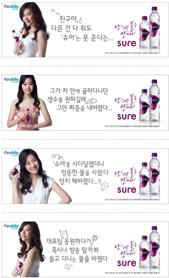
파나블루 ‘슈어’ – 피부에 좋은 미네랄 성분, 여자 손에 맞는 용기 디자인, Pink & Purple 컬러.
Panablu’s “Sure” — [A water drink] with mineral components good for the skin, and in a pink and purple container that fits perfectly into women’s hands.
국내1호 해양심층수 기업 파나블루(http://www.panablu.co.kr / 대표 설동환)는 올 여름 여성을 위한 뷰티(Beauty)워터 ‘슈어(SURE)’를 출시했다. 슈어는 물의 성분부터 용기 디자인까지 철저하게 여성을 형상화 한 제품이다.
Panablu is the first domestic company to sell mineral water sourced from the ocean depths, with company representative Sol Dong-Hwan explaining that Sure was launched this summer for women’s beauty. From the mineral components to the container design, it is a product thoroughly designed for women.
[James: Panablu wasn’t the first — Lotte Chilsung was using Olympic swimmer Park Tae-Hwan to sell “Bluemarine” at least a year before the first news reports about “Sure” I can find.]
슈어는 세계 최고 깊이인 수심 1500m의 해양심층수로 여자 피부에 좋은 미네랄이 일반 먹는샘물 제품 보다 10배 이상 함유되어 있는 ‘여자의 물’이다. 용기 디자인도 여성의 S 라인과 바다의 물결을 형상화 한 아름다운 곡선이 물병 전체를 감싸고 있다. 하지만 이 곡선은 단지 미(美)를 표현한 것만은 아니다. 신비스러운 여자의 신체 비밀도 담겨 있다. 이 물결 무늬는 20~30대 여성 300명을 대상으로 실시 한 ‘보틀 핸드프린팅 테스트(bottle hand printing test)’의 결과로 여자 손에 가장 편안한 그립감을 안겨줄 수 있게끔 디자인 된 것이다.
Sure water is taken from a depth of 1500m under the sea, the greatest depth of any mineral water source, and this “women’s water” contains 10 times more minerals that are good for women’s skin than regular bottled waters. Also, the curve of the bottle beautifully captures both the swell of sea waves and women’s S-lines. However, it doesn’t just visually capture their beauty — it also holds the secrets to their mysterious bodies [James: *Cough*, *Splutter*]. It was tested on 300 women in their 20s and 30s in a “bottle hand printing test,” and they selected it as the most convenient and comfortable to grip and hold.
파나블루 마케팅팀 이만 팀장은 “먹는샘물 시장 조사 결과 휴대용 물을 구입하는 소비자 가운데 80% 이상이 여성이었다”면서 “이에 맞춰 슈어는 여성 몸에 꼭 맞는 물의 성분과 그립감 뿐만 아니라 기본 색상도 그동안 생수 제품에 많이 사용되어 왔던 블루(Blue)계열 대신 핑크앤퍼블(Pink & Purple)톤을 채택하게 되었다”고 말했다.
Panablu marketing team manager Lee Man said, “The results of a survey of the bottled water market showed that over 80% of consumers were women,” and that “Sure is not just a product with a grip and components perfectly designed for women’s bodies, but so too were the colors pink and purple chosen rather than the blue which most bottled waters have.”
[James: Strangely, hourglass-shaped bottles have also been claimed to be the perfect shape for women’s hands, and indeed Icis 8.0’s ribbed bottle too.]
 (Sources: HiteJinro, ThinkFood)

하이트맥주 ‘S’ – 여자를 위한 저(低)도수, 저칼로리, 식이섬유 첨가로 장 운동 촉진까지
Hite “S Beer” for Women — Low alcohol level, low calories, added fiber, designed to aid bowel movements
하이트맥주는 올 여름 여대생 홍보대사를 대대적으로 모집하는 등 ‘여성’과 ‘S라인’에 컨셉을 맞춘 여성전용 맥주 ‘S맥주’의 마케팅 활동을 대폭 강화했다. S맥주는 식이섬유 첨가, 저 칼로리, 저 도수, 매혹적인 에메랄드 빛깔 용기, S라인 모양의 전용 잔 등 여러모로 여성을 닮은 맥주다.
This summer, Hite Beer recruited female university students on a grand scale to market “S Beer,” a beer designed for women combining the concepts of “woman” and “S-line.” S Beer as added fiber, low calories, low alcohol content, a seductive emerald bottle, with glasses in S-line shapes that resemble women’s bodies in many ways.
[James: These are the glasses referred to (has anyone seen one in real life?). In contrast to those claims about them, much of the early marketing for the product — when this article was written — seemed to center on how much women’s bodies could resemble the bottles rather than vice-versa, such as on the left above.]
S맥주에는 여성에게 꼭 필요한 식이섬유가 다량으로 함유되어 장 운동을 촉진시키고 체형관리에 도움을 준다. 칼로리도 100ml당 40~50kcal인 다른 맥주와 달리 30kcal로 낮춰 다이어트 하는 여성도 부담 없이 마실 수 있도록 했다. 평소 술을 잘 못하는 여성을 고려해 알코올 도수도 4.0%로 낮췄다.
S Beer has a large amount of the fiber absolutely essential for women, and through aiding bowel movements helps them to maintain their figures. Whereas most beers have 40-50 kcal per 100ml, this has been reduced to 30 kcal in S Beer, allowing even women on diets to drink it freely. Also, the alcohol content has been reduced to 4.0%, making it suitable for women who can’t usually drink.
이 외에도 국내에서는 처음으로 용기 전체에 매혹적인 에메랄드 컬러를 적용해 세련된 느낌을 표현했다. 가장 눈에 띄는 것은 S맥주의 전용 잔으로 ‘S라인’으로 날씬하게 굴곡진 여체를 형상화 한 점이 특징이다.
In addition, S Beer is the first domestic beer to have a seductive, emerald-colored bottle, giving off a sophisticated feeling. But the most notable thing are the exclusive glasses, slender and curved in the shape of a woman’s S-line.
 (Source: Ncyberzone)
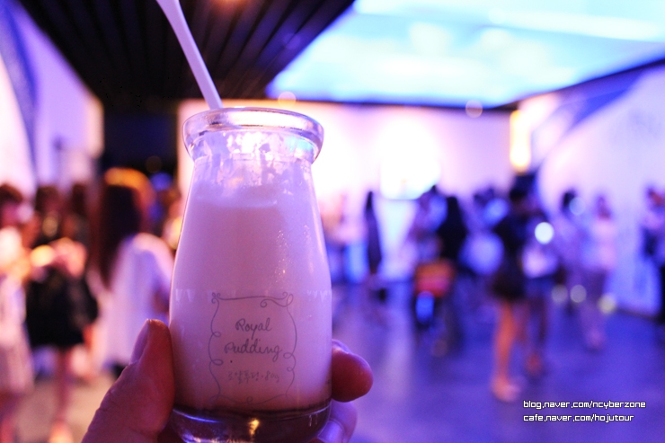
파리바게뜨 ‘로얄푸딩’ – 작고 투명한 유리병이 핸드백에 쏙… 휴대성 높이고, 칼로리 낮추고
Paris Baguette’s “Royal Pudding” — With a small, clear glass container, just drop it in your handbag…high portability, low calories
파리바게뜨는 2030 여성들을 위한 유럽식 프리미엄 디저트 ‘로얄푸딩’을 출시했다. ‘로얄푸딩’은 신선한 우유와 달걀, 카라멜 시럽이 독특한 맛의 조화를 이루는 제품이다. 입안에 넣는 순간 여느 푸딩에서 맛 볼 수 없는 부드러움과 달콤함을 느낄 수 있다. 하지만, ‘로얄푸딩’은 달콤한 맛에 비해 칼로리는 낮다. 80g 제품 한 개 당 칼로리는 140kcal로 일반 테이크 아웃 카페라떼의 칼로리(300kcal) 보다 저 열량을 자랑한다.
Paris Baguette has launched its premium, European-style desert “Royal Pudding,” aimed at 20 and 30-something women. Royal Pudding is a product with a taste that has achieved a unique harmony of fresh milk, eggs, and caramel syrup. Unlike most puddings, you can taste the softness and sweetness as soon as you put in your mouth. Yet despite that sweetness, it is low in calories. It boasts only 140kcal per 80g, whereas a takeout cafe latte has 300kcal [James: Granted. But how big would that latte be?].
‘로얄푸딩’의 용기는 작고 귀여운 숙녀를 닮았다. 그래서 여성들의 큰 호응을 얻고 있다. 한 손에 잡히는 투명하고도 깜찍한 용기는 시각적 만족감과 함께 핸드백 속에도 부담 없이 들어가 휴대의 편리함을 높였다.
The Royal Pudding container resembles a small, cute lady, so it has a wide appeal to women. Conveniently fitting in one hand, the small, cute container is highly portable. It can be simply dropped in a handbag and carried without a thought.
 (Source: 하하하)

대상웰라이프 ‘닥터클로렐라S’ – 여성전용 클로렐라 제품, 복용 간편하고 변비와 피부미용에 효과
Daesang WellLife “Dr. Chlorella S” — A chlorella product for women, an easy, effective medicine for constipation and skin beauty
대상웰라이프의 ‘닥터클로렐라S’는 외부 이동이 많고 바쁜 커리어 우먼을 위한 여성전용 클로렐라 제품으로 성분부터 형태까지 여성을 중심에 두고 만든 건강기능식품이다. 닥터클로렐라S에는 ‘락츄로스’가 첨가되어 직장인 여성에게 많이 나타나는 스트레스로 인한 만성 소화불량과 변비를 해소하는데 도움을 준다. 또한 각종 식물성 영양성분을 비롯한 식이섬유질이 들어있어 업무에 지친 직장인 여성들의 피부 건강을 회복하는데도 효과적이다.
From its mineral components to its shape, Daesang WellLife’s Dr. Chlorella S is a chlorella product with many health functions centered on career women who are often on their feet. Dr. Chlorella S contains added lactulose, which helps relieve the stress and chronic digestion problems and constipation which many career women suffer from. It also has many vegetable nutrients and added fiber which is effective for recovering the health of tired women workers’ skin.
닥터클로렐라S의 포장은 개별 낱개 형식으로 가볍고 부피가 작아 여성들이 시간과 장소에 구애 받지 않고 복용할 수 있도록 구성되어 있다. 또한 제품의 형태도 목 넘김과 소화 시킬 때 부담이 적고 장에서의 흡수가 빨라 여성들이 선호하는 과립형으로 만들었다.
Dr. Chorella S consists of small, light pills that are easy to take wherever and whatever you’re doing [James — It also came in powdered form]. The shape makes them easy to swallow, with the granules inside, which are quickly absorbed in the intestines, making them women’s preferred choice.
[James — Judging by the lack of news articles and blog posts after 2009, Dr. Chlorella S was a failure. I’m guessing, because it wasn’t pink? ㅋㅋㅋ]
파나블루 마케팅팀 이만 팀장은 “전통적으로 여성 소비자들에게 성공한 브랜드는 향후 브랜드 확장을 할 때 비교적 쉽게 안착할 수 있었다”면서 “식음료 시장에서 브랜드 확장이 활발하게 이뤄지고 있다는 점을 감안한다면 여성전용 식음료 제품은 앞으로도 꾸준히 출시 될 것”이라고 말했다.
Lee Man, the Panablu marketing team manager, said “Brands that were traditionally successful with female consumers could relatively easily reach them when they wanted to expand,” and that “In the food and drink product, many brands are actively considering women-targeted products. Expect to see many more of them in the future.” (End)
 (Sources: hayena2000, Vingle)

Before I forget, sorry again for the slow posting everyone, but I was very busy at work, and caught a frustrating, lingering cold. Meanwhile, have any readers encountered similar gendered campaigns for unisex products, in Korea or overseas? Also, how do any parents among you deal with your children’s attitudes to pink and blue? Please let me know!
p.s. I wasn’t joking about my own, “pink strategy” in the introduction, or about any of my purchases. I really do think I look fabulous with them! :D
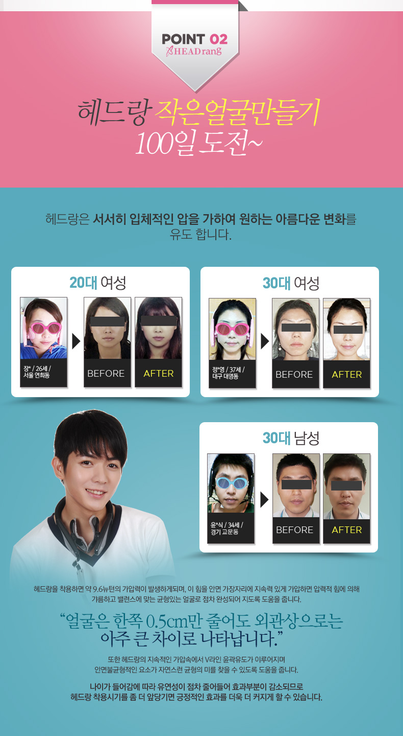
Update: I forgot to mention these his and her “V-line” face-shapers, the ads for which can be seen almost on every other website at the moment (if you live in Korea).
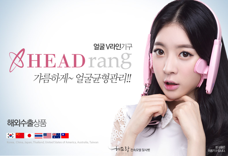
 Also, management company E-tribe contracted their girl-group Dal Shabet to endorse the product. Such endorsements by Korean Wave stars likely play a strong role in the propagation of Korean beauty ideals overseas:
 Related Posts:
- Korean Sociological Image #64: Hourglass-shaped Drink Bottles
- “Body Changing” Diet-Drink Generously Donated to High School Students
- Korean Sociological Image #54: Sex & Drugs
- Gender Advertisements: What, boys can drink girly drinks now?
- Korean Photoshop Disaster #8: The 100% Korean Lady Burger
- Korean Sociological Image #15: Gendered Health Drinks
- Korean Sociological Image #2: Son Dambi’s Corset
- Gendered Tea-drink Advertising in South Korea (Updated)
- Gender Socialization (Category)
(For more posts in the Korean Sociological Image series, see here)


S-beer has added fiber? WHY have I been eating vegetables? Thanks for this discussion on marketing to women and color~
LikeLike
In fairness, gendered marketing and exploiting body-image anxiety aside, I’m sure many people of both sexes would prefer a healthier beer, all other things like taste and price being equal. So, for the fun of it, I’ve even tried S Beer myself a few times, and didn’t find it bad at all actually…but then not great either. Once the novelty wears off, it’s not really worth the higher price.
LikeLike
Honestly, if I thought I looked better in pink I’d wear it more often. But I’m perfectly happy with lavender, which is a “girl” color. As for awesome unisex products geared “for her”, you might be aware of the Bic Pens for Her: http://www.amazon.com/BIC-Cristal-1-0mm-Black-MSLP16-Blk/dp/B004F9QBE6
The users at Amazon have taken to writing satirical reviews that are quite amusing to read on this and other similar products. Not sure that I saw a marketing campaign for it though.
LikeLike
Thanks, and — Ha! Yeah, I remember those. If you haven’t seen it already, here’s a post on Sociological Images about them (and other, equally bizarre cases).
LikeLike
Regarding your pink suitcase story, a colleague of mine bought a day-glow yellow suitcase with the same intention as you. It would be easy to spot on the luggage carousel. I was traveling with him on the first trip where he used the new suitcase, and we just shook our heads as TWO identical yellow suitcases came off the conveyor belt!
LikeLike
Yeah, there’s always that possibility. When it finally comes, I’ll get my daughters to personalize it with sparkly star stickers or something. I’m sure they’ll be happy to oblige!
LikeLike
Regarding 8.0 ph, it is a strong pinky red in swimming pool water test kits.
LikeLike
Thanks — in an earlier draft of the post, I added that it has been nearly 20 years since I last studied chemistry, and so the mistake may be mine (I might put that back in). Still, when I *was* studying chemistry it was always acid=red, alkaline=blue, as shown in the link. So I was surprised when I went to Wikipedia later and found a whole host of different color schemes used (I should have put that in too!). Add what you’ve just told me, then I officially give up on what colors various pHs are “supposed” to be or not!
LikeLike
I love your attitude for normalizing pink in your home. In addition to Pointlessly Gendering Objects™, I noticed that in the ads all the models are holding their headphones and water oh so delicately instead of how one would actually hold a product one didn’t want to drop. Marketing school required reading really needs to include Goffman…. Great article!
LikeLike
Good point, which I’m very embarrassed for not noticing and raising myself (I’ve written a lot about “The Feminine Touch” elsewhere).
LikeLike