
It’s all very cute and charming until you realize how rarely you see it used on men. Why is that?
 Estimated reading time: 7 minutes. Right: So-hee of the Wonder Girls.

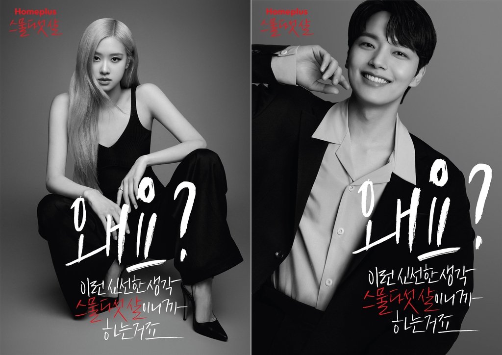
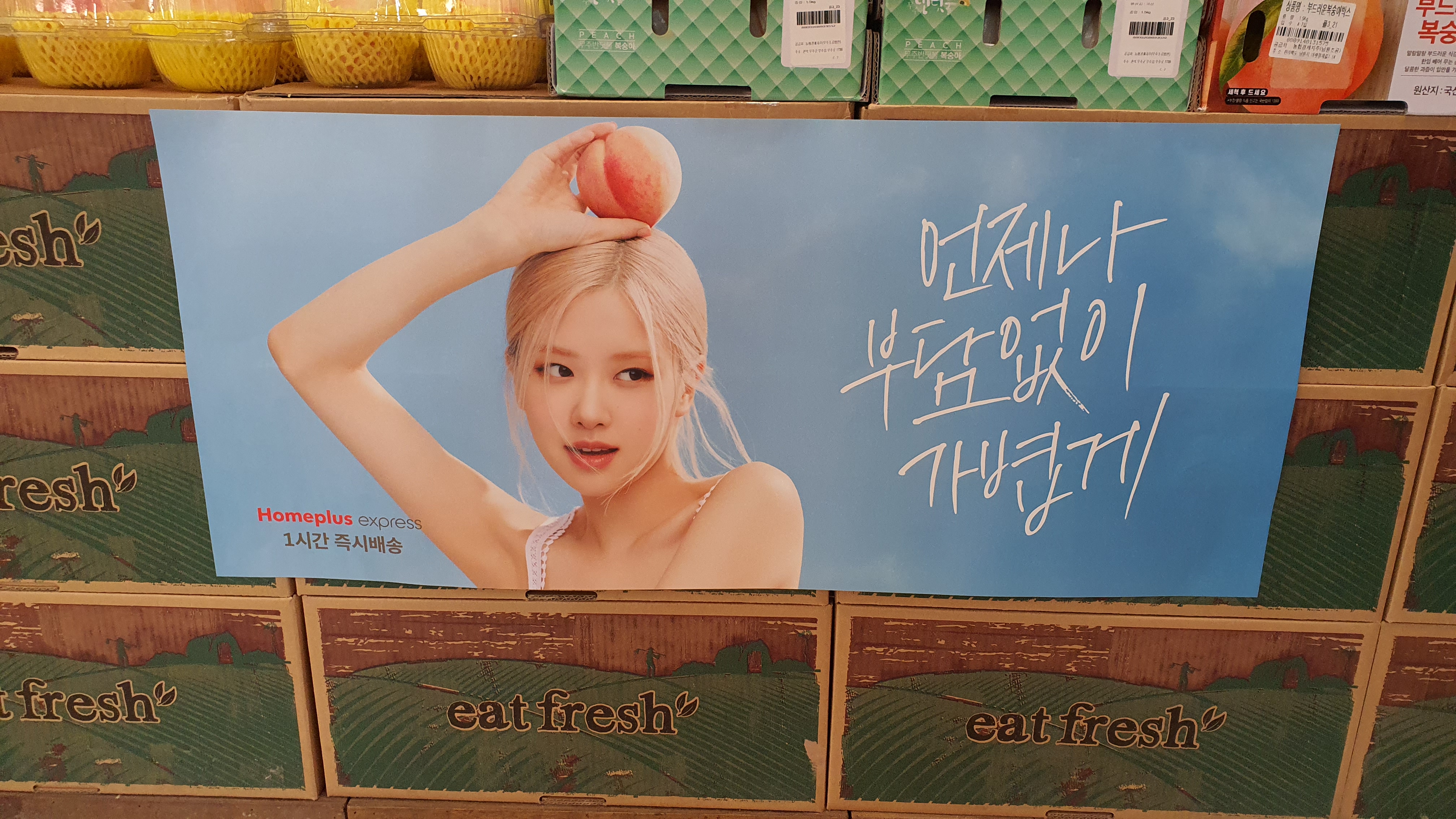
Yeah, Rosé does look very cute and charming in that poster. So it’s not like I’m about to boycott my local Homeplus over it. I have absolutely nothing against her either, who likely had little to no input in the direction of their advertising campaign. But when you realize that peach on her head effectively sabotages the whole concept behind that campaign, despite all the planning, preparation, and financial risks involved in hiring one of the hottest and most expensive stars in the world to help create that concept in the first place, then you really do have to ask why.
The poster, one of two of her that that now feature prominently at Homeplus stores (and online), is part of the chain’s “25 Years: A Fresh Way of Thinking” rebranding campaign to mark its 25th anniversary and launch of its new one hour delivery service. But critics were non-plussed by Rosé’s first, very different commercial for the campaign in February below, only grading it only a 2.6 out of 5. One of them thought the dancing and focus on Rosé’s face and body in the first half rendered the commercial more like one for Yves Saint Laurent, for whom Rosé already works as an ‘ambassador.’ Many others, that the luxurious, almost mature tone and atmosphere would only cause confusion among consumers when the logo for the homely supermarket chain then suddenly appeared. Also, that people’s attentions would be concentrated more on Rosé rather than on the service being advertised, and that stressing that she was 25 was unnecessarily ageist and alienating. (Actor Yeo Jin-goo was also hired as an endorser for being 25, with his own commercial rightly focused on high quality food. But the limelight has firmly been on Rosé.)
I tended to agree, especially about the unnecessary alienation of the bulk of its much older customers. Because well before I saw that commercial, I’d already noticed Rosé’s and Yeo Jin-goo’s glamorous visages in the giant banners below at my own local Homeplus, their eyes seeming to follow me as I perused the toiletries aisle, pondering which toilet paper best represented me as a person. Their purpose just baffled me. Neither of them offered any hint of any particular new Homeplus product or service, with both just saying (lit.) “Why? I have this fresh thinking because I’m 25.” Was Homeplus trying to remind me I’m almost twice as old? That just like when I used to run into my horrified students in bars, could I please just stop embarrassing them and leave?
Shockingly however, younger Koreans didn’t seem to care less about any of their elders and betters thought of the campaign. By April, there were 30 percent more visitors to brick-and-mortar stores in that age group than a year previously; of 20-24 year-olds specifically, a whopping 60 percent. Meanwhile, online customers in the 20s and 30s combined also increased by 60 percent.
(Staggering success stories like these are a major reason why Korea has the highest number of celebrity endorsements in the world. As is ignoring the 9 out of 10 times signing on expensive stars actually proves to be a complete waste of money.)
Which still doesn’t mean it was a good commercial. It wasn’t. But the next one, which came out on July 14, was. It refined the concept, presenting the perfect combination of the millennial dream of living in own’s one place in the heart of Seoul, of having the free time to luxuriate over the exquisite-looking grapes, and of having such a convenient fast delivery service for them available. And, lest I forget: that it was want-her or want-to-be-her Rosé showing us all of this too:
Which is why I’m so annoyed by the laziness of the two accompanying banner posters, which have since replaced those for the first commercial in stores (poor Yeo Jin-goo is nowhere to be seen):
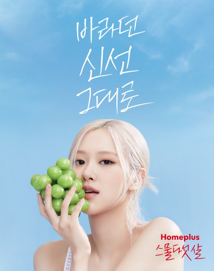
This first one, ironically used as the YouTube thumbnail, is simply poorly executed: as it happens, I consider myself a more sensual person than most (just throwing that out there), but even I can’t picture anyone so enjoying the texture of grapes that they’d ever want to rub them against their face. But let’s say I do suspend my disbelief for a moment. Even then, I’m still not getting the feeling from this poster that Rosé was, say, really, really enjoying the grapes just a moment ago, but has suddenly just noticed me and is about to invite me to join. Instead, the poster simply shows what actually happened: she was instructed to put the grapes to her face, so she obliged. Not to pretend to be interested in them too, as she was asked and did so well in the commercial.
By all means, the grapes do add an aesthetically pleasing splash of green, and vaguely fit in with the headline of “As fresh as you see.” Her mesmerizing gaze back at the viewer? It quashes all doubts of why she’s a superstar. And perhaps—okay, I see it now—the taut, tight skin of the grapes is meant to vibe with Rosé’s own. Again, symbolizing that freshness concept. (But so too, illustrating the huge potential for any celebrity endorser to completely overshadow the advertised service or product.) But surely it was possible to do so without losing the sensuality of the original commercial?

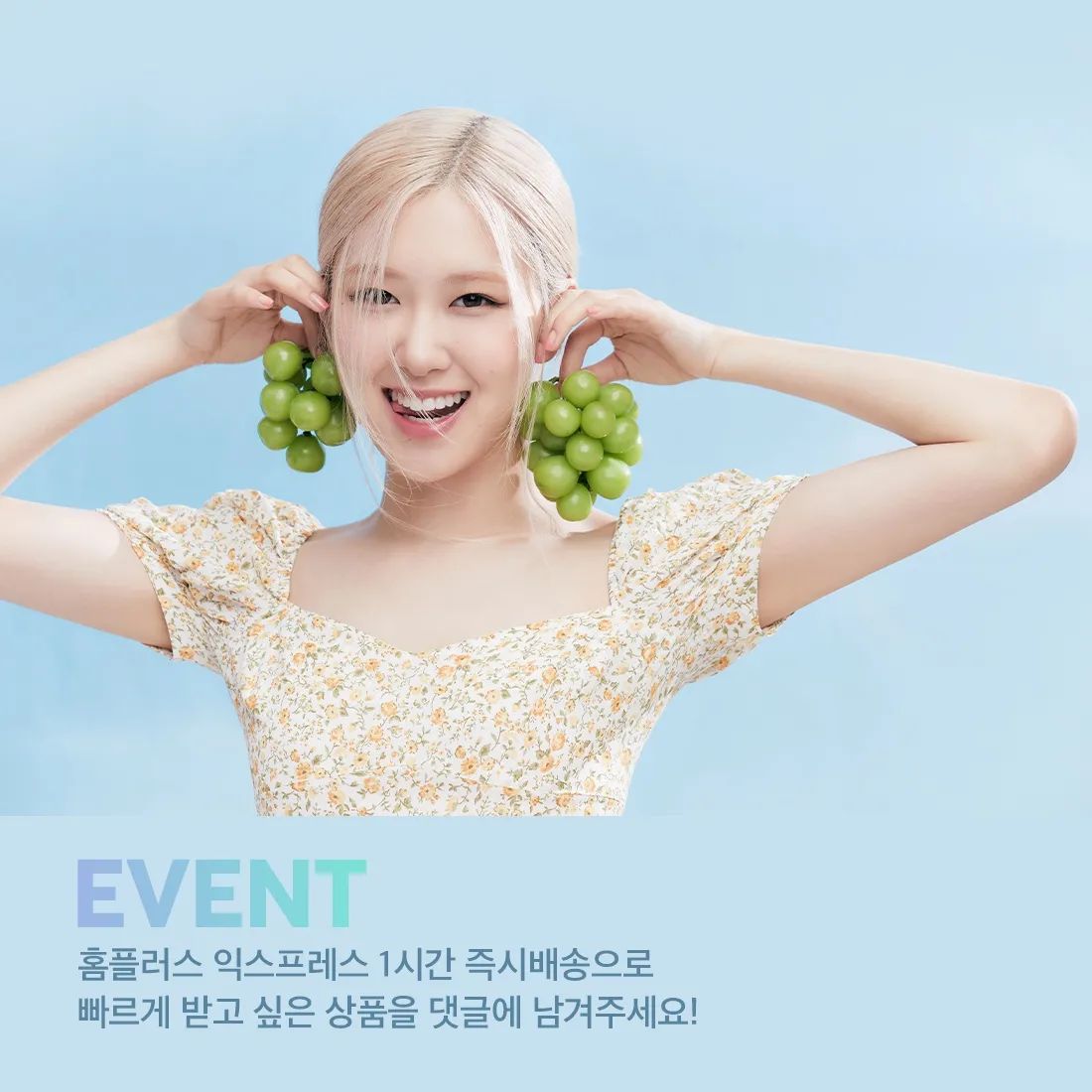
Just see for yourself. Compare this first of two additional images Homeplus released on its Instagram on July 15, but neither of which seem to be displayed in stores. (Yes, I’ve visited four in the last two weeks to check, feverishly snapping away at Rosé; by now, the security staff have probably flagged me as a perverted samcheon fan.) This one isn’t perfect by any means, but it at least retains some of the sensuality of the commercial, by reminding consumers that delicious-looking grapes are best enjoyed by actually eating them. And again, even if making a link to her youthful skin was considered just as or even more important (because Korea), why not combine both motifs?
This next, much cuter and more playful Instagram one, is very difficult to dislike (notice a recurring theme?). But it too represents a big step away from the sensual concept of the commercial, and of the commercial before that as well. And yet, still it would have been a far better choice than the second poster actually chosen for the stores and homepage:

There’s three big reasons not to like it. No, really.
First, in the second, very aspirational TV commercial it’s ostensibly tied to, we were supposed to pretend Rosé was just like you and (much younger) me, only with a nicer apartment and more carefree lifestyle. Which worked. To a greater or lesser extent, you could still roll with that vibe in all of the other images with the grapes above too. Whereas this one just casually tosses that carefully crafted fantasy aside. As playing with the product by putting it on your head, combined with her looking not at you, but at a more important, separate person/photographer instead, instantly identifies her as a glamorous model or celebrity. Ergo, not at all like you or me.
Second, just in case I haven’t stressed it often enough: the whole concept of the entire campaign, best expressed in the second commercial, was all about Homeplus gratifying your senses. Being able to get your fresh fruit quickly through its new delivery service, then enjoying, perversely lingering on and luxuriating in its look, taste, smell, feel, and—if you try hard enough—sound too. There was a strongly implied erotic potential as well. But here? What I actually see when my raging alcoholism drives me to head out to my local store for a cheap bottle of whiskey? That would be placing a peach on your head. As in, Homeplus no longer cared what I think of how that peach looks, tastes, smells, and feels like, the whole ostensible reason for signing on its to new, trendy, one-hour delivery service in the first place (what, you too had forgotten this is what the campaign was selling?). Rather, the peach has become instead just a prop, a toy even, which ultimately could be replaced by just about anything Homeplus sells and still have the same effect. Say, even that toilet paper I eventually did choose.
So, being generous, at best it’s lazy. It’s unoriginal. You could say the peach on her head loosely matches the headline of (lit.) “Whenever, with no burden, lightly,” but it’s tenuous. More likely, the advertisers asked Rosé for that pose because again, it simply makes her look cute and carefree, campaign concept be damned. And also because third, finally, and more likely still, that’s just what advertisers do with young female models.
Allow A Web Essay on the Male Gaze, Fashion Advertising, and the Pose to explain:
“Look at these images. What do they suggest to you about these men? Do they seem silly?”
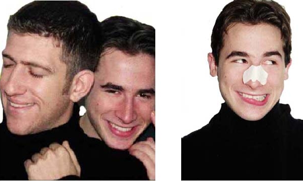
“What about these images?”
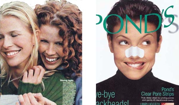
“Most viewers find the images of the men odd or laughable. But the images of the women seem charming and attractive…Why should it seem funny to see a picture of adult men striking a pose when the same pose seems normal or charming to us in pictures of adult women?”
Or, to conclude by going back to where we started: no matter how cute and charming Rosé may appear in the last poster, the campaign’s concepts of sensuality, luxury, and convenience are frequently confused by focusing on her looks, skin, and cute personality instead. Had they been the focus from the get-go, that would have been fine, and I wouldn’t have been annoyed at all.
I really do have better things to do with my time than write about this shit.
Instead, I’m reminded that it’s just so normal and unremarkable to infantilize grown women in ads, and that advertisers just can’t help themselves.
But why does women putting products on their head necessarily have that effect?
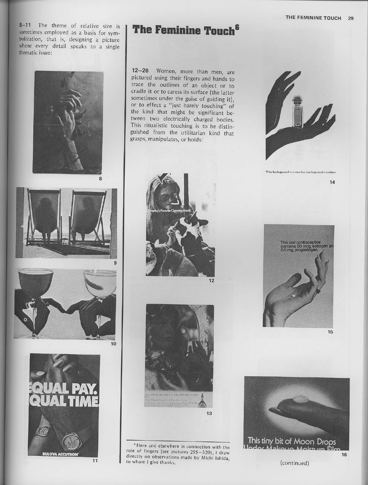
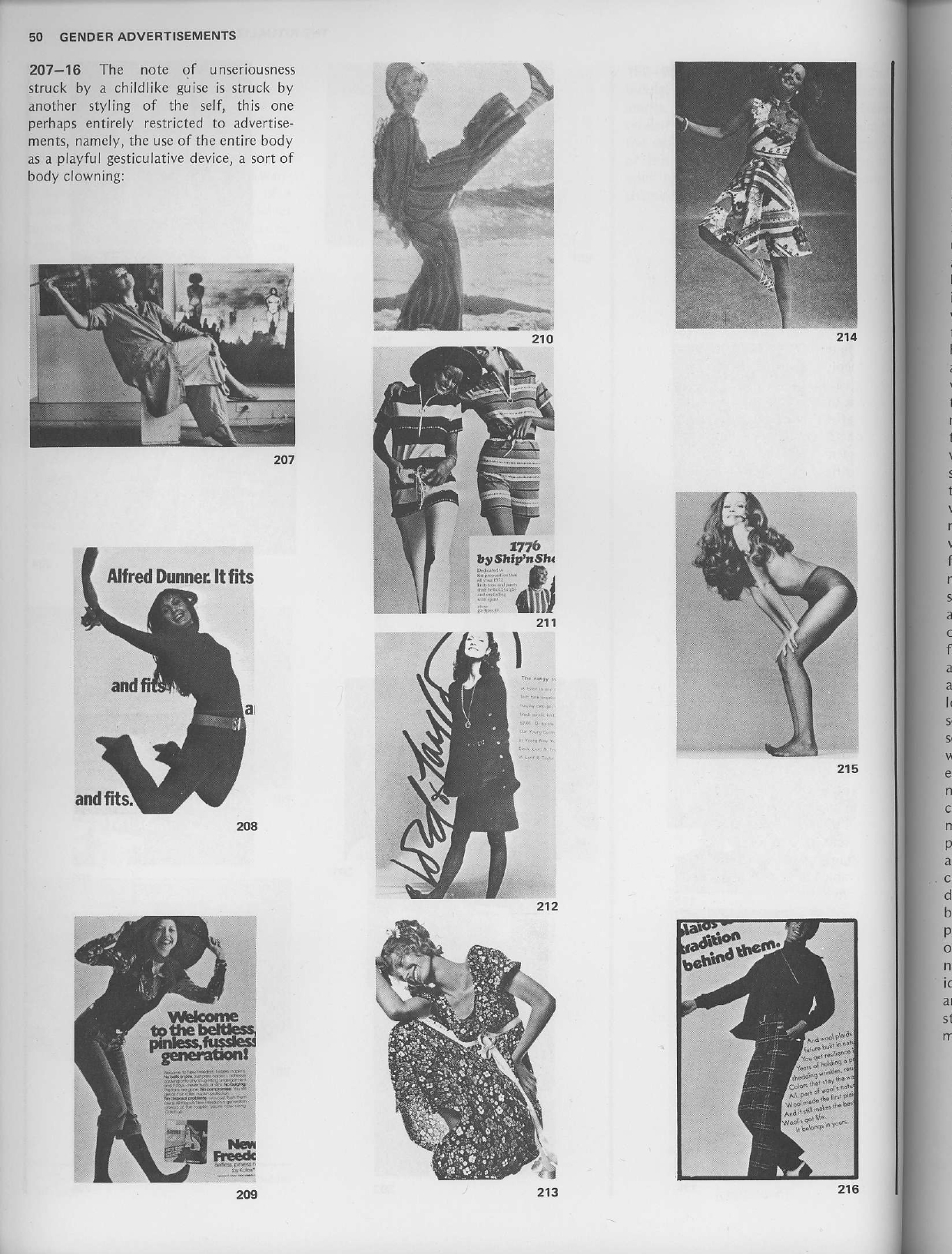
Because in addition to the aforementioned gender imbalance (which is the real issue; there’s absolutely nothing wrong with being cute), let me leave you with two pages from the classic Gender Advertisements by sociologist Erving Goffman, first produced the same year as me—1976. Sometimes, as you’ll see, it’s astounding to realize how little has changed in the 46 years since then.
Or, for that matter, the last 25:
Related Posts:
- When “How to Own the Room” is Really Just a Lesson in Male Privilege
- How Korean Celebrity, Gender, and Advertising Intersect—Some Quick Key Points
- Even When it’s to Businessmen, it’s Still Evil to Advertise Your Hotel with What Feels Like a Male POV Dating Sim. Here’s Why.
- Friday Fun? Korean Women Putting Shoes on Their Heads
- A Web Essay on the Male Gaze, Fashion Advertising, and the Pose
- When You Only Have 8 Seconds to Cram as Many Clichéd, “Feminine” Poses into Your Commercial as Possible

If you reside in South Korea, you can donate via wire transfer: Turnbull James Edward (Kookmin Bank/국민은행, 563401-01-214324)
