
Simple functionality can’t explain the incredible range of hourglass-shaped products aimed at women.
 Screenshot: YouTube

Have you seen Dove’s “Real Beauty Bottles” commercial? The one which offers Dove body wash in bottles designed to mimic women’s body shapes?
You can understand the reasoning. Dove’s long-running “Real Beauty” campaign has always been about celebrating body diversity. So, why not offer alternatives to the typical hourglass design?
Ironically though, the execution completely contradicts that message, as the internet has gleefully pointed out:
- It encourages paying attention to one’s body-shape, when that’s not supposed to be important.
- It only offers six bottle designs, despite the huge diversity of women’s body shapes in reality. (And all of the bottles are white too.)
- It’s really just a gimmick, offering only a very limited run of 6,800 bottles, spread among social media influencers in 15 countries. Meaning that even if ordinary women were somehow inspired to seek out the design that best matched their body shape, they wouldn’t actually be able to get one.
- And, in being so short-lived, and only providing the same one, classic bottle design in practice, ultimately it implies that there may just be one best body type after all.
Writing in the Atlantic, Ian Bogost thinks that last is inadvertent; given how “hilariously stupid” this campaign has been (Jezebel), I’m inclined to agree. Regardless of any marketing campaign centered on bottles’ shapes, hourglass designs will always be much more stable and easier to grip than most of the alternatives, let alone those monstrosities provided by Dove.
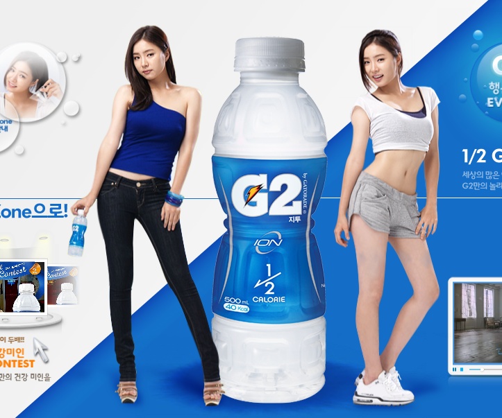
That said, they’re not the only option. Which got me thinking: where had I seen so many hourglass bottles before? Why, with slimming drinks of course. What is up with that?
You know the answer, and it’s not ergonomics. Indeed, many marketers and advertisers are not shy about the connections they’re making between their products’ designs and the body ideals—and insecurities—they’re promoting, instead elevating them as a unique selling point. Most notoriously perhaps, in 2009, when Son Dam-bi endorsed “Today’s Tea” drink for Lotte Chilsung. Which:
 (Source)

Not only sets up Son Dam-bi’s body as the one, singular standard for all the other women featured to define themselves against:
 (Source, all screenshots: Paranzui)

But also makes sure to do so for teenage girls too:
 And makes only the scene with the man humorous, to remind us how absurd it would be for men to ever do this sort of thing:

It’s really quite a feast of problematic messages. And, sadly, almost karmic in how Son Dam-bi herself has grappled with severe body-image issues in recent years, reports about her “still ‘frantically’ trying to lose more weight” emerging just as this post was published.
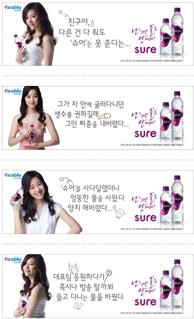
Usually, advertisers are less brazen, but they do still create and highlight a connection. See here for more examples and discussion from 2011 for instance, when there seemed to be a real trend:
 (Source)
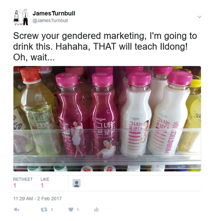
With that however, I don’t mean to imply they were the majority of slimming drinks. Nor are they in 2017, as a perusal of any convenience store fridge can attest.
But connections between bottle shapes and women’s bodies are definitely still being made, whether in the classic hourglass form or otherwise:
 (Source: YouTube)

 (Source: YouTube)

What’s more, if my search had extended to the packaging and marketing of slimming products in general, then I would have been simply overwhelmed with material. Wisely, I’ll confine myself to just one recent, representative example, that of Son Na-eun’s (Apink) commercials for Calobye:

(Source: Ezday)
Likewise, it’s never difficult to find an example of women’s bodies being used to represent a product or service. Again to give a recent for instance, below an obese woman magically loses weight and turns into model and actor Ray Yang, to represent a reduction in LG’s monthly installment rates (and, in a rare case of equal-opportunity objectification, has an obese man turn into model Choi Yong-ho too):
But it can seem like we’ve taken a long detour from a critique of Dove body wash bottles. So, let’s reflect on what we’ve learned on the way.
First, again, that hourglass bottles can’t be explained away by ergonomics, or claimed to be incidental. Who would even try, in the face of such overwhelming evidence?
Yet I’m often frustrated by the lack of mention in articles about their marketing campaigns, especially when writers otherwise wax lyrical over every other little detail. Why this blind spot exists, I’ll suggest a reason for in a moment.
 (A rare exception: Apparently “the curve of the [sure] bottle beautifully captures both the swell of sea waves and women’s S-lines.” Source.)

Next, this is by definition gendered marketing, which is usually predicated on and helps perpetuate a whole host of problematic gender roles:
Also, no-one is saying that slimming drink companies can’t distinguish their products from competitors’ by packaging them in this way. In addition, perhaps there are practical limitations to quickly conveying slimming on packaging, on a box, or on a bottle, or through their shapes, without using an hourglass motif. We do, after all, make exaggerated cola-bottle shapes to convey we mean a woman for instance (or we did: now it just feels distasteful). It may explain why articles don’t bother to mention that, because by default an hourglass design is chosen to convey slimming. And, being so common, that choice is unremarkable.
Which begs the questions: does it really make a product stand out, if so many other companies are doing the same thing? Are scenes of Son Na-eun dancing, hourglass hips highlighted with CGI (just in case we didn’t notice), really the best Calobye could come up with to make their product stand out? Or is their campaign just yet another case of using a celebrity to quickly grab viewer’s attentions (*cough* as per my opening image *cough*), which may then linger on the actual product in the 15 second time-slot, and somehow persuade the viewer that the product is responsible for those hips? Wouldn’t, ultimately, ditching the celebrity with the unobtainable body be cheaper, and using models with a range of body types have much wider appeal?
Perhaps I’m being naive. But surely marketers and advertisers have good financial reasons to ask these questions themselves, not just pesky sociologists and feminazis with axes to grind. And, given photoshoppers’ skills in crafting an hourglass waist (or S-line, or wasp waist, or whatever) for almost every woman that appears in an advertisement or photoshoot? Then no, I’m no longer convinced that it’s all that difficult to convey slimming through a representing a range of body types. Or that some patriarchal conspiracy is afoot either, so much as sheer laziness on the part of marketers and advertisers.
 (Source: instiz. The image on left is from a photoshoot for a 2014 commercial for Oceanworld)

What I am convinced of is how incredibly tiring this must be for women, constantly being reminded that your body doesn’t measure up to this one, monotonous standard, even though less than 1 in 10 women can ever achieve it.
I’d read about this pressure many times before of course. It can be difficult to relate to for a guy, no matter how sympathetic. But now, it feels just a little less abstract.
Which, all in all, is not a bad lesson to take away from some silly bottles.
Related Posts:
- Korean Sociological Image #82: Pink it and shrink it!
- Korean Sociological Image #64: Hourglass-shaped Drink Bottles
- Korean Sociological Image #2: Son Dambi, The Perfect Woman
- Gendered Tea-drink Advertising in South Korea
- “Body Changing” Diet-Drink Generously Donated to High School Students

