No offense Kim Sa-rang, but why would W-Angle hire a professional golfer to model its men’s clothes, but an actor for its women’s?
Just kidding—I know it’s because most Korean female golfers just don’t have the “right” bodies to appeal to the Korean public. This, despite Korea producing far more elite female golfers than male ones, and the South Korean women’s tour drawing many more spectators than the men’s equivalent.
Apropos of that only one woman’s body-size and shape will do attitude, which has driven manyfemale golfers overseas in search of sponsorship, even W-Angle’s advertorial in GolfBiz (I refuse to call it an article) is not shy about stressing that its new, ‘W-Ice’ women’s clothes are all about showing off the wearer’s body, whereas the men’s will help with their game (my emphases):
광고 속 김사랑이 착용한 ‘여성 W-Angle 긴 소매 블록 티셔츠’는 여성미를 강조하는 과감한 절개선과 배색으로 볼륨감 있으면서도 날씬한 몸매 연출을 도와준다. 냉감 기능성 소재를 사용하고 땀이 많은 등 부분에는 통풍이 잘 되도록 펀칭 소재를 적용해 쾌적하게 착용할 수 있다. 긴팔 디자인으로 자외선으로부터 상반신 전체를 보호할 수 있다. 블루와 마젠타(심홍색) 두 가지 컬러로 출시됐다.
The ‘Women’s W-Angle Long Sleeve Block T-Shirt’ worn by Kim Sa-rang in the commercial helps to show off a slim, voluptuous look with bold cut lines and colors that emphasize feminine beauty. Made of a functional, ‘punching’ material that removes sweat from the back through ventilation, it produces a cooling, comfortable feeling for the wearer, while the long-sleeved design protects the entire upper body from ultraviolet rays. It has been released in two colors, blue and magenta (crimson).
홍순상이 착용한 ‘남성 HSS 버티컬라인 냉감 긴팔 티셔츠’는 실제 홍순상 프로의 착용 피드백을 반영해 필드 위 최상의 플레이를 제공하는 ‘홍순상 프로 라인’ 제품이다. 고기능성 냉감 소재를 사용해 땀의 흡수와 건조가 빠르며, 팔 부분에 신축성이 뛰어난 냉감 나일론 소재를 적용해 부드러운 스윙이 가능하다. 홍순상 프로 라인의 시그니처 로고를 활용한 세련된 디자인도 특징이다. 색상은 네이비와 화이트로 출시됐다.
The ‘Men’s HSS Vertical Line Cool Long Sleeve T-Shirt’ worn by Hong Soon-sang is a ‘Hong Soon-sang Pro Line’ item that was developed with feedback from the athlete himself in order to create a product that enables the best play on the field for wearers. It [too] cools through use of a high-performance material that absorbs sweat and dries quickly, and a soft-feeling nylon material with excellent elasticity is applied to the arms to enable a smooth swing. It also features a stylish design that utilizes Hong Soon-sang’s signature logo. The colors are available in navy and white.
Apropos of those “men act and women appear” attitudes, the first half of W-Angle’s latest commercial presents a smorgasbord of gender stereotypical poses. With the advertiser’s determination to cram them all in to just eight seconds however, the result is almost like a satire of sociologist Erving Goffman’s Gender Advertisements, the go-to guide for how women are are subtly diminished vis-à-vis men in ads:
Blink and you’ll miss them though, so let me break those poses down.
First, Sa-rang shows off her profile to the viewer. Nothing wrong with that of course. But if you haven’t noticed it before, the contrast between her demeanor and Soon-sang’s is bizarre. It’s almost like he’s the dominant male gorilla, keeping a wary eye on possible competitors for her affections in the distance.
Having gained the attention of the viewer, she turns towards them and shows her romantic interest.
Yes, I’m getting a definite male gaze vibe too.
Finally, Soon-sang notes a rival mate for Sa-rang is close at hand.
At the same time, Sa-rang signifies both ownership of and protection by Soon-sang by placing a hand on and standing behind him respectively. As in, she’s interested, but you’ll have to prove your worth by going through Soon-sang first. And he makes sure you know it.
I realize a nature documentary seems a lot to read into just four seconds. But how else to describe the blatant cockblocking above, which—once you notice it—is astonishingly common in ads:
As I’ve discussed in more depth in earlier posts, Erving Goffman places this shielding in his—no pun intended—’Licensed Withdrawal’ category, meaning it’s a method by which women are subtly moved into a passive role and/or the background, compared to the men often literally standing guard over them. It’s further emphasized by the women using the safety and security they provide to express curiosity or even romantic interest in the viewer, giving even greater reason for her male partner to be wary:
Ironically, the effect is immediately ruined in W-Angle’s commercial by Soon-sang suddenly warming to his homie in the next shot, begging the question of what purpose the pose served:
But note Sa-rang’s feet:
Again, such a cross-legged pose is ubiquitous in advertisements and commercials. But this and many others like it are much more awkward than the models make them look (hence Sa-rang’s need for Soon-sang’s support here), and are far more commonly found on women than on men too. For instance, in the “Don’t Worry Mom!” ads and commercials for Remark Vill serviced apartments I recently discussed, which—notice a certain conception of women emerging?—also sell themselves on the notion that their incoming 30-something female residents are so impractical and girly that they haven’t learnt how to adult yet:
32 year-old actor Im Se-mi: “Mom, you’re bringing that up again?” / “I’m taking care of things myself now!” / “I can get lightbulbs changed if I need to, and the toilet unblocked too.” / “I don’t need to call Dad!” Source: YouTube.
Erving Goffman places such poses in his ‘Ritualization of Subordination’ category. By which he means that whereas Gong Yoo on the right below, for example, is posed naturally and ready to spring into action, Lee Min-jung on the left will be having trouble just keeping her balance. She is, quite literally, one step removed from being in control of the situation, and is thereby subordinate to Gong Yoo.
Admittedly this is much more subtle than most. But it’s there, and it’s reasonable to ask why it’s far more common for women than men to be posed in stances that would have them falling over in real life, and what the effects of constantly seeing such ads might have on our notions of gender roles.
Finally, as if to further remind the viewer who’s the subordinate partner in W-Angle’s commercial, Sa-rang cants her head onto Soon-sang’s shoulder:
Yes, it probably is more aesthetically pleasing than having both simply standing straight. And yes, she is 10cm shorter in real life. But she just wouldn’t have been hired had she been taller. Moreover, Goffman notes that simply being shorter frequently isn’t good enough—women are subordinated further still by the tendency for female models to be posed to make their bodies as diminutive as possible relative to their male counterparts. Usually, by sitting or lying down while the men stand or sit respectively, or by canting their head like Sa-rang:
On top of that, even though men and women appear much less often together than when Goffman wrote Gender Advertisements in 1979, still the drive to quite literally put women in their place remains. Hence the uncomfortable-looking example by Gong Hyo-jin below for example, despite there being no man in Uniqlo’s ad campaign that she needed to elevate:
That example was from 2010; in all the time I’ve spent researching ads since, it’s been my overwhelming experience that ads that diminish women in some way—especially the minor ones like those showcased in this post—are more due to advertisers’ simple laziness and following of convention than any deliberate sexism.
Yet it’s also true that Korean internet ads are notoriously unregulated, with even advertisers themselves calling for more regulation of sexual content. That women are almost 60 times more likely than men to be wearing revealing clothing in Korean TV commercials. And that the Korea media industry as a whole and upper echelons of ad agencies are dominated by men.
So, change is needed. And this example of digging a little deeper into W-Angle’s commercial hopefully provides some ammunition for that. Shielding, awkward crossed feet, and a female model resting her head on a male model’s are not ‘sexist’ per se, but a knowledge of those cliched poses can help translate gut feelings of distaste into legitimate questions to pose to advertisers. Also, a reminder that where there’s smoke there’s usually fire, and that in 2020 it’s often very possible to find evidence that the people behind problematic ads do really do harbor less than helpful gender stereotypes. Like an advertorial, say, that explicitlysays the clothes being advertised are for men to act and women to appear in.
Probably, many of the people behind this commercial would be just fine with that. But I like to think that many others, unable to dismiss criticisms of the clichéd, “feminine” posing and forced to acknowledge their sexism, would be embarrassed enough to try a little harder with their next effort.
If you reside in South Korea, you can donate via wire transfer: Turnbull James Edward (Kookmin Bank/국민은행, 563401-01-214324)
What models do with their eyes is important. When they return your gaze, they seem to own the room. Whereas if they don’t seem to be paying attention to anything in particular, or if they’re depicted without their faces at all, the temptation to dismiss them as people and focus only on their bodies is all the greater.
“Gender Stereotypes Depicted by Western and Korean Advertising Models in Korean Adolescent Girls’ Magazines”, Sex Roles (2011), 64: 223.
No-one’s saying models staring into space is bad in itself. Nor can advertisers of fashion and beauty-related products really be faulted for wanting to focus attention on the products, or on their alleged effects on the consumer. But if you know anything at all about advertising and gender, you’ll know that regardless of what’s being advertised, women tend to be depicted much more passively than men. And herein lies the first of two fatal flaws in Fields’ argument. For she bases her conclusions on no more than (fn. 70) an unspecified “survey of ads” in various magazines and catalogues from the 1900s to 1960s, although she also asserts that “[c]urrent issues of the Los Angeles Times provide almost daily evidence of the continuing importance of these evasive postures in ads.” Or in other words, she provides no evidence whatsoever that the tactics she describes “to dispel the homoerotic impulse” are any more prevalent in lingerie ads than in other kinds of ads, whatever period she’s talking about. And sure enough, those same tactics can quickly be found in other ads just through, say, a simple walk down the average city street. Here’s some with “women alone, turned away from the viewer” and/or averted eyes in Korean soju ads for instance:
I’ve often wondered what on Earth is Jang Yun-jeong looking at exactly…
[One] way in which women are disempowered is by displaying them as withdrawn from active participation in the social scene and therefore dependent on others. This involvement with some inner emotional processing, whether anxiety, ecstasy or introspection, can be symbolized by turning the face away, looking dreamy and introverted, or by covering the face, particularly the mouth, with the hands….
….Rather than being portrayed as active, powerful and in charge, females are commonly shown in this licensed withdrawal mode, removed into internal involvements, overcome with emotions, or symbolically silenced with hand over the mouth….
….In another variation, females are frequently shown withdrawn inwards into some dreamy introverted state; they pose, become things for others to gaze at and desire. Males will stereotypically be shown active, engaged, and in charge of the situation. They are not so much objects for others’ to gaze at, as actors with occupations and professions….
The point being, although no motivation for these depictions is explicitly mentioned here, advertisers wanting to avoid provoking homoeroticism seems a rather unlikely one—the second flaw of Fields’ argument. Because are lingerie advertisements really so salacious, and really so sexually transgressive, that homophobia needs to be invoked to explain the depictions commonly found therein? Are they really so different to all other kinds of ads, that explanations for the depictions of women in those ads wouldn’t also apply?
I know—boobs. Maybe there is something to them that prevents (male-dominated) advertising teams and advertising standards authorities from thinking rationally. I’m not dismissing any special considerations they have for lingerie ads out of hand, and indeed Fields provides a wealth of examples of precisely those, albeit with expressions of their worries about evoking homoeroticism notable only for their absence. But she hardly persuades in addressing those alternative explanations for lingerie ads’ typical features by deliberately ignoring them. And I do mean deliberately, for in fact she does mention Goffman earlier (p. 210):
And by all means, these are things, well covered in Gender Advertisements (see my earlier post for examples from soju advertisements). But to have read the book and demonstrated that she’s taken note of those various categories of its framework, only to fail to mention that one of its largest categories—Licensed Withdrawal—already well accounts for her claims about lingerie advertisements? She doesn’t have to agree with it, but she does have to acknowledge and respond to it. Otherwise, her shoehorning of an alternative explanation evoking homophobia seems very disingenuous.
In fact, the foundations of the whole chapter may be equally tenuous. Its title, “The Invisible Woman: Intimate Apparel Advertising” refers to the tendency of early-20th Century lingerie advertisers to show only parts of women or not at all. But reviewer Jane Ferrell-Beck argues there was actually a very practical reason for this:
And reviewer Kristina Haugland goes further, arguing that “the author’s interpretation of the material is a serious concern” of the book as a whole. She cites no examples from Chapter 5 though, so let me just leave you with her conclusion:
Words to live by as a colleague, our student assistants, and I wearily plod through our own survey of Korean women’s magazines advertisements this summer, of which this post is admittedly but an extended version of one of its footnotes. Thanks for reading it!
Tonight has been interpreted as an uplifting, carefree song about female friendship, maybe even about a lesbian awakening. So why is the MV so male-gazey?
Released in August 2013, Tonight by Spica is the perfect short summer song. It’s fun, breezy, and simple to understand for a Korean learner too. Just take a listen for yourself:
Though most K-pop songs don’t age well for me, I do still soo love the music and vocals of this one. But its sales were poor, and it won no prizes on music shows. Itreceivedfewsubstantivereviews. Then the same happened again with You Don’t Love Me, which came out in January 2014. Crestfallen, I lost track of Spica after that, but I remember being further disappointed by their misguided US debut that summer, then the news in November 2015 that a manager of their former entertainment company was being sued for embezzlement, which derailed their planned comeback. Add that they haven’t uploaded a video to Youtube in over a year, then I started this post half-expecting they’d disband before I finished it.
Spica, it seems, have always been plagued with bad luck.
But there’s hope on the horizon. I soon learned that they’d switched entertainment companies in December, and that they’d quickly followed that with the announcement that a mini-album would be released in April, later cancelled in favor of the release of a full album in June. Also, while their Twitter,Facebook page, various Instagram accounts, and (Korean) fan cafe were only being updated every few days, they were still being updated. An hiatus on those updates since April was cause for alarm, but it was likely only because the group is very busy working on the album.
Sure enough, soon after I wrote that they’ve since resumed posting, and have just reconfirmed their comeback and released new member photos. So, I’m optimistic that they’ll announce a firm release date any day now. Which makes them a perfect choice for my own return to writing about K-pop.
Who could write a simple review after watching that MV though?
There’s only so much that can be said about the generic lyrics of the song, or added to what other reviewers have already written about the dreamy, memory-like atmosphere. Who has time for such banalities, when the MV is so sensual, but also soo blatantly aimed at heterosexual men? When the first half mostly consists of the Spica members lying on their backs in bikinis or tight clothes, the camera constantly lingering on their breasts? And much of the rest, just that lingering gaze, with only occasional shots of the actual faces of the various body parts’ owners?
I’m serious. For teaching the concept of the male gaze, and the rights and wrongs of objectification, this MV is the perfect K-pop example.
(0:31)
(0:53)
No, I’m not a prude, I don’t think those are negatives (necessarily), and I’m not complaining. No way in hell, did I plan to spend six weeks on researching the male gaze before I got a post out either.
But I felt I had an obligation to discuss what no-one else was. Because when I first saw the MV three years ago, it was on my phone while I was on the subway; I had to stop watching, lest other commuters think of me as just another typical, sweaty uncle fan. When I showed the MV to a coworker to get a second opinion, he burst out laughing at how shameless it was; when I showed it to my wife, she just rolled her eyes. When I went online for fourth and fifth opinions though…?
Of scenes like the above, almost every other reviewer and commenter only mentions the ice cream one, if at all; instead, they talk about the strong vibe of sexual freedom they get from the MV, and/or the lesbian undertones. For instance, Alexandra Swords at Music Matters:
[The MV is] just plain fun to watch. It’s also incredibly sexy, the sensual movements, the outfits, the skinship . . . all of it contributes to a great idea of personal liberation, including sexual freedom and comfort with that sexual freedom. It’s great because very few music videos period, let alone the ones in Korea, express that not only is it okay to be a sexual creature, but that being so is not strange or special, it just is and we can just accept it with ease and comfort as an aspect of the world in which we live.
And commenters at Seoulbeats, after reviewer Laverne originally mentioned she found the sexual undertones of the ice cream scene unnecessary and distracting:
All of which is still cool of course: we’re all free to interpret the MV however we like, and a male gaze isn’t mutually exclusive with their reading of it. I should have made more of an effort to look for Korean reviews too.
But…sexual freedom? Tasteful lesbian undertones?
I’m just not seeing them. If a lesbian coming-of-age story was the intention, then it seems poorly executed at best, as I can identify only two scenes that hint at potential romantic interest between the members, and just barely at that. (Frankly, I think it’s just wishful thinking really. And, just off the top of my head, think Because of Youby After School is a much, much better K-pop example.) In the absence of that narrative though, what I’m seeing in its place is the presentation of a very passive, come-hither version of female sexuality, much like that which already overwhelmingly dominates the media.
Again, that’s not necessarily bad, in the right context. Nor, as Womantic’s and ChencingMachine’s comments demonstrate, are the resulting scenes necessarily for the exclusive pleasure of heterosexual men. Yet while a lesbian appreciation of this MV is no less valid than a male heterosexual one, I still think it’s only incidental.
But I’m not a lesbian. As you’ll see, I still have lots to learn about the (heterosexual) female and lesbian gaze too. And, whatever your sex or sexuality, I can’t and won’t presume to lecture you that any feelings of sexual empowerment to be gained from the MV are simply a form of false consciousness either. Instead, let me just present my own biases and intellectual baggage first then, to show you why I interpret the MV the way I do.
That makes for a very, very long post, almost a presentation really, which readability dictates that I split into three. Also, for an uneasy segue into a discussion of men and women in advertising next, to be continued in Part 2, and ironically not returning to the MV again until Part 3. But if that’s what it takes to demonstrate the very narrow vision of female sexuality being presented by the MV, and of male tastes in turn, then so be it.
Hopefully, you’ll be too intrigued by the hundred or so images to notice the length anyway. And, ultimately agree or disagree with my interpretations, maybe we’ll still have a fun discussion about the male gaze and/or Tonight too, and both learn a lot in the process.
Here goes…
The Male Gaze: A Gender Advertisements Perspective
Whatever your experience with analyzing advertisements, you can appreciate that the sizing and placing of people in them is a fundamental part of photographers’ and designers’ jobs. With that in mind, consider these images of Prince Charles and the late Princess Diana:
Most people wouldn’t think twice about them. Unless, they already knew that Diana was actually the same height as Charles, or even slightly taller:
This effort to make Charles appear taller is a social commitment to the idea that men are taller and women shorter. When our own bodies, and our chosen mates, don’t follow this rule, sometimes we’ll go to great lengths to preserve the illusion.
Is that social commitment also operating in these Korean advertisements? You be the judge:
Now, those examples were pretty obvious. However, that social commitment to men’s greater height can be said to be part of a wider commitment to presenting conventional, in many ways unequal gender roles by the media. Which may sound like hyperbole, but literally just about any survey looking at how the sexes are portrayed can confirm.
In advertisements, that commitment is usually achieved in much more subtle ways than simply giving high stools to short men though. Fortunately for us, the late Erving Goffman outlined many of those ways in Gender Advertisements (1979), and his framework has been considerably expanded upon and modified by scholars since.
Concentrating on the two ways most relevant to the Tonight MV here, the first is by positioning men and women (and races) differently, which comes under the “Relative Size” category in Goffman’s framework. (Note that in addition to being positioned differently, they are frequently doing different things and/or have different jobs too, which comes under “Function Ranking”). For example:
None of those examples are particularly objectionable in themselves, nor is there a real case to be made that the teams behind them were deliberately or even subconsciously sexist: there could have been any number of legitimate aesthetic reasons and other considerations which came into play when they placed the men and women (and Koreans and Caucasians) the way they did. It’s also true that I deliberately selected all the advertisements in this post to make certain points, which in turn are necessary generalizations; of course you see men standing in the back sometimes, and so on. That said, do surveys of multiple advertisements, and, for whatever reasons, men tend to be front and center more often than women, and tend to have better jobs and/or take more active roles than the women behind them.
In that vein, take a look at these two:
In the left (technically only half of the advertisement), of course the mother is taller and of a higher social status than her young daughter. Also of course, there’s no implication that the teenage boy in the advertisement on the right is of a higher social status or in any other way superior to the teenage girls in any way simply because he’s standing while they’re sitting.
Look at multiple advertisements however, and it turns there’s a lot more ads like the one on the right than vice-versa. Or, of ones that elevate the men above the women in some other way:
Alternatively, if the men themselves are sitting, then the women end up on lower furniture (remember the stools earlier?), in beds, or even on the floor or ground:
This is the part of second category of Goffman’s to bear in mind for the MV, which he termed the “Ritualization of Subordination” (but with obvious overlaps with “Relative Size”). He explained it thus:
Although less so than in some, elevation seems to be employed indicatively in our society, high physical place symbolizing high social place. (Courtrooms provide an example.) In contrived scenes in advertisements, men tend to be located higher than women, this allowing elevation to be exploited as a delineative resources. A certain amount of contortion may be required. Note, this arrangement is supported by the understanding in our society that courtesy obliges men to favor women with first claim on whatever is available by way of a seat. (p. 43)
And in particular:
Beds and floors provide places in social situations where incumbent persons will be lower than anyone sitting on a chair or standing. Floors are also associated with the less clean, less pure, less exalted parts of the room – for example, the place to keep dogs, baskets of soiled clothes, street footwear, and the like. And a recumbent position is one from which physical defense of oneself can least well be initiated and therefore one which renders very dependent on the benignness of the surround. (Of course, lying on the floor or on a sofa or bed seems also to be a conventionalized expression of sexual availability) The point here is that it appears that children and women are pictured on floors and beds more than men. (p. 41)
A note of caution. In lectures in the past, I’ve explained that Korea provides an interesting counterpoint to such interpretations. As in this part of the world, age and status trumps everything:
And indeed maybe it does. But after rereading the original book, I found that Goffman had already indirectly addressed this:
An interesting contrast is to be found in turn-of-the-century portrait poses of couple [example above], wherein the effect was often achieved of displaying the man as the central figure and the woman as backup support, somewhat in the manner of a chief lieutenant. (p. 40)
Which is to say, it’s important to bear advertisements’ contexts in mind, and not interpret them dogmatically. But whether they’re Korean or from Goffman’s native Canada, examples like these seem to be the exceptions that prove the general rule.
Another thing to bear in mind is one of the biggest changes since Goffman’s day: that fewer and fewer couples and mixed groups are depicted in advertisements. Despite that, women are still less likely to be standing in them than men:
The sides of buses, I’ve noticed, are frequently used for full-length shots of people on their sides. It’s just that those people rarely seem to be men:
And finally, some examples of women on the floor, in beds, and/or lying down. Which, like Goffman said, are considered to be expressions of sexual availability:
Sources: FM Korea; Imgur. Ironically, there was some controversy about the one on the left. But only because of its supposed resemblance to BDSM.
This next example with Bae Su-ji for Clalens contact lenses below is particularly interesting. When I showed it to a female friend, who’s very au fait with overthrowing the patriarchy, I pointed out that it looked like I was hovering over her as we lay together in some sunny, secluded glade. (Su-ji that is, not my female friend; let’s not go there.) That didn’t occur to her at all though, and instead she admired what the advertisers had done with her hair, the black lines serving to highlight the clarity of vision brought about by the contact lenses (although in hindsight, I think the intention was to highlight that they’re colorlenses):
I include it then, partially as an example of where my background is possibly clouding my judgement. Also, as a reminder that I’m not the target audience of most of the advertisements I critique.
But still: with this ad, I think my friend wasn’t seeing the forest for the trees.
Because consider the similar one in the middle below too. At that more usual scale, only a blogger with a bone to pick would notice the black lines at all. Add the slightly scared expression on her face, which seems out of place for a contact lens ad, and I’m right back to my original interpretation. Neither exactly scream “Now that I can see properly, I can finally do shit and get on with my life!” either, which is why I much prefer the one on the left. (Even Seol-hyun’s on the right is an improvement.)
Apologies for the reflection of some ugly bald guy in the picture on the right.
But okay, so what? So we see many more women than men in beds and on floors in advertisements, frequently in sexualized poses. Is that problematic?
Well, if we put aside for a moment that not every ad needs to be sexualized, and that when it is, it’s usually the sexualization of women by and for heterosexual men? Then not so long ago, I would have said no. Not necessarily.
Yes, I know I say that word a lot. But hear me out.
In my lectures, I used to point out that basic biology meant that heterosexual men found women in beds more sexually attractive than vice-versa. Whereas you have lots of time, energy, and most importantly no kids, I would wistfully explain to my 20-something audience members, so you make it a point of personal pride to try new and exciting sex positions everyday, the reality is that the missionary position is overwhelmingly the most popular male-female one. (And besides which, if we’re talking about penis-in-vagina, all those new and exciting sex positions are all just variations of the same six basic positions anyway.) Ergo, if sex sells, and, rightly or wrongly, sex is always going to be used to sell, then that sexual difference is always going to be reflected in advertising.
To reinforce that point, and get some laughs, I would show some photos of men parodying women’s typical poses:
But sometimes after the lectures, women would point out that the men above weren’t as (conventionally) attractive as the women they’re mimicking. And they had a point. So too, if they’d asked how come I’d just enthralled them with numerous images of scantily-clad women in beds or lying down, for which they were eternally grateful, yet failed to provide any examples with men to prove my original point? Like some from two Instagramcollections recently featured at Bored Panda say, which have a much wider range of guys than normal too?
Ewww, men on their backs. How unmanly and unattractive. Source: @brosbeingbasic; left, right. One NSFW image follows.
What they really should have done though, is told me to just shut the hell up. Because what the fuck would I know about what poses turn women on?
I like to think I know a little. This blog is about sexuality after all. I do have lots of books about sexuality in my bookshelves to impress guests at my cocktail parties with, and have even read some of them too. Obviously, I have no qualms about talking explicitly about sex. Obviously, I do so with my wife and did with my former partners. Probably, you can guess, that lack of inhibitions extends to conversations with my friends too. (Consider that a heads-up, if any readers want to hang out.)
But had I really talked to my female friends about what turns them on? Exactly what turns them on? Had I really talked to enough heterosexual women, or read enough about female sexual desire written by them? Could I really stand there as a cisgender, heterosexual guy and tell heterosexual women that I know they aren’t as attracted to men in beds as men are to women, which is why we don’t see men in beds so much in ads?
No.
Instead, it took the following image to make me finally realize my utter foolishness. Seen back while I was still naively expecting this post to just be a normal review, this image is a big reason for the way it developed the way it did. Because just between you and me, I can see the attraction…
Source: Paper.
I’m sure it would have been more to the point to post a picture of a eager, expectant-looking guy in bed, with a much prouder erection; alas, it’s that picture that really, really does it for me. I mean did it for me. Enlightened me I mean.
Anyyyway…
If it doesn’t enlighten you personally though, then here’s some eye-opening links I was also reading at the time, which provided the thousands of words of background that picture told me:
Explainer: what does the ‘male gaze’ mean, and what about a female gaze? (The Conversation; make sure to read the comments also)
Gaze Upon Me, and Despair!: Tropes vs. Women in Video Games, S2E2 (The Learned Fangirl)
How music videos challenged the male gaze in 2015 (Dazed)
How is this painting ‘pornographic’ and ‘disgusting’? (The Guardian)
‘Neighbors 2’ is a middle finger to anyone who thinks feminism can’t be funny (Fusion)
Hollywood Men: It’s No Longer About Your Acting, It’s About Your Abs (Jezebel)
NSFW: See Images From “Bare Men,” A New Photo Book on Male Nudity (Paper)
A New Tumblr Calls Attention to “Headless Women” in Film & TV Marketing (Bitch, Feministing)
NSFW: 10 Images That Take The Female Nude Back From The Male Gaze (Bust; my Twitter and Facebook conversations about them)
Empowered Young Women Star In These Portraits Of Chinese Girlhood (The Huffington Post)
How did ‘Playgirl’ magazine go from feminist force to flaccid failure? (Fusion)
An Earl in the Streets and a Wild Man in the Sheets: Tarzan and Women’s Sexuality (Bitch)
That said, of course there’s still many differences in what heterosexual men and women find sexually attractive in the other; it’s just that I’m no longer convinced that lying in bed (etc.) is one of them. And if I’m right, that social commitment to literally keep women in their place seems to be the biggest reason for the discrepancy in the media.
Especially when, if pandering to the male gaze is the modus operandi, there are many more active alternatives, and/or alternative body types, that are just as effective…
Which I’ll present in Part 2, before discussing the MV proper in Part 3. Thanks very much for reading this far, and I’d love to hear your thoughts. (By all means, feel free to jump ahead and talk about the MV too!)
When I think of my shoes, nothing repulses me more than imagining sticking them on my head.
When I think of ads and magazine photoshoots, nothing infuriates me more than seeing so many women sticking their shoes on their heads. I don’t care how clean they are.
(The shoes I mean, not the women).
Most cases, naturally enough, are by shoe manufacturers—or in magazines heavily influenced by the prerogatives of shoe manufacturers. Presumably, their motivation in having the models fondle the shoes, play with them, and generally put them anywhere but their feet, is to make the shoes appear as much more interesting, fetish-worthy objects than they really are. Which is all well and good.
But for every guy that gets a faceful of rubber, I’d wager there’s at least 10 women. Combine that gender difference with the playing, and it becomes one of a host of childish representations of women in advertising, so ubiquitous that we come to take such behavior as only natural. As explained in A Web Essay on the Male Gaze, Fashion Advertising, and the Pose:
“Look at these images. What do they suggest to you about these men? Do they seem silly?”
“What about these images?”
“Most viewers find the images of the men odd or laughable. But the images of the women seem charming and attractive…Why should it seem funny to see a picture of adult men striking a pose when the same pose seems normal or charming to us in pictures of adult women?”
It’s not all bad though. With the proviso that advertising is a very broad subject, with sometimes huge differences between different mediums, my own impression is that while sexualization has greatly increased in recent years (albeit by no means a uniform evil), it’s rare that I’ll find a glaring gender difference (à la Goffman) worthy of mention here. That’s what makes these ads stick out so much, and why they’re so infuriating. Cute, yes. But still infuriating.
Please tell me about any more examples you know of, of either sex, and I’ll post them here. Or, shoes on heads aside, what ads bug you the most these days? Please rant away!
Update: Hat tip to reader chocole, who found a variation on the theme with a guy:
It’s not a shoe of course, and it’s specifically the thought of putting a dirty, smelly shoe on one’s head that bugs me, and which prompted me to write this post. But I acknowledge that Hong Jung-hyun above looks equally childish, stupid, and/or cute (or whatever) as the women do in the other examples, and indeed in the photoshoot as a whole. This raises an important point mentioned in the comments to that old 2010 post of mine I linked to, which I began incorporating into my presentations:
“As noted, Korean men are increasingly shown semi-nude and/or with confident and assertive poses. But…”
“…they are more likely than Caucasian* men to be shown behaving cutely and childishly.”
*As is still the case today, it is very rare to see non-Caucasians among foreign models in Korean advertisements.
‘…more likely than Western men [and even Western women] to be associated with many female stereotypical behaviors such as self-touching, canting postures, smiling, and childlike and cute expressions. This might indicate that in contemporary society men are not immune to commercial and sexual objectification and this phenomenon was more evident in Korean advertising.'”
“They concluded that if young Koreans usually only see strong, confident, sexy, and assertive Caucasians, then they may feel that their examples don’t apply to them”.
But that’s based on an old study, so I’ve been working on getting more recent data. To quickly sum up my findings for you here (no link sorry; it’s in the process of being reviewed for a journal), through my tedious, mind-numbing examination of 2329 fricking ads in various selected months of Metro newspaper between 2007-2013, I determined that K-pop stars at were sexualized at about the same rates as Caucasians, and that both were sexualized at much higher rates than other celebrities, so there’s no longer so much of a gap between those two groups at least.
Unfortunately though, there were actually so few ads with either that it was difficult to draw any definite conclusions, not helped by Metro declining in page numbers and circulation over the period because of the advent of smartphones. Also, I didn’t specifically look for assertiveness and childishness and so on (not the focus of my study, which was more on the numbers of celebrities), and of course Metro is very different to Korean adolescent girls’ magazines too, so we should be very, very wary of making comparisons between them. Sorry!
This may be an old ad, but it’s just a great introduction to my Gender Advertisementsin the Korean Context lecture. I’ll probably still be using it 10 years from now.
First, because it shows the value in spending a couple of extra seconds to really look at an ad. Most readers probably immediately notice the faux scratches and blotches on it, reminiscent of a phone screen overlay, but it’s easy to overlook that Kang Dong-Won (강동원) and Kim Tae-hee (김태희) themselves are also supposed to resemble the advertised phone. Once you notice that his collar resembles the reflection on the screen though, then you’ll quickly realize that his grey button represents the dial, and that her black belt buckle matches the cover of the entry port, the curve of her breasts the back of the phone at the top. It’s really quite clever.
But still: if they’re supposed to resemble the phone(s), then why weren’t models of equal heights used? Or why wasn’t the layout of the ad rearranged and/or Kim Tae-hee photoshopped to make her look as tall as Kang Dong-won? Either would have been quite easy, as this second phone ad with the two of them makes clear (source).
To explain, I raise Erving Goffman’s concept of “Relative Size”, or the fact that, if random men and women are paired off together, then in 1 in 6 cases the woman would be taller than the man, whereas in advertisements it’s as low as 1 in 200. Later, I consider the obvious rejoinder that Kang Don-won and Kim Tae-hee were primarily chosen for their celebrity status, discussing why65% of Korean advertisements feature celebrities, whereas it’s only 10% in most other developed countries. Finally, there’s also the concept of “Licensed Withdrawal” to mention, one aspect of which is how men are often shown providing virtual shields for women.
Bearing all that in mind, what does this Samsung SHW-A210S Shape Phone on the right remind you of (source), released back in November 2010? Specifically, the side, which according to Samsung is a particularly attractive feature of the model?
Alas, Samsung was really just attempting to capitalize on Uee’s star power, and on men’s interest in seeing and women’s interest in having an “S-line” (again, the copy makes that explicit). Lest we forget though, that actually means a great set of tits and ass, and it’s testament to the saturation of the term in Korean advertising and popular-culture that Samsung could get away with linking it to a completely unrelated inanimate object.
But that’s not the main reason I’m highlighting the phone here – after all, it’s by no means the first time the S-line has been used to sell one. The Wondergirls (원더걸스), for instance, did so back in 2008:
Instead, what makes this advertising campaign stand out is because on the one hand, Samsung is taking advantage of one body label to sell something, but on the other it’s attempting to replace that label a new one of its own creation – the yoptae (옆태), or “profile”.
The Invention Process
Actually, the campaign starts quite innocently, with Uee simply sketching profiles of things, finishing by announcing that it’s now “The Age of the Profile”. Later on in the campaign, visitors to the website would be encouraged to submit their own sketches and photographs in a competition:
But not before viewers were show which kind of profile the campaign was really focused on. Skip ahead to 0:40 for fashion tips on how to show it off:
Next, Men’s Health cover model (source) and fledgling drama star (and friend of Rain!) Jung Sueng-kyo (정승교) is shown working on his own profile. And you’ve just got to hand it to Samsung for thinking of something that can be applied equally to men and women:
Instead of running with that equally-opportunity objectification though, we’re quickly back to women’s profiles. It’s difficult not to wonder if advertisers are just a little too used to using women’s bodies sometimes:
Context – The Profit Motive
Usually, when Korean body terms are explained to non-Korean audiences, then they’re made out as simple equivalents of English ones, the S-line and now profile substituting for the “hourglass figure” for example. But unlike that term, which I’d wager goes back to at least the infatuation with corsets in the 1800s, the S-line wasn’t even around when I came to Korea in 2000: jjookjjook-bbangbbang (쭉쭉빵빵) was used instead. Moreover, not only are so many invented these days that it’s difficult to keep track, but the pace and especially audaciousness with which this is done in Korea is nothing short of outstanding (source, below right).
(Update: I may be mistaken about how old the hourglass term is – Stuart and Elizabeth Ewen, for example, only mention the “Grecian Bend” in Channels of Desire: Mass Images and the Shaping of American Consciousness {1992; p. 75}. But surely it dates back to at least the 1950s?)
You are probably already familiar with the unbelievable example of the X-line for instance, which is literally only possible in Photoshop, but you may be surprised to also learn that companies are also constantly trying to get the public to redefine “established” terms too, lingerie company Vivian (비비안) hoping to make the V-line better known as the line between a women’s breasts rather than a triangular jaw (which Kwangdong Pharmaceutical sells – yes really – “Corn Silk Tea” to help you obtain). On top of that, Yes’ (예스) lingerie company and W Magazine would rather have that area of a woman’s body known as a Y-line and W-line respectively…while in turn other companies still would rather have the Y-line mean a woman’s back.
And that alphabet soup is just the tip of the iceberg when it comes to that competition for buzzwords and (re)definitions that will stick with consumers. But unfortunately there’s only so much I could fit on a Powerpoint slide!
Media Promotion
Of course, the media and Korean public are well aware of this – the combined image on the left of that slide is testament to that (I added the two on the right). But in my own experience, usually the latter finds the situation more humorous than concerning (a generalization I’d be very happy – but don’t expect – to be proven wrong), while the former merely “reports” on the new body labels (and others like “Gold Misses” – more abstract perhaps, but still very much designed to get women to buy things), only very rarely criticizing the process and/or its effects. In so doing, it serves to simply promote the term, whether that’s in direct collusion with the companies or otherwise.
Take, finally, this inane example from Star News, a transcript of which (from here) I’ve translated below. If you get confused by some of the dates mentioned in it, please note it was aired in November 2011:
스타노출의변화, 옆태가뜬다? The way stars show off their bodies is changing, the “profile” look is now booming
[Y-Star] 스타들의 노출이 많아지면서 섹시한 앞태는 물론이고 일명 숨 막히는 뒷태라 불리며 신체의 뒤 라인이 주목을 받고는 했었는데요 이제 노출의 키워드는 바로 옆태가 됐다고 합니다. 새로운 섹시함의 상징, 옆태에 대해 <스타뉴스>가 알아봤습니다.
While stars have been showing a lot of skin recently, and of course people’s focus is on their sexy “front figures”, and most recently on their so-called breathtaking “back figures”, now a new body-revealing keyword is emerging – the profile. A new symbol of sexiness, Star News has investigated.
드라마 <브레인>를 통해 1년6개월여 만에 컴백을 알려 화제가 된 최정원.오랜만의 제작발표회에서 모습을 드러낸 것보다 더 화제가 된 것이 있습니다. 바로 옆태가 훤히 드러나는 파격 시스루 의상인데요
A year and half since her last acting role, Choi Jung-won has recently made a comeback in the drama Brain. At a press conference about it, the topic of how she looked was much more interesting than the drama itself, as she wore a striking see-through dress that was very revealing in profile.
[현장음: 최정원] 안녕하세요 <브레인>에서 지혜 역을 맡은 최정원입니다
[Choi Jung-won]: Hello everyone, I’m Choi Jung-won, and play the role of Ji-hyae in this drama.
이날 최정원은 이번 시즌 트렌드인 토트 무늬가 가미된 블랙 원피스에 은빛의 과감한 킬힐과 우아한 헤어스타일을 더해 한층 성숙해진 매력을 과시했는데요
On the day of the press conference, Choi Jong-won showed off this season’s trend of a black one-piece with a jigsaw-like design; silvery, bold killer-heels; and had an elegant hairstyle, all of which combined to make to make her attractiveness all the more mature.
특히 옆태가 훤히 보이는 파격 시스루 원피스는 주위 시선을 사로잡으며 집중 플레쉬 세례를 받기도 했습니다
In particular, her profile, visible through her striking one-piece dress, received a lot of attention, getting lots of camera flashes.
이 아찔한 옆태노출패션은 작년 11월, 애프터스쿨의 유이가 선보이기도 했었는데요 일명 옆태폰이라 불리는 한 휴대폰 광고에서 보일 듯 말듯 옆태라인을 노출한 미니 드레스를 입고 옆태 댄스를 선보이기도 했었습니다
This dizzy profile-revealing fashion was also shown off by After School’s Uee last November, in a dance wearing a now-you-see-it-now-you-don’t revealing mini-skirt in a commercial for the so-called “Profile Phone” (source).
그리고 월드컵 축하공연을 위해 무대에 올랐던 포미닛의 현아는 붉은 악마 티셔츠의 옆 라인을 과감하게 자른 의상으로 파격적인 노출을 해서 화제가 되기도 했죠
Also, in a public performance to congratulate soccer World Cup players, 4Minute’sHyuna appeared on stage in a Red Devil t-shirt with the side cut away, so revealing that it became a hot topic (see below).
지난해 유이와 현아에 이어 올해는 최정원 뿐만 아니라 많은 여배우들이 옆태를 내세운 몸매로 시선을 끌기도 했습니다
Following Uee and Hyuna last year, many actresses have drawn attention to their bodies by showing off their profiles, not just Choi Yong-won.
지난 10월 6일 개막한 부산국제영화제에서 파격적인 노출 패션으로 화제를 모았던 신인배우 오인혜.
This October the 6th, new actress Oh In-hye’s exceptionally revealing dress at the opening ceremony of the Busan International Film Festival also became a hot issue.
어깨는 물론 가슴을 거의 드러낸 오렌지 빛 드레스를 입은 그녀는 가슴라인과 등 라인을 노출한 것은 물론이고 아슬아슬하게 비춰지는 옆 라인은 보는 이들의 입을 딱 벌어지게 하기도 했습니다
Of course the orange dress showed off her shoulders, and almost completely exposed her breasts, but it was how dangerous she looked in profile [James – i.e., how close it was to also showing her nipples] that had people’s mouths agape.
그런가하면 지난 7월 14일 열렸던 부천 국제 판타스틱영화제 개막식 현장에서 가장 화제가 됐던 배우 곽지민은 앞트임, 뒤트임에 이어 옆트임까지 노출 포인트를 모두 갖춘 무한 노출 패션을 선보였는데요
Also, at the opening ceremony of the Bucheon Fantastic Film Festival on July 14th, the hottest topic was actress Kwak Ji-min’s outfit, which, being open at the front, back, and the side, revealed almost everything.
[인터뷰: 곽지민] 반응이 그렇게 뜨겁게 될 지는 상상도 못했어요. 학교에서 특히 반응이 굉장히 뜨겁더라고요
[Kwak Ji-min]: I could never have imagined the reaction would have been so intense. It was especially heated at [the?] school. [Kwak Ji-min is 27, so I don’t know what school she’s referring to. Is she referring to a festival venue? – James]
Update: Thanks to (native Korean) Grace in the comments, who clarifies that Kwak Ji-Min is “referring to how popular that image is among schoolboys, saying that the reactions were hot from schools, i.e. the kids in school.”
드라마<내 마음이 들리니>에서 발랄한 캔디녀로 사랑을 받았던 황정음. 지난 5월 공개했던 섹시화보 제작발표회에서 언뜻 보면 평범해 보이지만 옆라인에 반전이 있는 의상을 입어 눈길을 끌었는데요 슬쩍 보이는 상체 라인이 더 아찔했다는 평가를 받았습니다
Hwang Jung-eum has received much love for her role as a vibrant and active candygirl [James – I’m told this means a young woman who’s cheerful and extroverted, especially someone who overcomes some kind of adversity] in the drama Can You Hear my Heart. In May, at a press conference for her new sexy photobook, at a glance she appeared to be wearing ordinary clothes, but if you looked closer you saw that she was wearing eye-catching ones that showed off her profile, making you think of her upper body in a new light [James – see here for my translation of a blogger’s thoughts on how such “exposure” affects her career].
이어 지난 7월 한 패션매거진 화보를 공개한 윤은혜는 옆 라인을 살려 상의를 탈의하고 손으로 가슴부위를 감싸 안은 파격적인 포즈로 화제가 되었죠 그리고 상체 위주의 옆태 라인을 강조하던 다른 스타와는 달리 하체 옆 라인을 과시하며 아찔한 각선미를 보여 주기도 했습니다
In July, Yoon Eun-hye became a hot topic by showing off her profile in a photoshoot for a fashion magazine, undressing her upper body and embracing herself, covering her breast with her hand. Unlike other stars that emphasize the top half of their profiles, Yoon Eun-hye mostly shows off the bottom half of hers.
이렇게 과감하게 옆 라인을 노출해 제대로 된 S라인을 뽐내는 스타들이 많았는데요 새롭게 떠오른 노출의 키워드 옆태! 적정한 선을 지킨 옆태 노출로 진정한 아름다움을 뽐내길 바랍니다.
There are now many stars that have been showing off their well-made S-lines through boldly exposing their profiles like this, making “profile” the new exposure keyword! But let us hope that nobody overdoes it, only showing off sincere beauty by exposing their profiles (end).
If you were confused by the second to last paragraph, then you weren’t the only one: as is clear from the image above (seen in the video), Yoon Eun-hye’s photoshoot was actually in October, and the other pictures can only be said to emphasize the bottom half of her profile (alas, not her bottom itself) in that her legs are physically longer than the upper half of her body. But speaking of Yoon Eun-hye, and to end on a positive note, by no means does all the above imply that Korean celebrities feel compelled to show off every new body term out there, nor – if they do decide to – that they can’t exploit them for their own ends, and/or simply to feel sexy. For much more on that, please see here!
(For all posts in the “Korean Sociological Image” series, see here)
Opening my “Gender Advertisements in the Korean Context” lecture these days by talking about erections, I’m loath to end it on something as deflating as domestic savings rates. But then so often am I asked questions afterwards like…
Why are there such sharp distinctions in the ways men and women are presented in ads?
Why are women portrayed passively, weakly, dependent, childishly, and in awkward, unnatural poses to a much greater extent than men?
Why, despite being written about North American advertisements in the 1970s, does Gender Advertisements have such resonance in Korean advertisements today?
…that in my latest version for the 4th Korea-America Student Conference at Pukyeong National University (a highly-recommended 4-week exchange program by the way!), I decided to address the last by providing the data to backup my argument that it was largely because of a shared experience of housewifization. In the actual event though, the students wisely decided that they’d much rather get lunch than ask any more questions, so let me give a brief overview of that argument here instead:
In short, housewifization is the process of creating a labor division between male workers and female housewives that every advanced capitalist economy has experienced as it developed, essential and fundamental to which is the creation of a female underclass that acquiesces in this state of affairs, finding self-identity and empowerment in its consumer choices rather than in employment. Lest that sound like a gross and – for the purposes of my lecture – rather convenient generalization however, then let me refer you to someone who puts it much better than I could. From page 60-61 of this edition of The Feminine Mystique (my emphases):
The suburban housewife – she was the dream image of the young American woman and the envy, it was said, of all woman all over the world. The American housewife – freed by science and labor-saving appliances from the drudgery, the dangers of childbirth and the illnesses of her grandmother. She was healthy, beautiful, educated, concerned only about her husband, her children, her home. She had found true feminine fulfillment. As a housewife and mother, she was respected as a full and equal partner to man in his world. She was free to choose automobiles, clothes, appliances, supermarkets; she had everything that women ever dreamed of.
In the fifteen years after World War 2, this mystique of feminine fulfillment became the cherished and self-perpetuating core of contemporary culture.
And then this from page 197 of the 1963 edition:
Why is it never said that the really crucial function…that women serve as housewives is to buy more things for the house… somehow, somewhere, someone must have figured out that women will buy more things if they are kept in the underused, nameless-yearning, energy-to-get-rid-of state of being housewives…it would take a pretty clever economist to figure out what would keep our affluent economy going if the housewife market began to fall off.
Ironically, by 2009 more women would actually be working in the US than men. But rather than the result of enlightened attitudes, this was primarily because layoffs were concentrated in largely male industries like construction, and I am unconvinced that the above dynamic no longer applies there.
In Korea however, the exact opposite happened. Moreover, while by no means are modern Korean notions of appropriate gender roles a carbon-copy of those in the United States in the 1960s and 1970s, even if Korean womenthemselves are saying that the parallels between Mad Men and Korean workplaces are uncanny(!), the fact remains that in a society where consumerism was once explicitly equated with national-security, there also happens to be the highest number of non-working women in the OECD. It would be strange if the gender ideologies that underscore this decades-old combination were not heavily reflected in – nay, propagated by – advertising.
This is a simplification of course, one caveat amongst many being that the Korean advertising industry is actually heavily influenced by the Westernized global advertising industry (see this post on the impact of foreign women’s magazines in Korea for a good practical example of that). But, also raising the sociological issues of Convergence vs. Divergence, and the role of Base and Superstructure, the main purpose of my finishing my lecture with that explanation is to leave audiences with encouraging them to think for themselves, by giving them just a tantalizing hint of how deep the sociological rabbit hole goes.
Yes: it’s a cliche, but Gender Advertisements is very much a red pill. In particular, consider what greeted me at work just two days after giving the lecture:
I don’t know their names sorry (anyone?), but I was struck by the different impressions left by the man and the woman’s poses. Whereas he seems to be engaging the viewer’s gaze, the finger on his chin implying that he is actively thinking about him or her, in contrast the woman’s “bashful knee bend” and “head cant” make her appear to be merely the passive object of that gaze instead.
For more about those advertising poses, see here and here, especially on how they arguably make the person performing them subordinate in many senses, and – regardless of those arguments – the empirical evidence that women do them in advertisements much more than men. Indeed, while that advertisement was perfectly benign in itself of course, and you possibly nonplussed at my even mentioning it, just a little later that week I saw this similar image with Han Ye-seul (한예슬) and Song Seung-heon (송승헌) in a Caffe Bene advertisement, outside a branch opening close to my apartment:
A close-up:
Granted, the head cant helps frame the couple, and the ensuing contrast between the two models makes for a more interesting picture. But neither explains why it’s more often found on women than on men. Moreover, primed to look for more examples from then on, for the rest of July I saw plenty of advertisements featuring women by themselves doing a head-cant, and a few with men by themselves doing one. But when a man and woman were together?
Call it confirmation bias, but it became a slightly surreal experience constantly only ever seeing the woman doing it (it’s one thing to know about something like that in an abstract sense from academic papers, quite another to experience it for yourself). Here’s an example from a recent trip to Seoul:
A close-up:
Another with Lee Min-jeong (이민정) and Gong-yoo (공유) in Seomyeon subway in Busan:
One more with Wang Ji-won (왕지원) and Won-bin (원빈), commercials of which are playing on Korean TV screens at the moment:
Finally, with Jeong Woo-seong (정우성) and Kim Tae-hee (김태희):
(Source: unknown)
Only after 4 weeks(!) of looking, did I finally find a possible example of the opposite in Gwanganli Beach last Saturday (with Song Seung-heon {송승헌} and “Special-K girl” Lee Soo-kyeong {이수경}):
Having told you about the difficulty I had in finding such an ad though, then Murphy’s law dictates that you’ll probably see one yourself very soon; if so, please take a picture send it on, and I’ll buy you a beer next time we’re both in the same city. But it wouldn’t surprise me if I don’t actually hear from anyone until September!
Update 1: Literally just as I typed that last, the headline that “Women till stereotyped in TV ads” appeared in my Google Reader. I should feel vindicated, but I actually find the study described quite superficial, the conclusions meaningless without reference to that fact that roughly 75% of Korean advertisements feature celebrities. Still, I’ll give the National Human Rights Commission the benefit of the doubt until I see Korean language sources.
Update 2: The Korea Herald also has an article on the study, but it’s virtually identical.
See here for the details. Alas, with just 1 hour available then there’ll be little opportunity to do more than summarize what I’ve already written in my “Gender Advertisements in the Korean Context” posts unfortunately (see the right sidebar), but hopefully my very visual presentation will be a much more fun introduction to the topic then reading those tens of thousands of words would be. And it’ll be great to finally meet Seoul-based readers, and to hear your own opinions face to face.
What’s more, it’ll also be my birthday next Tuesday. So you have to come!
What was the first thing that went through your mind when you saw the above advertisement?
Me? Why Nazi-occupied Colorado of course.
No, really. Specifically, the end of the following segment from Chapter 6 of Philip K. Dick’s classic alternative-history book, The Man in the High Castle (1962):
…Her shift at the judo parlor did not begin until noon; this was her free time, today. Seating herself on a stool at the counter she put down her shopping bags and began to go over the different magazines.
The new Life, she saw, had a big article called: TELEVISION IN EUROPE: GLIMPSE OF TOMORROW. Turning to it, interested, she saw a picture of a German family watching television in their living room. Already, the article said, there was four hours of image broadcast during the day from Berlin. Someday there would be television stations in all the major European cities. And, by 1970, one would be built in New York.
The article showed Reich electronic engineers at the New York site, helping the local personnel with their problems. It was easy to tell which were the Germans. They had that healthy, clean, energetic, assured look. The Americans, on the other hand — they just looked like people. They could have been anybody.
One of the German technicians could be seen pointing off somewhere, and the Americans were trying to make out what he was pointing at. I guess their eyesight is better than ours, she decided. Better diet over the last twenty years. As we’ve been told; they can see things no one else can. Vitamin A, perhaps? (source, right)
Of course, regardless of hierarchy and relationship, people do need to point things out in the distance to each other sometimes. But in advertisements featuring both sexes in Phil K. Dick’s time however, somehow it always seemed to be the men that were pointing things out to then women, as noted by sociologist Erving Goffman in Gender Advertisements in 1979:
On the positive side though, the second thing the advertisement reminded me of was a social studies textbook that I read in my final year of high school (back in 1993), which noted how rife such imagery was in earlier editions of a science textbook that I also happened to be using. But which had long since been removed, and indeed subsequent studies based on Goffman’s work – Belknap, P., & Leonard, W. M. (1991), “A conceptual replication and extension of Erving Goffman’s study of gender advertisements,” Sex Roles, 25(3/4), 103-118 for instance – confirmed that examples in advertisements were (by then) also so rare that it was not even worth looking for them. And much more recent studies of Korean advertisements (listed here) have come to much the same conclusions of them too.
But still, they do occur occasionally. Anybody remember this commercial I analyzed last September for instance, of which even just the visuals alone convey the message that only men are serious and thoughtful enough to be put in charge of your finances?
Vodpod videos no longer available.
To which now can be added the ad I saw on the subway this morning, which feels like it’s at least 30 years out of date. Or is that just me?
p.s. Yes, I’m aware that, technically speaking, Colorado isn’t occupied by Nazis in the book, but is rather in a buffer zone between the Japanese “Pacific States of America” and the Nazi “United States of America.” Alas, that wouldn’t have had quite the same impact as an opening line however!
Something about Kong Hyo-jin (공효진) got me all hot and bothered last week. And no, I don’t mean her lingerie photoshoot for Calvin Klein.
Rather, it was her ads for Uniqlo (유니클로), all over Busan at the moment. Surely, I thought, the creative team could have anticipated how their ads would look on the side of buses, and designed something that didn’t look like she was literally squashed into them?
But then I caught a subway train on Line 2, every carriage of which was decked out like this:
And suddenly I realized that her squashed appearance wasn’t an accident:
Still, what’s the big deal?
Well, just try it for yourself. Assuming that you have, and that your neck no longer hurts, then now you too may be wondering why her head was placed so awkwardly. Moreover, why is it overwhelmingly women that have this “head cant” in advertisements too, albeit not usually tilted quite so much?
(Sources: unknown)
Sociologist Erving Goffman believed it made women look subordinate, and hence that the disparity was evidence of sexism. But as I already discussed that back in February, my original aim here was just to pass on further evidence of the sociological pattern.
Yet the more I looked at the ad, the more I liked it despite myself. And I wanted to know why.
One possible reason, I thought, was Kong Hyo-jin’s luxuriant, flowing hair, another recurring theme of advertisements. Combined with her hands on her hips, it reminded of this ad with Kim Ah-joong (김아중) especially:
(Source: unknown)
And in particular, the wind effect:
…makes it look as though whatever she is looking at (presumably a male viewer) is powerful enough to nearly blow her away while she marvels at him and waits for his approach. She doesn’t look like she intends to act, but rather like she hopes to be acted upon–sexual but still submissive.
As discussed in detail here. But of course that wouldn’t apply to all cases of women with windswept hair in advertisements, and so I did a little investigating. And just guess what I found was #1 in “The 13 Most Common Female Courtship Signals and Gestures” in my Korean edition of The Definitive Book of Body Language (p. 290)?
Basically, that says that when women see a man they are interested in, the first thing they tend to do is start touching their hair, as raising their arms allows them to more easily give off pheromones via their armpits. I’m surprised that it doesn’t also mention that it would also serve to thrust their chests out a little too, and that as women tend to have longer hair than men then touching it also shows off that secondary sexual characteristic; but it does note that even women with short hair do it, so that latter may not be all that important really.
The head cant though? It’s more complicated, and for a little while I confused it with number 7 on that list (pp. 293-4):
But which is not actually referring to the head cant, but rather how women will raise their shoulders and look at the object of their affection while he’s preoccupied, suddenly looking away when he looks at them (which in turn makes him secretly look at them afterward, according to the book). Apparently, the round shape of their shoulders is suggestive of breasts also, which is not as ludicrous as it sounds considering breasts themselves likely evolved (to such a disproportionately large size for primates) through looking similar to buttocks.
Still, I did know that a tilted head showed interest in something or someone though (sexual or otherwise), and sure enough I soon found this (pp. 231-2):
Apologies for lacking the time to properly translate all of the above scans; if anyone would like me to, I’m quite happy to later in the week. In the meantime, it basically says that in addition being an expression of interest, tilting the head also serves to expose the neck, the obvious submissiveness of which is exaggerated by also having the effect of making the person shorter and/or smaller, which is quite the opposite of standing up straight to emphasize our height when we want to compete or fight with others in some sense.
Finally, it notes that it is often seen on women in advertisements, although it doesn’t say why. Upon reading that though, I finally realized what many of you probably knew all along: Kong Hyo-jin is in that pose because it’s sexually appealing to men, as easily confirmed by this, this, and this article on dating advice, and that’s why I was drawn to it I guess.
Hell, even knowing all that, I still like it!
But that doesn’t mean it isn’t problematic. Or rather, that seeing that pose so often on women in advertisements isn’t. After all, there are many many other ways to appeal to heterosexual men, some quite the opposite of looking submissive, so it’s strange that that particular one would be so common (and, related, that you find women taller than accompanying men in ads muchless than in real life). Moreover, why is the ad designed for a male gaze too, when presumably the intended consumers of the women’s clothes advertised are women?
But I started this post because Kong Hyo-jin’s pose looked so strange, and just because it did ultimately prove to have a logic is not to say that women in advertisements aren’t still frequently placed in some bizarre, awkward poses nevertheless. Consider the other Uniqlo advertisement in the series on the bus for instance:
Now, despite deconstructing advertisements for over 3 years, just like everyone else in a developed country I too am exposed to 500-1000 advertising messages a day. So some common advertising themes I just simply get used to, a sure sign of which is that I originally thought that this was the more normal and natural-looking of the 2 advertisements, and hence had no intention of writing about it.
But in fact, it’s anything but “natural”. Again, I invite you to adopt Kong Hyo-jin’s pose for yourself just to see how strange it really is.
The crucial thing is her arms: one folded over the other, it reminds me most of a gesture that you’ll frequently see on new students and colleagues and so on on their first days at schools and workplaces. Just like on the woman below on page 103 of The Definitive Book of Body Language:
As I first mentioned here, the logic behind it is that when someone is nervous, then their instinctive reaction is to protect their exposed fronts using whatever comes to hand, be they bags, books, folders…or of course their own arms. Meeting people with folded arms doesn’t exactly create a warm and open first impression though, and so with the other partially open, hanging arm, they try to express that at the same time.
Yes, it is indeed an awkward compromise, but even having read the 1989 edition of Body Language above at the age of 13, and being perfectly aware of what I was doing (and why) thereafter, nevertheless I still couldn’t stop putting my arms like that on my first days at all 6 of my high schools (in 3 years in 3 countries). For those lacking self-confidence, as I did back then, it is an amazingly powerful instinct.
In Kong Hyo-jin’s case however, while I guess the expression of nervousness does accentuate an image of submissiveness, it’s just too much of a compromise to expose one part of the body – the neck – while protecting others with the arms. It also contradicts her “bashful knee bend” too, which I discuss here.
But why? I confess I simply don’t know, being a little mentally subdued after having to reconsider my original opinions about the first ad so much. Now seems as good a time as any then, to throw the floor open to readers, who may see something that I’ve missed and/or have alternative explanations!^^
Quick question: for want of a better word, what vibe do you get from the above image? How does it make you feel?
Part of this Korean Air advertisement, how about with the caption:
From departure to arrival, only dignified services for our dignified guests.
Or with the fine print:
When you land, you should be in the same delicate condition as you were during take-off. That’s why our delicate service with a smile remains constant throughout the flight until you reach your destination.
In particular, do you find it demeaning to the steward in any way, or women in general?
Does the fact that only 11% of Korean Air stewards are men influence you in any way, Korean Air only hiring men from within its own ground staff since 1997, but women also from the general public?
And finally, do you get the same vibe from this Gucci advertisement? Why or why not?
Alas, I have no information about the Gucci advertisement unfortunately (I would be grateful if any readers could enlighten me), but the Korean Air advertisement at least ran in magazines and newspapers worldwide in March 2008, and I recall finding it vaguely disturbing when I saw it in the Asian edition of The Economist at the time, but not quite being able to put my finger on why exactly.
And as it turns out, I wasn’t the only one, commentators from Singapore to London either baffled by it, finding it “hilarious that Korean Air published it in a Western magazine,” thinking it demeaning to women, and/or hoping that in Korea itself “it’s some kind of image of empowerment.” But I didn’t personally see anything sexual in it however, and so – forgive my naivety – originally didn’t quite get this unspecified newspaper author who commented that they were “glad that she is wearing a scarf, which is part of her uniform, and not something else.” Moreover, I certainly didn’t think it looked like she was about to perform fellatio either, unlike the author of Copyranter:
KOREAN AIR: How May We Service You?
Korean Air: You think our turbines have suction power…
The ad copy (click image) reads, in part: “That’s why our delicate service (no teeth!) with a smile remains constant throughout the flight…” Now, the ad was scanned from the March 31st Asian edition of Newsweek. And as tipster Juditha wrote, there certainly is a cultural difference with how female flight attendants (and really, all females) are perceived in Asian culture. But. Still. If the airline keeps running ads in this vein (sorry!), their male passengers are not going to stop at unbuckling just their seat belts.
But hey, we all make mistakes, and it’s not like there weren’t some distinctly sexual overtones to the advertising campaign as a whole; with thanks to fellow blogger Logan Row for pointing it out, note the symbolism at 0:19 in the commercial below for instance (and quite a common theme in wine advertisements!):
What is the logic of the Korean Air advertisement then? Well, as commentators in those above links pointed out, what Korean Air is trying to say in it is:
…that their attendants will go the extra mile for their guests. The pose that the flight attendant is striking is how traditional Korean hostesses would serve guests in their own homes. It is a traditional Korean (and to an extent Japanese) form of humility and hospitality
…Korean (and Asian) custom of bowing in front of your elders, parents, to people you respect, or in general to show deference to someone and submission. (ie students serve their teachers drinks/food on their knees) Its a position of servitude not necessarily the same ‘on your knees’ sexual connotation we have in the US. Obviously all of this still is problematic as far as the the female subjugation at the will of the Korean Air clients and basically almost just as offensive. But I thought that cultural reference was probably really important as well, as Korean, and other Asian cultures would read it with that in mind.
it conjures up being treated like royalty – in the old days the servants of royalty had to kneel and bow at all times when presenting the king with food/drinks/documents and then scoot out the door, never showing their backs. it is a sign of respect. with that said, this should not run anywhere outside East Asia as it can be misconstrued by everyone else.
However, unfortunately it was. And unlike in Korea where cultural factors mean that the advertisement is not necessarily demeaning to women, a person’s social status usually trumping factors like how (literally) highly they are placed in an advertisement (see here, here, and here), having any group regularly placed lower than another in advertisements tends to be problematic in Western culture, for reasons the late sociologist Erving Goffman outlined in Gender Advertisements (1979):
Although less so than in some, elevation seems to be employed indicatively in our society, high physical place symbolizing high social place. (Courtrooms provide an example) In contrived scenes in advertisements, men tend to be located higher than women, this allowing elevation to be exploited as a delineative resources. A certain amount of contortion may be required. Note, this arrangement is supported by the understanding in our society that courtesy obliges men to favor women with first claim on whatever is available by way of a seat. (p. 43)
And also:
Beds and floors provide places in social situations where incumbent persons will be lower than anyone sitting on a chair or standing. Floors are also associated with the less clean, less pure, less exalted parts of the room – for example, the place to keep dogs, baskets of soiled clothes, street footwear, and the like. And a recumbent position is one from which physical defense of oneself can least well be initiated and therefore one which renders very dependent on the benignness of the surround. (Of course, lying on the floor or on a sofa or bed seems also to be a conventionalized expression of sexual availability) The point here is that it appears that children and women are pictured on floors and beds more than men. (p. 41)
Granted, the Gucci and Calvin Klein examples of this above are particularly provocative, but you can see more normal ones in this “Ritualization of Subordination” category of Goffman’s framework at The Gender Ads Project if you’re interested. Moreover, in light of those, I’m no longer entirely convinced that the Korean Air advertisement isn’t still problematic despite its cultural context: after all, with the proviso that men usually look rather awkward in poses that are sexually appealing on women (as hilariously demonstrated here), I personally find it very difficult to imagine a man in place of a woman in the Korean Air advertisement, although I fully concede that that may be due to my own socialization process leading me to believe that it is more “natural” with a woman, or even simply my familiarity with the advertisement, that happened to feature a woman rather than a man. Or is it not just me?
Regardless, this is by no means the first time that Korean advertisers or advertising agencies have produced advertisements that are appropriate for and/or logical to Koreans, but completely confusing and even offensive overseas. Not that only Korean companies are guilty of doing so of course, but they are the focus here, so let me leave you with 2 examples, the most notorious of which is probably Korean cosmetic maker Coreana’s (코리아나) use of Nazi imagery in 2008, about which you can read more at Brian in Jeollanam-dohere, here, and then here (and the video is still available at Adland.TV).
Next, slightly more benign, there is that for the Samsung Sens notebook computer from September last year:
The logic of those with other, non-Sens notebooks having pig noses is that Korean 2-plug electrical sockets do indeed look a little similar, and I’ve heard that that’s traditionally what they were called too (but perhaps only by children?). Regardless however, one wonders why they act like bafoons, and particularly why they’re all Caucasian when the commercial was filmed in a city as racially diverse as Sydney?
But a crucial difference between those and the Korean Air advertisement was that only the latter was intended for a global audience, and so the advertiser or advertising agency responsible should really should have known better. And now I’m curious: can anyone think of other cases where Korean advertisers or advertising agencies have made similar mistakes overseas? Alas, given the insular nature of the Korean advertising industry, probably not!
Update: Compare this advertisement for ANA airlines’ flights to Japan, from the February 2010 Hemisphere magazine (the in-flight United Airlines mag).
(For more posts in the “Gender Advertisements in the Korean Context” series, see here, here, here, here, and here)
Well, not life-changing like reading The Communist Manifesto inspired an Argentine ex-lecturer of mine to start shooting police officers. But you will pay much more attention to advertising messages, of which you already receive between 500 and 1000 every day. (Yes, it’s really that many.)
Of course, advertisements have changed considerably since the book was published in 1979, and are much less sexist overall. But indeed that’s precisely because of the attention given to them. Moreover, some elements have actually gotten worse, advertising to children for instance now an embarrassment compared to the relatively gender-neutral tone of the early-1980s (compare these to this, this, and this), and also there is now so much partial nudity in advertisements that several researchers argue that a new category has had to be added to Goffman’s framework to analyze it.
However, partial nudity isn’t objectifying or sexist per se: rather, it is the manner and context in which it is applied. And if that is the case, then you can imagine how problematic applying Goffman’s framework as a whole to Korean advertisements is, in which such different cultural codes operate.
Or do they? In at least one case, yes: social status usually trumps all other considerations in Korea, and so having one person (usually a man) elevated above another (usually a woman) in an advertisement, perhaps by him sitting and her reclining on the floor in front of him, by no means implies superiority, rendering that subcategory of Goffman’s “Ritualization of Subordination” category problematic (see here and here for examples). Still others, such as cute and/or childlike depictions of women, or having them staring off into the distance rather than directly back at the viewer (a subcategory of “Licensed Withdrawal”), are not necessarily sexist in light of East Asian notions of metrosexuality and politeness respectively, as helpfully pointed out by reader Melissa. And in point of fact the only analysis (Nam et al, 2007) that has looked at men as well as women in Korean magazine advertisements did find that Korean men were depicted much more childishly and “withdrawn” than Western men in them.
Still, while this point is easy to miss in posts that necessarily give only a few illustrative examples, surveys of depictions of men and women in advertisements using Goffman’s framework are made to determine if there are statistically significant differences between them as a whole. And, if those are found, then there are a number of different cultural and anthropological explanations that can be suggested in addition to feminist ones: Occidentalism, for instance, may have played a role in the above result, or the fact that it is quite acceptable for Korean 20-somethings of both sexes to behave in a manner that many Westerners might consider childish (see here for possible reasons for this). Alternatively, Nam et al (2007) found that Western women were much more likely than Korean women to be depicted in a lower physical position than men, such as by him standing and her reclining in a chair on on the floor, but while this could be interpreted positively (for Korean women), much more likely is the fact that status trumps all other considerations in Korea, and so to be physically lower than someone else by no means implies that one is the inferior. Accordingly, there were no statistical differences between Korean men and women in this regard.
Other differences however, like the fact that regardless of the social norms I’ve discussed, Korean women are still depicted childishly or withdrawn more often than Korean men for instance, are extremely difficult to account for other than in terms of their inferior social and economic status in Korea. Or in other words, while an individual advertisement depicting a woman like a child isn’t necessarily sexist in itself, that there’s more of them than there are of men is certainly evidence of sexism. Moreover, I fail to see how noticing discrepancies like this is somehow Eurocentric of me, or “looking at Korean society through Western eyes.” Which is not at all to say that Melissa argued that, but others have.
In response, in what was originally intended to be a single post here I wanted to discuss the problems Kang (1997), Hovland et al (2005), and Nam et al (2007) had with Goffman’s framework, the alterations they made to it, and the latter two’s discussion of how appropriate various categories of it were to the Korean context.
In particular, the last found that Western men and women were more likely to be depicted as partially nude than their Korean counterparts, but with allowances again for Occidentalism, and the fact that Korean female models will rarely appear in lingerie advertisements (of which the authors were unaware, and so didn’t account for), they argue that this is again evidence of sexism because in fact “many scantily garbed women [emit] a sense of independence and confidence.” While I’d be a bit more circumspect than that myself, fortunately having long since on moved on from the days when I automatically equated bikinis with feminist liberation, they do have a point, particularly in a society where the majority of women were too scared to wear them 5-10 years ago.
Also, I wanted to discuss the “female-stereotypical” depictions of Korean men in advertisements like Melissa identified, posing a challenge as they do to especially Western men’s notions of masculinity. Unfortunately however, for reasons of space and ease of reading those will have to wait for Part 2 and perhaps even a Part 3. Instead, having provided a grounding in this post, let me devote the rest of it to a practical example of another discrepancy in the ways men and women are portrayed in advertisements, one that I stumbled onto by accident in the process of investigating the Evisu (에비수) advertisement at the beginning of the post.
Featuring Jung Yun-ho (정윤호; also know as “U-know”) of the boy band TVXQ (I don’t know who the woman is sorry), the first thing it reminded me of was this:
Of which I wrote this back in November 2008 (update: since edited out sorry):
Personally, it took me a few moments to figure out what this advertisement is supposed to represent exactly: were the couple prisoners? No…why would their sunglasses be tied up too? How apart parts from a model kit then? No…then they’d be disassembled, and besides which the man appears to be raised from the white background a little, a rather awkward position for a model component. And then I realized that he’s actually standing, which would mean that the woman is too, although I can surely be forgiven for thinking that she’s lying down.
So probably they’re supposed to be like a Barbie and Ken doll set in a box, like you find in a toy store. But then why is the women tied down so helplessly, whereas the man, ostensibly also tied down, looks – as the photographer points out – firmly grounded and in control? I haven’t been looking (sorry!), but I dare say that Barbie and Ken dolls don’t leave the Mattel factory like that in real life. So why would the advertisers choose to depict them like that?
Granted, it’s a much more extreme example than the own with Yun-ho. But while I don’t mean to equate the two, that is indeed what it reminded me of, and the final question I pose is just as relevant.
But in terms of Goffman’s framework itself, probably this is more similar:
And with that, let me add “participation shields,” a subcategory of Licensed Withdrawal, to add to all those others I’ve already elaborated on here, here, here, and here as well as those in this post. This is what Goffman (1979) had to say about it:
It is possible to look in on a social situation from a distance or from a one-way panel—a “participation shield”—and be little seen oneself, in which case one can, in effect, partake of the the events but not be exposed to scrutiny or address. A splitting up this results between some of the gains and some of the costs of face-to-face interaction. I might note that when one’s participation is thus shielded, simultaneous maintenance of dissociated side involvements would seem to be facilitated, since these could hardly intrude between oneself and one’s availability to the others in the situation – one not being available at all.
A ritualization of participation shielding occurs when one presents oneself as if on the edge of the situation or otherwise shielded from it physically, when in fact one is quite accessible to those in it. Still further ritualization is found in commercial posings. (p.70)
Then he gives examples of using walls as shields, then window frames, then various objects, then animals, and finally people:
…with the consequent opportunity to overlay distance with a differentiating expression, in the extreme, collusive betrayal of one’s shield. (p. 72)
Here are some examples he provides, from my scan of page 73:
And I think the Evisu advertisement is a good example of that last point, as Jung Yun-ho’s aggressive, confrontational stance is betrayed by that of the inquisitive, unconcerned expression of the woman partially hiding behind him. But lest I contradict myself and read too much into one image (and I’ll grant that those above are deliberately much more extreme cases), again let’s consider the discrepancies among the advertisements currently on the Evisu website. In particular, when the woman and Jung Yun-ho are by themselves, both have strong, confident stances, good examples of the “Independence/Self-Assurance” category first suggested by Kang (1997) and expanded on Nam (2007) which I’ll be discussing in Part 2:
So why then, in most of the few Evisu advertisements that have a man and a woman together, are the women relegated so to speak? But don’t just take my word for it. Instead, see all of them for yourself, starting from the most glaring example to the least:
Note also that only the woman has the “head cant” in each, which I discuss here.
But here is one example that is the complete opposite to all the above:
And I include this one also as it’s the only other one with two people, although strictly speaking it shouldn’t be counted:
Personally I think that the woman on the right above is not quite as “out of it” as she in her advertisements with a man, but I’ll grant that that’s open to debate, as is how much she is using the man as a participation shield in that second advertisement in which she is wearing black gloves. But that’s precisely the point: again, those are all the advertisements with more than one person in them on the Evisu website as a I type this (please note that the first one with Jung Yun-ho isn’t on the website though), and so please make your own minds up about whether there is a discrepancy in the way the men and women are depicted in them. Naturally, I think it’s obvious that there is, but if you agree and yet have a non-feminist, culturally-based argument for its existence however, then I’m all ears.
Meanwhile, a note on the sources for this post: if they look very familiar to regular readers, then that’s because there have been so few surveys of Korean advertisements made using Goffman’s framework. Moreover, even Nam et al’s (2007) is based on magazines from 2002 and 2003, hopelessly out of date for a society as fast-changing as Korea, and so I’ve long wanted to conduct my own survey(s) to compensate. That would involve far too much work for just one person unfortunately, and so if any readers are interested in co-authoring a conference paper and/or journal article on the topic, please let me know!^^
• Goffman, E. (1979), Gender Advertisements.
• Hovland, R. et.al. (2005) ‘Gender Role Portrayals in American and Korean Advertisements’, Sex Roles: A Journal of Research December 2005, pp. 887-899 (although I have a physical copy, unfortunately this is no longer downloadable; I’d appreciate it if anyone with library access could email a PDF).
Update: If you’ve enjoyed this post, then you may also be interested in this one at Sociological Images that describes how even the “physiology and anatomy” theme of a university website also genders the stances of the physiological representation of both sexes, the man standing straight, looking ahead, and having even weight distribution, but the female form being “almost classically passive, hands held behind her back, weight distribution uneven” in contrast.
It’s not often that I laugh at soju advertisements.
Flying in the face of decades-old traditions that they should feature demure and virginal-looking women though, this one with singer Baek Ji-young (백지영) for Yipsejoo (잎새주) literally had me in tears.
Indeed, if it’s not a deliberate satire, then it at least prompted me to reexamine those traditions, making me realize just how ridiculous many are. And being exclusively designed for a “male gaze” too, they also prove to be a very good guide to it, giving pointers to the ways in which a wide range of advertisements seem to be based on the assumption that their audience are entirely heterosexual men, especially by focusing on and sexualizing women’s bodies.
Even when the products are aimed at women.
But first, the humor of this one, which is on several levels. First there is the caption, which reads “In autumn, rather than your lips (kiss), please give me some strong-tasting Yipsejoo!,” (가을, 입술보다 진한 잎술주세요!), and is a pun based on the fact that yibsool (입술), or lips, sounds very similar to yipsool (잎술), shorthand for Yipsejoo.
And as an added inside-joke for fans, a popular song on Baek Ji-young’s 7th album Sensibility, released five months before she was hired by Yipsejoo’s parent company Bohae (보해양조), even had the name Give Me Your Lips (입술을 주고) too.
But context is everything.
Previously on a fast track to stardom, Baek Ji-young was the innocent victim of a sex-scandal in 2000, and had to fight hard against Korea’s double-standards in order to revive her career. But while this severely limited her advertising options, perhaps one silver lining was the ability to disregard the high moral standards Koreans usually apply to their celebrities (especiallywomen), and indeed it is very difficult to imagine anyone else appearing in advertisements like those she has so far for Yipsejoo.
For instance, recall that when she was chosen in an online poll to model for Yipsejoo in March last year, I remarked that her first advertisement for the company below was:
…not to put too fine a point on it, literally the sluttiest soju ad I’ve ever seen….
With apologies for sounding crass (then), but I still can’t think of a better way to describe it:
I also discussed the fact that while she did mention how happy she was to have been chosen to appear in soju advertisements like top stars Lee Hyori and Song Hye-gyo, one still sensed that they wouldn’t have consented to appearing bra-less and with an open zipper in them, which smacked of desperation. Judging by the soju advertisements that emerged that summer however, I was quite wrong, but then I’d already concluded of Beak Ji-young that:
Still, I didn’t realize that she would take my advice quite so literally!
To be precise, I laughed so hard when I saw the opening image because I thought she looked like a prostitute who’d been plying her trade for rather too long now, and which were quite a contrast to, say, these earlier ones for Yipsejoo featuring Jeong Ryeo-won (정려원), for whom her evening of drinking soju with her male partner will be her first time in more ways than one:
But this post is not about that shift, which I’ve more than adequately covered elsewhere, although I do want to stress 2 things about it here before moving on: that however impressed I was by the changes when I first noticed them back in 2007, it was still extremely naive of me to have ever equated it with (female) sexual liberation(!); and that while an empirical study would undoubtedly demonstrate an increase in soju advertisements with – in the sociological framework that I’ll be using below – “body display” – in recent years, there is by no means an linear progression of racier advertisements over time.
Even just Yipseejo itself for instance, makes both forms of advertisements with the same models, and/or seems to alternate which ones it primarily makes with them, such as traditional, virginal ones with Jeong Ryeo-won and Han Ji-min (한지민) in 2006 and 2008 respectively, but then racier ones with Kim Ok-bin in 2007 and Baek Ji-young in 2009.
Regardless, both types are still designed for the male gaze. In the interests of full disclosure however, I have never studied that formally, and so here I shall be quoting liberally from the excellent A Web Essay on the Male Gaze, Fashion Advertising, and the Pose, part of the Semiotics and Advertising Web Site of the University of Vermont, and I also highly recommend this post by Michael Hurt at the Scribblings of the Metropolitician after that for an analysis of Korean women’s body images using that perspective.
But it does dovetail nicely with the work done by the late sociologist Erving Goffman in his 1979 work Gender Advertisements, still very much the framework by which sociologists study how gender roles are perpetuated in advertising (and indeed referred to repeatedly in A Web Essay). In earlierposts, I’ve already analyzed Korean advertisements using one motif of that: “Relative Size”, or how and why it is extremely rare to see women taller than men in advertisements despite being women being taller than men in 1 out of 6 randomly matched pairs. It’s high time to start using others, beginning with “Ritualization of Subordination”:
Under this broad category, Goffman actually described a great number of symbolic ways in which the women’s behavior in advertisements displays the subordination of females to males, many of which involve women acting like children. Why this is more problematic than it may sound is because:
Given the subordinated and indulged position of children in regard to adults, it would appear that to present oneself in puckish styling is to encourage the corresponding treatment. How much of this guise is found in real life is an open question; but found it is in advertisements. (Goffman, p. 48)
Korean women were more likely to be portrayed in smiling, pouting and childlike or cute expressions than Western women. This result is similar to the findings of [this 1999 study] in which many Japanese girls in magazine advertising were portrayed as happy, playful and childlike. Understanding that gender displays in advertising reflect cultural orientation in a society, these findings indicate that in Korea and Japan, cuteness is an important virtue for women. (p. 18)
And yet to complain about those advertisements with Yoo In-young (유인영) and Shin Min-a (신민아) above, especially when they’re aimed at men, might still seem a little excessive. But then consider the following images from A Web Essay, which poses the questions “What do they suggest to you about these men? Do they seem silly?”
“What about these images?”
And as you probably expected:
Most viewers find the images of the men odd or laughable. But the images of the women seem charming and attractive…Why should it seem funny to see a picture of adult men striking a pose when the same pose seems normal or charming to us in pictures of adult women?
Not childlike per se, but as the next part points out, such expressions are often done with a head cant, for instance by Chae Yeon (채연) and Han Hyo-Joo (한효주) below:
The effect of the head cant is to lower the level of the head:
“…relative to that of others, including, indirectly, the viewer of the picture. The resulting configuration can be read as an acceptance of subordination, and expression of ingratiation, submissiveness, and appeasement.” (Goffman, p. 46)
And A Web Essay adds that it is often combined with putting a finger in the mouth or otherwise touching the face in a childlike way, and so common in advertising as to be barely noticed:
The difference between those and the soju advertisements however, is that they’re all from women’s magazines and presumably aimed at women, and so what is actually going on in those is:
…not that the viewer is looking at a woman who is actually subordinate or childish. Rather, the models are posed so as to show that they know that they are being looked at — belying the otherwise childlike pose — and they are controlling or mastering this act of being looked at. The childish, submissive postures are represented as strategic, as a sign of control of the gaze.
This mastery and control over the gaze might explain why the highly accomplished and wealthy women you see above would strike submissive, deferential poses for the camera that no accomplished man would strike. For in so doing:
…[they are] not at all signaling to others that [they are] actually subordinate; on the contrary, [they are] showing that [they], too, can be successful in this arena, the arena where the goal is to attract and control the power of the gaze by striking a subordinate pose. And were this an occasional event, if we regularly saw images of women that were of a different sort, the effect might be innocuous.
The problem is, however, that most women make less money and have less power than most men, and the message that goes out to women without power is that to get some, you need to gain control of a male view of women — which means to get power through male power, rather than on your own.
This is where the theory of the male gaze becomes important…
A Web Essay also briefly mentions women’s typical advertising poses in much the same vein. But I think that that’s a little misguided, as a distinction needs to be made between those that are sexually appealing to heterosexual men and others, the basic physiology of sexual reproduction ensuring that men will almost always look ridiculous in the former. Hilariously demonstrated by these pictures from English Russia for instance:
See Sociological Images for a wider discussion of those. Of course, by no means are women (or men) always placed in sexually appealing poses in advertisements, but for some reason women in particular frequently are placed in completely bizarre, often comical ones instead. Goffman notes of them that:
The note of unseriousness struck by a childlike guise is struck by another styling of the self, this one perhaps entirely restricted to advertisements, namely, the use of the entire body as a playful gesticulative device, a sort of body clowning. (Goffman p. 50)
With the possible exception of that with Kim Ok-bin, admittedly these following examples from soju advertisements can not really be described as “childlike.” But however natural they may appear though (again because of our frequent exposure to them), in fact some are extremely awkward to perform: just try them and see!
Those with Chae Yeon, Kim Ok-bin, and particularly Shin Min-a also display the “bashful knee bend,” which women frequently but men only infrequently are posed in a display of. Whatever else, it:
…can be read as a forgoing of full effort to be prepared and on the ready in the current social situation, for the position adds a moment to any effort to fight or flee. Once again one finds a posture that seems to presuppose the goodwill of anyone in the surround who could offer harm. (Goffman, p. 45)
But I’ll wisely move on to the second and last motif for this post, that of “Licensed Withdrawal.” In the words of Images of Women in Advertising:
[One] way in which women are disempowered is by displaying them as withdrawn from active participation in the social scene and therefore dependent on others. This involvement with some inner emotional processing, whether anxiety, ecstasy or introspection, can be symbolized by turning the face away, looking dreamy and introverted, or by covering the face, particularly the mouth, with the hands….
….Rather than being portrayed as active, powerful and in charge, females are commonly shown in this licensed withdrawal mode, removed into internal involvements, overcome with emotions, or symbolically silenced with hand over the mouth….
….In another variation, females are frequently shown withdrawn inwards into some dreamy introverted state; they pose, become things for others to gaze at and desire. Males will stereotypically be shown active, engaged, and in charge of the situation. They are not so much objects for others’ to gaze at, as actors with occupations and professions….
But I’d never given it much thought until I saw this composite of four soju advertisements with Jang Yun-jeong (장윤정), which I also laughed out loud at. What on Earth is she looking at?
And to which can be added Han Hyo-joo’s from earlier. Arguably Ku Hye-sun is merely lost in her enjoyment of her drink though, and in that sense the advertisement could even be used to appeal to women(?). But then with the possible exception of the second one of Baek Ji-young’s, no advertisement featured here is particularly objectionable in itself; rather, this post has been about noting recurring features of soju advertisements that – if I may be so presumptuous – now that you’re more aware of, are likely to see across the entire Korean (and Western) media.
It is the pervasiveness of these features that is objectionable, and so rarely countered by alternative images of women.
But on that note, I should point out that I notice and pay attention to soju advertisements with skin just as much as the next guy; actually probably more so (call it an occupational hazard). Still, based on the opinions of the men and women in my classes at least, this one with Song Hye-gyo has the greatest universal appeal, although that is probably simply because of her attractiveness:
And after writing this post, in fact this one with Kim Yoon-ah (김윤아; not the skater) of the rock band Jaurim (자우림) is my favorite: it’s the only one I’ve seen in which the woman depicted is actually doing something of her own accord and enjoying herself, rather than waiting to be seduced by a man. Baek Ji-young’s does come close of course, but then it’s even more unflattering, and all she is doing is drinking!
Finally, while it’s technically out of place, I would be remiss in not providing the one which, well, literally had my female students squealing in delight when they saw it. Featuring Kang Dong-won (강동원) for Bom Bom (봄봄; “Spring Spring”), that will be music to the ears of manufacturer Daesun (대선주조), creators of one of the first ever soju brands aimed at women:
See here for more information on the consequences of that for soju advertisements so far; given all the above, it is perhaps no surprise that most soju advertisers still can’t restrain themselves from using womens’ bodies!
(Soju advertisement sources: Shootar.net, or directly from manufacturers’ websites)
Forget the TED Talks. Instead, use this 16-second commercial for a great introduction to Korean gender roles.
By Girls’ Generation’s for Shinhan Card, it’s completely innocuous at first viewing. Take a second and third look though, and it’s extraordinary in how much it reveals:
First, because of the obvious: those legs. Then, because my students barely seemed to notice them when I asked what they thought of the commercial, let alone considered objectifying only the women to be problematic. Probably, because they’re already used to ubiquitous female “assistants” (doumi;도우미) and scantily-clad “narrator models” (나레이터 머델) being used to sell and promote all manner of products, services, and causes. And girl-groups, effectively, are performingvery muchthe sameroles.
But I’m not—I’m singling it out for what the differences between the men and the women reveal. Because my students would surely have noticed more if the men had also been wearing short-shorts, with the well-muscled legs to pull them off. Or, with more male-specific revealing costumes that showed off their abs.
With just women doing silly dances in revealing clothes though? That’s so normal in advertising that most people don’t think twice about it. See what I mean by looking at these images from A Web Essay on the Male Gaze, Fashion Advertising, and the Pose below. What are your gut reactions to them?
(“Most viewers find the images of the men odd or laughable. But the images of the women seem charming and attractive…Why should it seem funny to see a picture of adult men striking a pose when the same pose seems normal or charming to us in pictures of adult women?”)
Obviously, this speaks to gender role portrayals in the media worldwide, not just that of Korea. But, with the latter’s tendency towards cuteness and aegyo, it does seem quite extreme here. And, as if to rub that in, in this particular commercial the text and the song also emphasize that the women are very much just for decoration:
First, the text in blue box: “끝없이 ‘고객만족’을 생각하는 카드”.
“The card that unceasingly thinks about customer satisfaction”.
Then what the men are saying while that is visible: “생각, 생각, 생각, 생각”.
“Think, think, think, think.”
Next Girls’ Generation, dancing with their shoulders while sitting on a bench: “어떡하면, 원하는걸, 다 이뤄줄수 있으까?”.
Then the men again, while the girls are do their leggy dance, then stand in a line with the men and supposedly sing along with them (but we only hear the men’s voices): “손잡고 힘을 모아 다 함께 생각 생각”.
“Let’s cooperate [with the customer] and collect our energy together and think about all that”.
Finally in the voiceover, with the men sitting in contemplative poses and the girls standing behind them clapping : “카드의 길을 생각하다”.
“What is a card’s purpose? Let’s think about that”.
With this text in the blue box above them: “끝없는 제휴혜택으로 더 큰 고객만족을”.
“The card that can be used anywhere in order to increase customer satisfaction!”.
Easy to miss on a single viewing, it emerges that it is only the men that do the thinking in this commercial, and by default, for the bank also. Yes, really: even when they all say “How shall [the card] achieve everything [the customer] wishes?,” if you look closely at roughly 0:08 into the commercial when the girls actually finish saying that (see far above), they clearly turn to the men for an answer. Rest assured then, that if you invest your money in this bank, that it will be in the hands of smart people that will take your concerns very seriously. Those people just won’t be women, that’s all.
Exaggeration? Hardly. Consider the facts: according to a recent report in the Korea Times, there are no female CEOs in the entire financial industry here; there are only 2 women out of a total of 220 team managers in the Financial Supervisory Service (and no executives); there are no women with either position in the Bank of Korea. Moreover, one anonymous (male) government official in finance argued that this is somehow justified by “the country’s financial bureaucrats [having] been overwhelmed with too “serious tasks” to pay attention to gender equality” (as in ever since the early 1960’s, not just the recent crisis), and it’s telling that even Rep. Lee Sung-nam (이성남) of the Democratic Party, a woman and former worker at the FSS, feels that women’s weak point in finance is their “competitive edge.”
Granted, given that Korea has one of the lowest women’s workforce participation rates in the OECD, and that Korea has a surprisingly low “Gender Empowerment Measure” relative to its level of development, which is based on “factors such as the number of female legislators, the percentage of women in senior official and managerial positions, the percentage of women in professional and technical positions, and the income differential between men and women,” then it might seem unfair to single out the financial sector for criticism in this regard. But then if I’d wanted to highlight the lack of women there in particular, then I couldn’t have selected a better commercial to illustrate why that might be so.
Nor for explaining “function ranking” either, a common sexist motif in advertisements. A quick summary (source):
Activities can also be expressive and symbolic—who is shown doing what in the image? For example which gender is most likely to shown caring for children? Very commonly when persons in the image have functions, these functions are ranked, with the male carrying out the senior functions, the female the junior functions. Men act, and women help men act. Males are more likely to be shown in the executive or leadership role, with females in the supportive, assistant, or decorative accessory role.
That and other motifs were first outlined by the late sociologist Erving Goffman in his 1979 work Gender Advertisements, and which is still very much the framework by which sociologists study how gender roles are perpetuated in advertising. Let me leave you with one more observation from it (see the sidebar for many more examinations of Korean advertisements using his framework), then another example from Korean banking:
In our society where a man and a woman collaborate face to face in an undertaking, the man—it would seem—is likely to perform the executive role, providing only that one can be fashioned. This arrangement seems widely represented in advertisements, in part, no doubt, to facilitate interpretability at a glance (p.32).
As indeed is the case with this advertisement for a bank I came across last November:
Technically, the man is a customer, the women clerks (the text reads: “The customer’s best life partner, with Busan bank”). It is very telling though, how difficult it is to imagine an ad with the sexes reversed—let alone find an example in real life.
Thoughts?
Update: For comparison, see here for a Shinhan Card commercial with just the men.
(For all posts in the “Korean Sociological Images” series, see here)
Activities can also be expressive and symbolic – who is shown doing what in the image? For example which gender is most likely to shown caring for children? Very commonly when persons in the image have functions, these functions are ranked, with the male carrying out the senior functions, the female the junior functions. Men act, and women help men act. Males are more likely to be shown in the executive or leadership role, with females in the supportive, assistant, or decorative accessory role.
(Source: Korea Times, 25/02/2009, p. 20; see full advertisement here)
A classic case of sociologist Erving Goffman’s notion of “The Ritualization of Subordination” in depictions of the sexes together, although you don’t need to have heard of either to tell who’s the boss in this particular advertisement!
One slightly less obvious point of interest though, is Han Ye-seul’s (한예슬) use of the “bashful knee bend,” a common motif for women in advertisements, and which according to Goffman:
…can be read as a foregoing of full effort to be prepared and on the ready in the current social situation, for the position adds a moment to any effort to fight or flee. Once again one finds a posture that seems to presuppose the goodwill of anyone in the surround who could offer harm. Observe…that a sex-typed subject is not so much involved as a format for constructing a picture (Gender Advertisements, 1976, p. 45).
Which I read as it being used in advertisements to show women feeling safe and secure in the presence of their male protectors, in this case Song Seung-heon (송승헌). And why not? To claim that the depiction of that natural feeling is sexist in itself is absurd, but Goffman’s point was simply that the knee bend, and a host of other means of active/passive dichotomies in depictions of the sexes like that—such as men almost always being portrayed as taller than women, far more than in real life—were still overdone in advertising, and not exactly compensated by images of women as assertive, aggressive and/or as instructors, superiors and leaders either.
Or at least in 1976; as that last link explains and the advertisement on the right (source: popseoul) with Lee Min-ho (이민호) makes clear, things have certainly changed a great deal since, having one person on a bed and/or lower than the other also being a common way of showing ranking. Which is not to say that—now that you have it in mind—you won’t still find many many examples of women with the knee bend in advertisements (or, indeed, in a bed).
But even more interesting though, is the fact that it is Song Seung-heon at all that is advertising the Whisen (휘센) air-conditioner, for actually I only noticed the ad because is the first Korean one for an air-conditioner that I’ve seen in which a man is the center of attention. Sure, that they’re dominated by women is no surprise, as it’s also true of their Western counterparts, albeit to a much lesser extent (but a difference one would expect given Korea’s deeply patriarchal society). But then bear in mind that the process of modernization that electronics and electric appliances still epitomize—especially in a society as development-obsessed as Korea—has always involved “housewifization” and the nuclearization of the family, and so while it’s certainly true to say that owning one’s first washing machine in the 1960s in the UK, say, was also a definite signifier of status and upward mobility, Korean advertisements for the same should be placed in the context of a society where consumerism has been equated with national security, and in which the lowest numbers of women in the world work (for a developed society). Hence not only are Korean examples almost hyperreal advertisements for modernity itself, but so far they’ve overwhelmingly featured female-centered narratives, Korean housewives’ need for the self-fulfillment that Betty Friedan saw that their purchase provided being all that more the greater here, and other manifestations of which would be an obsessive focus on real-estate speculation and on children’s educational achievements.
Which might sound a little to take in all at once, but I assure you, once you’ve seen a few examples like the one below then you’ll get a sense of how surreal they consistently are, and why this deserves explanation (and have also reminded me personally of how advertisements really area reflection of the zeitgeist of an era). So, why the change in that particular advertisement?
My first thought was because it was for the “Luxury” (럭셔리) model, as the instant I learned that in fact a scene from science-fiction novel I read as a teenager came to mind, which opened with a conversation between a couple in which the woman explained to her fiance that, while women did the bulk of shopping, men still bought the important expensive things like houses and cars. As it happens, the couple were in a decidely backward parallel universe where, among other things, American women had never gained the vote(!), but obviously it still has echoes in real life, and indeed this logic does especially apply to Korea: for instance, while I’m not sure to what extent this tradition is followed, I’ve repeatedly heard that it is expected that before a wedding a new wife’s family must provide for the furniture for their new apartment, whereas the husband’s family must provide the apartment itself. Does the expense of this model then, draw it from the female realm to the male, thereby appealing more to the latter? Or is the advertisement still primarily aimed at women, this supposedly luxurious model possessing a male and/or sophisticated aura that other, cheaper ones lack? Or is there still some other factor that I’m missing?
Unfortunately, the K-pop blogs (see here, here and here) do little more than provide more pictures and links to related commercials, so I’d be happy to hear your own thoughts. And I’ll make sure to keep an eye out for mention of it in next month’s Korean advertising magazines.
벗겨라, 팔리리라! Undress the Models and the Products Will Sell!”
에로틱 광고, 잡지에서 거리로 나왔다…예술과 외설 사이 아슬아슬한 줄타기” 광고 속 에로스. Borderline indecent advertisements formerly only found in magazines are now on the streets (16 December 2006).
▶근육질의 남성과 섹시한 여성이 반라 차림으로 서로를 그윽하게 바라보는 속옷 광고 (서울 지하철 2호선 삼성역). A muscular, semi-nude man and sexy woman furtively looking at each other in this underwear advertisement (Samseong Station, Seoul Subway Line 2).
브래지어와 팬티 차림의 여성이 거리를 점령했다. 잘록한 허리에 배꼽을 드러내다 못해 엉덩이까지 절반쯤 나온 섹시한 여성의 눈빛이 버스 정류장에서 혹은 지하철 역사에서 남성들의 시선을 붙잡는다. 예술과 외설 사이를 아슬아슬하게 넘나드는 속옷 광고들이다.
Advertisements with women in just their bras and panties are to be found on streets everywhere these days, but presenting narrow, slender waists and navels are no longer enough for advertisers, and so many at bus stops and subways stations now reveal women’s buttocks too, which naturally gain the attention of more men than women. Many are not so much artistic, as bordering on the indecent.
과거 잡지 속에서나 볼 수 있었을 만한 아찔한 속옷 광고들이 당당히 거리로 나왔다. 속옷 광고뿐만이 아니다. 녹차 광고나 심지어 커피숍 광고도 일단 벗고 본다. 에로틱한 분위기의 광고는 제품과 관계없이 일단 사람들의 호기심을 불러 일으키는 법. 이것을 광고 제작자들이 놓칠 리 없다. 그러나 너무 많이 벗은 탓일까? 반라의 남녀가 넘쳐나는 거리를 행인들은 무심히 지나간다.
Such revealing advertisements used to be only found in magazines, but now you can find them on the street. It’s not just lingerie advertisements which have such revealing images either: even tea drink companies and coffee shops use them also, trying to attract the curiosity of passers-by with sexual images that have no actual relation to the products being sold. Other advertisers can’t help but notice this trend and be sucked in by it, but don’t you think it’s too much? Indeed, there are so many images of semi-nude men and women on our streets these days that in fact people may be taking less and not more notice of them.
▶위 : (주)좋은사람들이 지난해 8월 20대 후반 여성을 타깃으로 런칭한 속옷 브랜드 ‘섹시쿠키(Sexy Cookie)’의 지면 광고. 아래 : 국내 속옷시장에 패션 바람을 몰고 온 이랜드 계열의 속옷 브랜드 ‘에블린’의 광고판 (서울 지하철 2호선 삼성역). Left: An advertisement for a new kind of lingerie from “Eblin”, set to be quite a trend in the national lingerie fashion market. Right: An advertisement from August 2005 launching Korean company “Good People”‘s new lingerie brand “Sexy Cookie”, targeted at women in their late twenties (both advertisements from Samseong Station, Seoul Subway Line 2).
▶좌 : 반라차림의 여인을 전면에 내세운 속옷 광고판 앞을 한 남성이 무심히 지나가고 있다 (서울 지하철 4호선 명동역). 우 : 여성만 벗는 것이 아니다. 남성도 벗는다. 근육질의 남성 모델을 내세운 ‘코데스콤바인’의 지면 광고. Left: A man absentmindedly walks by a lingerie advertisement. Right: A muscular man in a Korean “Codes Combine” underwear advertisement (both advertisements from Myeong-dong Station, Seoul Subway Line 4).
▶좌 : 반라의 여성모델을 내세우는 것은 속옷 광고만이 아니다. 전지현의 S라인을 전면에 내세운 ‘17차’의 광고판.(서울 지하철 2호선 강남역). 우 : 화장품 광고라고 해서 얼굴만 대문짝만 하게 찍는 것은 아니다. 살짝쿵 벗어 주는 센스를 보여준 ‘라네즈’의 거리 광고 (서울 홍대앞). Left: The semi-nude women in this advertisement is not advertising lingerie, but is actually the actress Jun Ji-hyun advertising a tea drink (Gangnam Station, Seoul Subway Line 2). Right: An advertisement for Laneige cosmetics in which the model’s face has been greatly enlarged, but with which we somehow get the impression of her being semi-nude (Hongdae University area, Seoul).
▶좌 : 홍대앞 속옷가게 앞에 걸린 광고판을 뚫어져라 바라보고 있는 두 남자. 우 : 벗는 것만이 에로스는 아니다. 살며시 눈을 감은 여인의 얼굴에서 살포시 읽히는 에로틱함으로 행인을 유혹하는 커피숍 광고 (서울 홍대앞). Left: Two men’s gazes penetrate a lingerie advertisement in the Hongdae University area. Right: This women’s softly closed eyes while reading a book give a slightly erotic and seductive impression to this coffee shop advertisement, persuading passers-by to come inside (Hongdae University area, Seoul).
▶풍만한 여인의 가슴을 그대로 노출한 속옷 브랜드 ‘ Yes’의 거리 광고 (서울 홍대앞). A “Yes” lingerie advertisement exposing a woman’s voluptuous breasts (Hongdae University area, Seoul; End)
As a further example, contrast two recent bra commercials with Han Ye-seul (한예슬) for Venus (비너스) with I think a 2003 one with Go So-young (고소영). Whereas Han Ye-seul’s unabashedly presents herself — or rather, her breasts — as an object for the male gaze, Go So-young advertised the ‘Nudy Bra’ on the basis of bra-straps and lines not being visible, and therefore unlikely to attract any unwanted attention from men.
Finally, another article from the JoongAng Daily on the rapid change in fashions and attitudes:
Underwear emerges from the shadows
(September 04, 2007)
Underwear has been an integral part of the fashion industry for so long that saying “underwear is outerwear” now feels trite.
Ever since the 1990s, when Courtney Love sported a rag-doll look, wearing nothing but big red lips and a stark white slip, the boundary separating underwear from outerwear has become very thin. It now seems like the line will vanish altogether.
Looking through a rack of neon-colored swimsuits at the Galleria department store, Kim Ji-eun, 27, revealed her own summer fashion tip. “I’ve been wearing halter-style bikini tops in pretty colors under summer dresses. The little bow on the back [of the swimsuit, made when she ties the loose ends around the neck] makes a great accent and it does double duty as a bra.”
Kim, a fashion-hungry Seoul girl, went on to disclose more underwear secrets as she walked out of the department store. “Do you remember when Winona Ryder wore a bright red bra under a white tank top during an award show and the straps showed?” she said, with a smile. “To tell the truth, I’ve been copying that look all summer.”
Looking around the Apgujeong area recently, it seemed that Kim wasn’t the only one. Han Hye-seong, 25, was wearing a flowy peasant skirt with a loose top, under which her colorful bra straps were strategically placed to be noticed. “Five years ago, these [straps] would have been clear. But now, I hardly ever see clear straps being sold,” she said.
Until recently, Kim and Han did their underwear shopping at Internet sites which stock foreign underwear labels like Victoria’s Secret. “I couldn’t find underwear made by Korean labels which had any pretty patterns, bold colors or high-fashion elements,” said Kim.
It seems as though Korean companies are finally catching up. The triad of underwear brands – Try Brands, BYC and Taechang, have faltered, making room for new names.The triad’s standard white, black and beige selections with a small variety of designs couldn’t withstand the new wave of outer/inner wear. By 2005, Try Brands’ sales had fallen from 220 billion won ($24.2 million) in 2003 to 129 billion won. BYC’s sales also went down significantly, from 182.5 billion won in 2003 to 151 billion won in 2005. Taechang sold their underwear division to E-Land in 2005.
In their place, a new triad have emerged, including E-Land World (with brands like Roem, Who.A.U and Hunt), Yeshin Persons (including brands like Maru, Codes Combine and Noton) and Good People (with Bodyguard and James Dean). Yeshin Persons was in the forefront of this new group with Maru Underwear (a domestic sportswear brand) in 2004. “Maru Underwear features casual lingerie with a bit of a fashion edge and it targets women from 19 to 25,” said Lim Sae-un, a Maru media representative. Following the initial success of this brand, the company made another underwear line – Codes Combine – which also stems from one of their sportswear brands. This line, targeting people in their 20s and 30s, includes underwear with bohemian and vintage-inspired elements like fringes and neutral tones. The two underwear lines alone made the company 45 billion won in 2005.
E-Land World has been following a similar path. Besides Hunt Underwear and The Day Underwear, they launched Body Pop and Petite Lin, the former for teenagers and the latter for kids under 10. Both have been a great success. Good People launched underwear lines which target women in their late teens to 20s, including Sugar Free and Sexy Cookie.
One factor behind the success of these lines is their affordability. Along with the growing popularity of affordable cosmetics lines like Missha and The Face Shop, these underwear lines provide a sense of adventure at prices that do not involve the risk of a big investment. “Customers feel free to take risks and buy colorful items with patterns instead of your basic white or skin-colored underwear because these items are so affordable,” said an E-Land representative.
Along with domestic brands, underwear brands from other countries have also been selling well. Women’s Secret, an underwear brand from Spain, was introduced in late 2005, with its first shop in Apgujeong-dong. “Underwear is no longer hidden beneath clothes and consumers are now more daring and wear colorful, showy underwear. We decided to bring in this brand to meet these needs,” said Kim Hyun-hwa, the brand’s assistant marketing manager. “Customers are smarter as well. They don’t want cheap material or poor tailoring. Underwear nowadays has to be fashionable and practical with a reasonable price tag.”
Choi Young-jip, head of Princess TamTam Korea, an underwear brand based in France, agrees. “Customers not only look for good designs, but also for underwear that is a good fit for their body. So material and cut are very important.”
These factors have led to some adjustments in tailoring. “We have introduced a line of bras and panties just for the Asian market for this fall/winter season,” said Kim Hyeon-hwa at Women’s Secret. “The panties in this line support the hips, with more coverage, as opposed to thongs or Brazilian-style pieces which are popular in Europe.”
Actress Park Jeong-su launched Sooanae last year, an underwear line targeting middle-aged women which offers stylish yet form-flattering foundation garments. Next was actress Hwang Shin-hae with Elypry, which was first offered through Hyundai home shopping but branched out to CJ home shopping this year. Actress Hyeon Yeong and actress/singer Um Jeong-hwa both used their sexy image to full advantage by launching underwear lines this year. “Finally, there are now lots of choices [for underwear] in Korea.” said Kim Ji-eun as she flipped her hair and continued to search for the perfect bikini/bras to match her new shoes.

 Estimated reading time: 7 minutes. Screenshot source (edited): YouTube.


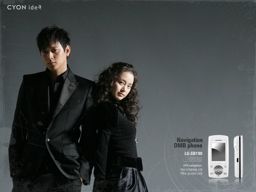

 But note Sa-rang’s feet:
 Again, such a cross-legged pose is ubiquitous in advertisements and commercials. But this and many others like it are much more awkward than the models make them look (hence Sa-rang’s need for Soon-sang’s support here), and are far more commonly found on women than on men too. For instance, in the “Don’t Worry Mom!” ads and commercials for Remark Vill serviced apartments I recently discussed, which—notice a certain conception of women emerging?—also sell themselves on the notion that their incoming 30-something female residents are so impractical and girly that they haven’t learnt how to adult yet:
 32 year-old actor Im Se-mi: “Mom, you’re bringing that up again?” / “I’m taking care of things myself now!” / “I can get lightbulbs changed if I need to, and the toilet unblocked too.” / “I don’t need to call Dad!” Source: YouTube.


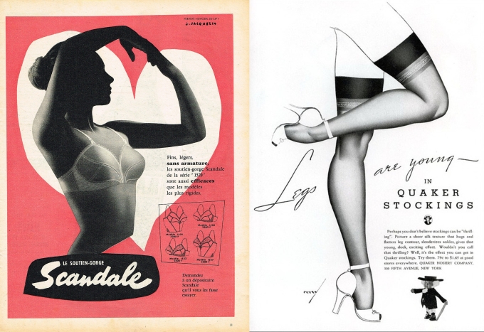
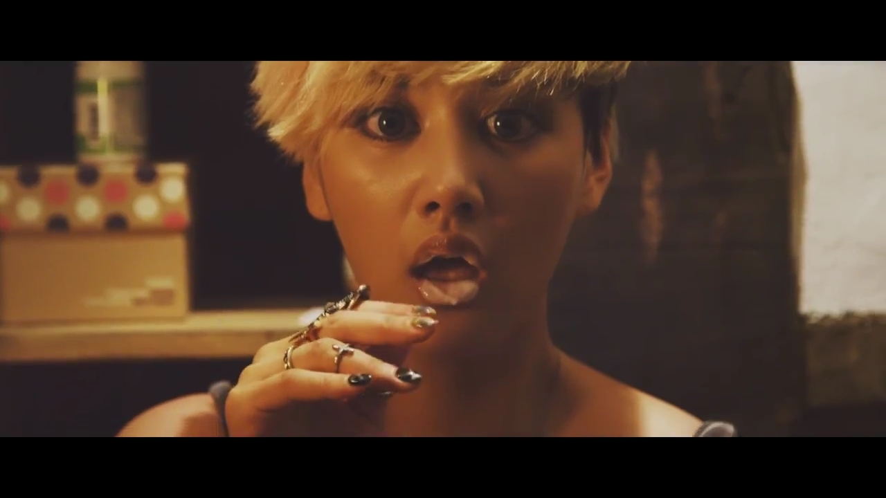


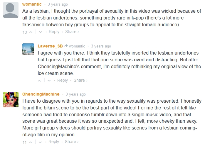
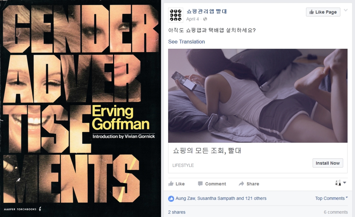

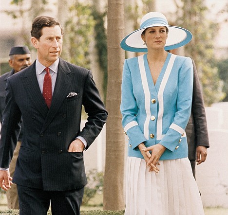


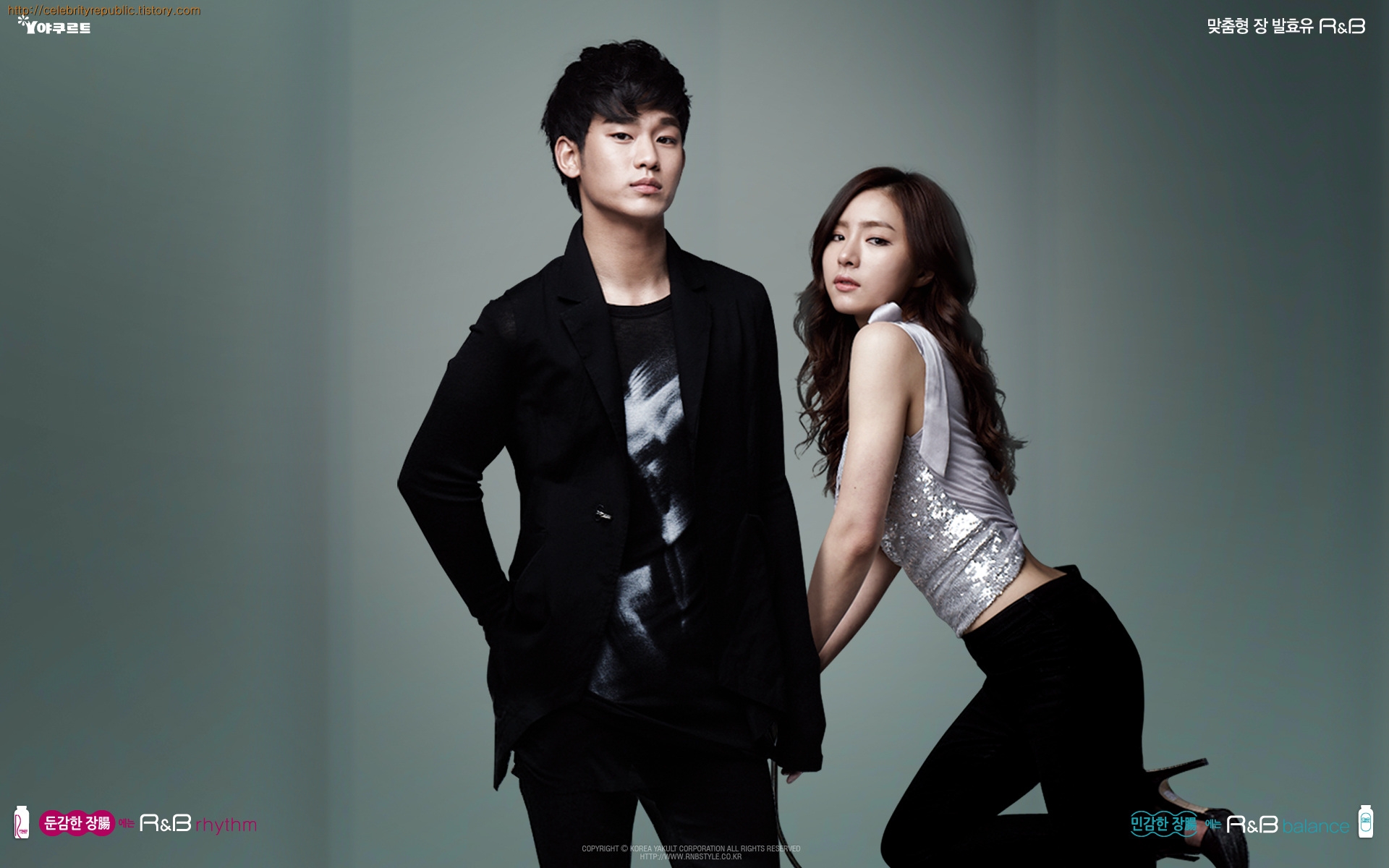


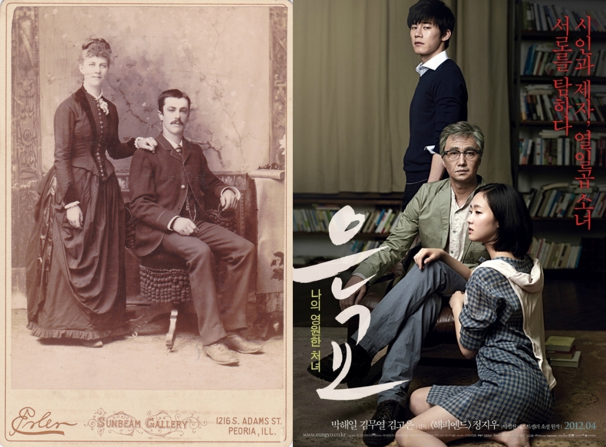


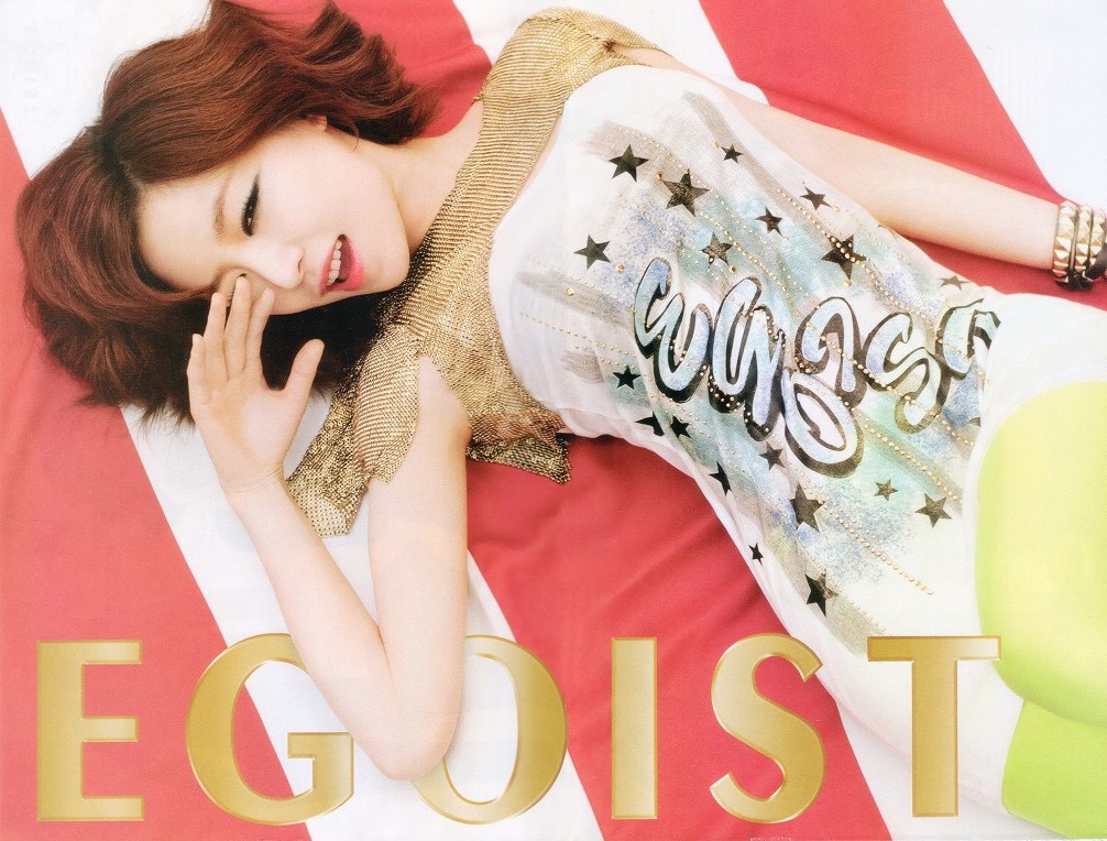

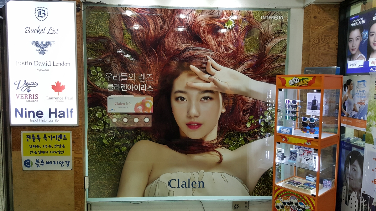
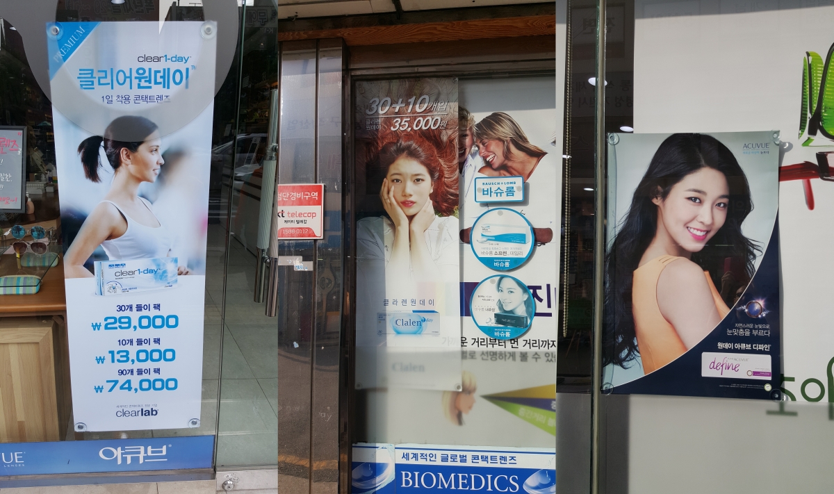
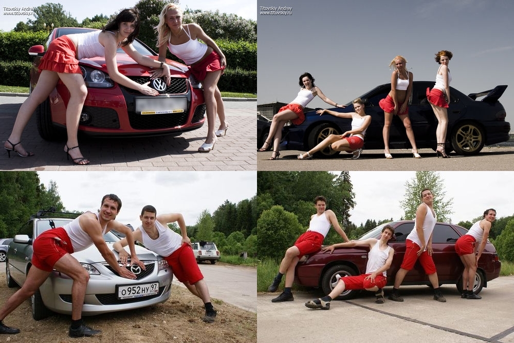


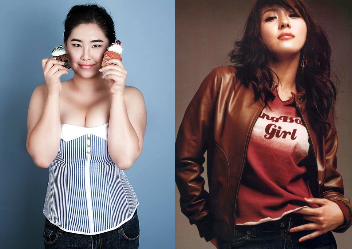

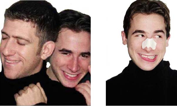
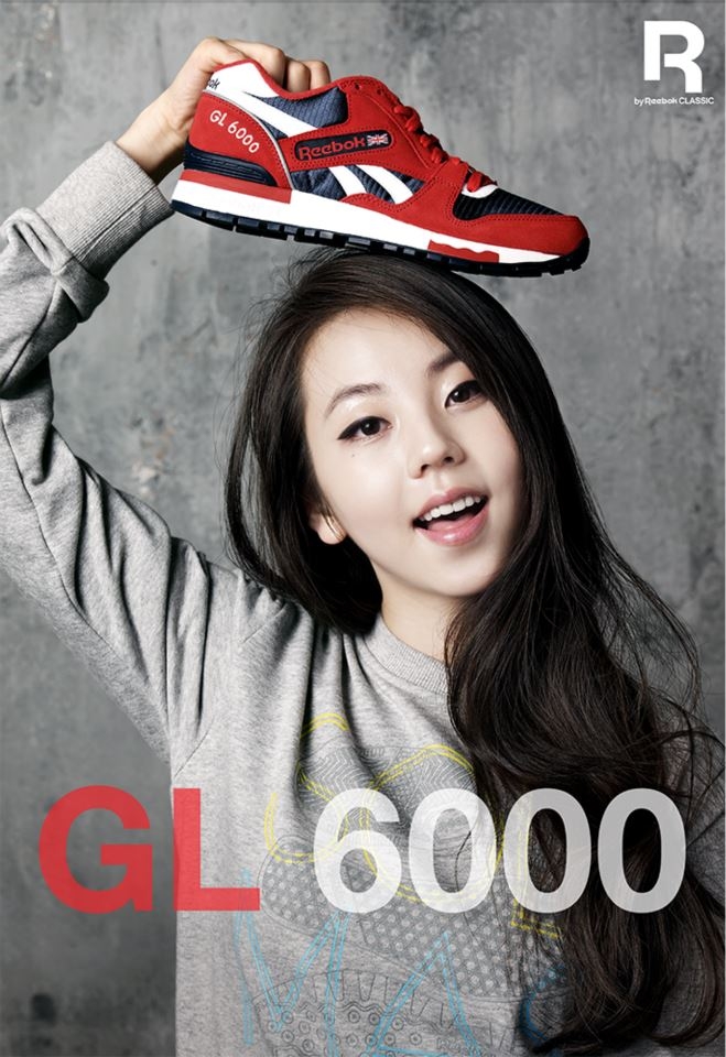


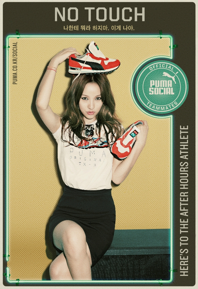

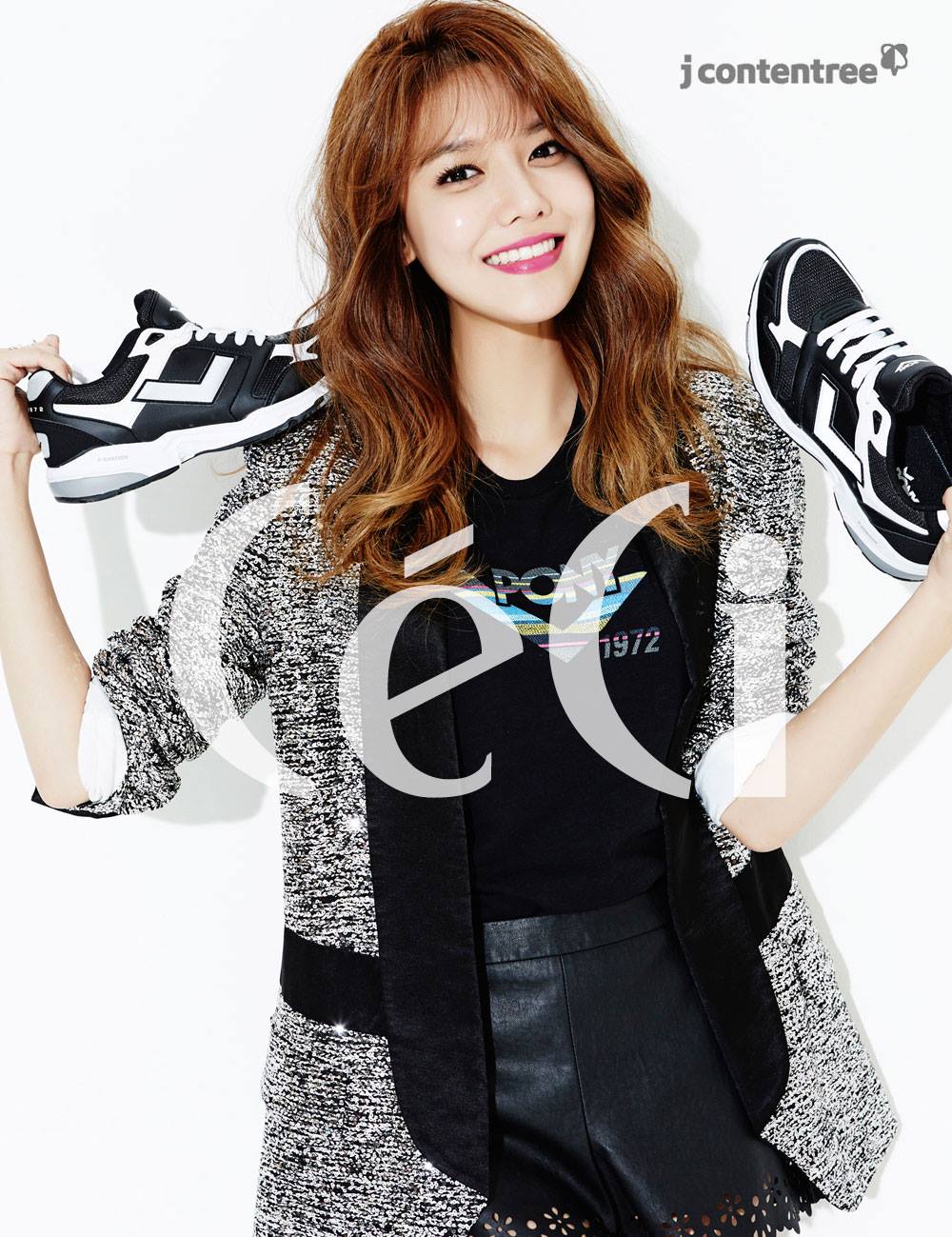
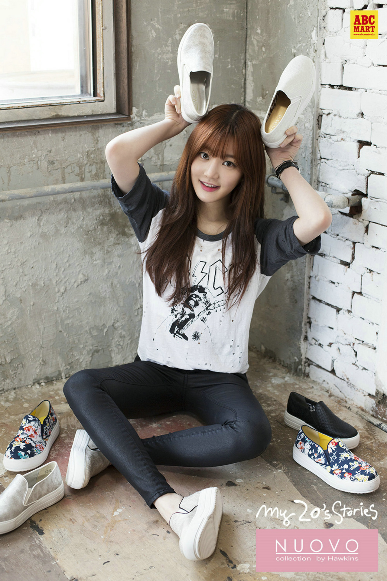
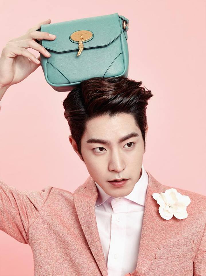


 (
(


 (
(


 (Source:
  (Source, above and below:


